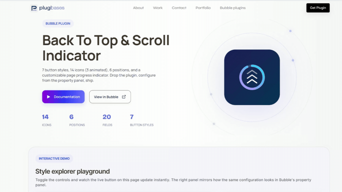
Scroll to Top + Progress adds a polished scroll-to-top button with live page-scroll progress to any Bubble page — 7 button styles, 14 icons (3 animated), 6 positions, and an optional always-visible progress indicator on any edge. Just drop the plugin and configure from the property panel.


 ⚡ Main Functions Zero setup
 - drop the plugin element anywhere on the page (invisible at runtime). The button mounts at the viewport root and stays above all content with no CSS conflicts.
7 button styles - Circle Icon, Circle Percent (% text inside ring), Pie (filling disc), Square Icon, Arc (3/4 gauge), Floating Icon, and Floating Percent. Mix progress visualization with iconography or numeric readout.
14 icons + custom uploads - Chevron, Double Chevron, Arrow, Caret, Home, Arrow Thick, Arrow Square, Circle Arrow, Chevrons Up, Rocket, plus three animated icons (Bounce, Pulse, Wave). Or upload your own SVG/PNG/JPG, or paste raw SVG markup for multi-color logos.
6 positions - bottom-right, bottom-left, top-right, top-left, center-left, center-right. Configurable edge offset for fine control.
Page progress indicator - optional always-visible thin bar showing total page scroll progress. Anchors to any of the four viewport edges; vertical orientation on left/right. Independent color and track from the main button.
Smart icon sizing - master size field that applies to all icons (built-in and custom), automatically capped so it never overflows the button. Empty value = sensible default at ~70% of button size.
Animated icons - Bounce, Pulse, and Wave run continuous CSS-driven loops. Automatically disabled for users with
prefers-reduced-motion
enabled — accessibility built in.
Full color control - separate fields for ring fill, ring track, button background, icon color, indicator fill, and indicator track. Mix and match for any brand.
Smooth scroll animation - hardware-accelerated cubic ease-out on click. Show threshold lets the button fade in only after the user has scrolled past your chosen point.
Accessibility built-in - ARIA label, keyboard focus ring, Enter/Space activation, motion-respecting animations. Reads correctly to screen readers.
No conflicts with Bubble layouts - the button and indicator render at the document root with maximum z-index, escaping any container that Bubble's page wrapper would normally clip them to.
🛠 How It Works1. Drop the element - drag onto any page; renders invisibly at runtime.
2. Pick a style - choose 1 of 7 button presets (Circle, Percent, Pie, Square, Arc, Floating).
3. Set position - select 1 of 6 corners/edges and tune the offset.
4. Choose an icon - pick from 14 built-in icons or upload your own SVG/PNG.
5. Style colors - set ring, track, icon, and background colors independently.
6. Tune behavior - configure size, scroll threshold, and animation duration.
7. Enable page bar (optional) - toggle the always-visible scroll indicator on any edge.
8. Ship it - no workflows needed; button appears on scroll and returns to top on click.
 Built on Bubble


