Designing a website for your small business can feel overwhelming. Even if you use a no-code site builder like Bubble, you still need to make countless creative decisions right from the get-go.
Things like:
- Site design
- Functionality
- Navigation
- Aesthetics
- User experience (UX)
- Web content
These all factor into the success of your site and can be overwhelming to figure out. To get you started on the right foot, we’ve broken down some of our key principles for building great small business websites and some examples you can look to as you build.
Start by finding your why: your business website’s purpose
The most important question to answer when creating a website for your business is:
“What do I want people to do with my website?”
Business websites can serve so many different purposes:
- Booking an appointment
- Buying products in an online store
- Watching videos
- Learning more about a product
- Finding hours and location for a restaurant
- Ordering online for pickup
- Subscribing to updates and news
All of these different purposes and actions should guide the structure and design of the website.
Ultimately, you want to think about what your website should accomplish for your business, what it should accomplish for the visitor, and how you can design and structure it to achieve both purposes.
For example, if you have a local restaurant, you may want your website to increase restaurant reservations and visitors. Your visitors may want to review your menu before they visit (to make sure they can find something they like) or find information on how to find your restaurant.
So, how can your website achieve both goals?
Strong branding on the homepage to capture the visitor’s attention (and taste buds), a prominent button to make reservations, and easy-to-find menus and details on location and hours.
Business website design best practices
Start by clarifying and defining the purpose of your website. With those goals in mind, you can move on to other decisions while keeping our business website design best practices in mind.
Choose the right tech stack
First things first: You need to choose your tools! When building a website, this primarily means a website builder. There are plenty of no-code website builders on the market: from very basic ones like Wix and Weebly, to more complex options like Webflow or Wordpress, and fully-customizable options like Bubble.
Each no-code builder has its own pros and cons, but we recommend looking for one that offers customization, scalability, and flexibility. You want your site to be flexible and fully customizable so it can achieve your goals, match your branding, and be easy to iterate on. Scalability is also crucial — as your business grows, small business owners need a platform that can grow with you and support increased traffic.
Aside from a website builder and hosting service (which often comes built-in with no-code website builders), you may want to consider adding other tools to your tech stack to help with planning and building your small business website, like:
- A straightforward web design tool for planning like Figma
- A brainstorming tool like Miro
- A project management tool like Airtable or Notion
Accomplish your website’s purpose
As discussed above, figuring out the big purpose of your website is crucial for making a successful website. Once you know what the purpose is, decide what you’ll need to create to achieve that purpose.
Some examples might be:
- If your website is designed to get customers scheduling more appointments, you might show a “next available appointments” calendar on the homepage.
- If you want to increase online purchases, you might focus the homepage on current sales or most popular items.
- If your website is focused on delivering information about your product or services, you’ll want to make sure the navigation is super clear. You may consider having a “start here” button or page where users can quickly find information and FAQs.
Prioritize website UX
Good website user experience (UX) makes sure your website is easy to use. It thinks about actions and interactions and prioritizes human-centered web design. This makes it easy for a user to accomplish the tasks they want to do.
How do you prioritize good website UX? Keep the user at the forefront. Always consider your decisions and options from the users point of view.
You should also follow web UX best practices such as:
- Designing a clear, well-organized structure for your site so users can easily find the pages they’re interested in.
- Using accessible design, such as clear color contrasts, mobile-friendly sites, etc.
- Using consistent design with things like color palette, buttons, style, and so on.
- Iterating and responding to user feedback and actions to continuously make your site more intuitive.
For some tools that can make great UX easier, check out our list of the best UX tools available today.
Use an intuitive, easy-to-navigate structure
Navigation and site structure are big parts of a professional website. They impact UX, accessibility, and the ability for your site to accomplish your goals.
You should lay out your site in a manner that’s easy to navigate and understand for your target audience. Put yourself in the user’s shoes and lay out your site in a way that will enhance rather than detract from the user experience.
This means prioritizing things like:
- Making sure all menu bars and navigational bars are intuitive and consistent
- Including and highlighting key website pages and making them easy to find
- Using strong interlinking strategies to give the user what they need at each step
- Organizing site content in a logical way
- Using visual hierarchy to guide visitors to the most important content
A clear site structure makes it easier for users to find what they need on your website. This makes it easier for them to reach their goals (and helps you reach your goals).
Ensure mobile friendliness
In a mobile era, every site needs to be focused on mobile users (often referred to as a “mobile-first” site). Sometimes, it may even make sense to create a web app version of your site for mobile devices, depending on your site’s purpose and functionality.
Whether you opt for a web app or simply mobile web, make sure your site is just as easy to use and navigate on mobile as on desktop. This starts with responsive design, for one, but it should go beyond that.
If you’re building on Bubble, mobile-friendly web design is even easier. We have built-in responsive design tools for your website or web app to make sure it works on different screen sizes.
Even better: Bubble is rolling out native mobile app functionality to our drag-and-drop editor, allowing you to create native mobile experiences without any coding. Join the waitlist to get access!
Keep content quality high
Your website’s content doesn’t just refer to blog posts or videos. Website content is truly anything that goes on your web pages — from marketing copy to informational text to pictures and videos, product descriptions, and so on.
High-quality website content reflects your brand well to site visitors and gives visitors the information they’re looking for in an easy-to-digest way. Quality content means that it’s:
- Accurate and up-to-date: Always fact-check and update your site regularly.
- Easy to read and clear: Visitors should be able to quickly understand key information.
- Focused: Website users shouldn’t be wading through tons of content to find the most important info.
- Thoughtful and engaging: Your site content should reflect your brand positively.
You should also optimize your site for search engine optimization (SEO). This doesn’t just refer to keywords and internal linking. It also includes key behind-the-scenes items, like loading speed. Something like excessively large files can bog down your site. Make sure to optimize your site for users and search engines alike, so that it’s easy to discover.
Iterate and continually improve
As you’re building — and after you launch — even a “static” website shouldn’t be static. You want to iterate on your website based on user feedback and responses, and continue testing, iterating, and improving to serve your users better and accomplish your goals more efficiently.
User testing and research before, during, and after the building process can give you valuable insights into how to design your site and what changes or updates might make it more effective. New to user testing and research? Read our guide to user testing to get started.
6 amazing business website design examples
No matter how many best practices and principles you have in your head, sometimes you just need some inspiration to get started. Drawing from our Bubble Community Awards and recs from our internal team, here are some of our recent favorite business website designs.
Use these to spark some ideas or see those best practices in action:
Minimum Studio
Winner of the Bubble Community Award: Outstanding Homepage Design
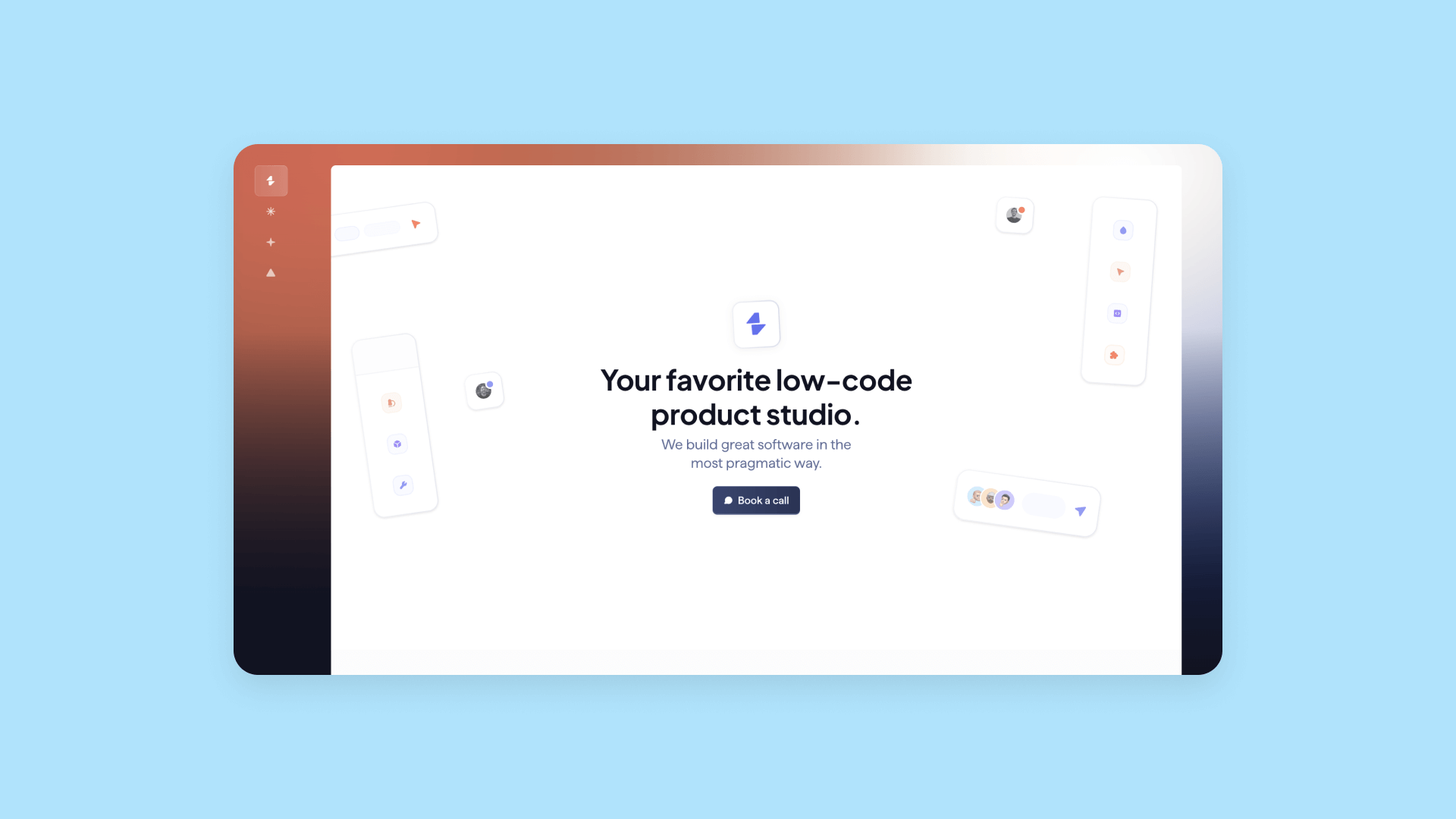
Minimum Studio is a low-code product and software development agency. They follow a number of best practices:
- Their clean and minimalist design highlights their brand and work (simple, clean, and effective!) without saying a word. They’re showing, not telling, and giving you confidence in their work right away.
- They’re prioritizing their website’s purpose — getting interested leads to book a call. The homepage is uncluttered and focused on that singular purpose with a prominent button.
- The site is easy to navigate. A sidebar is set off with a different colored background to make it easy to find, and they focus their main navigation on the three key pages visitors might want to see: “About,” “Services,” and “Work.”
- The content on these main pages is high-quality, giving the visitor further confidence in their work and expertise. It’s easy to explore, find key information, and dive deeper if desired.
Building a clean, effective, and easy-to-use site on Bubble is pretty easy. Start with our guide on building a website homepage on Bubble. Then, take it a step further with responsive nav bars and input forms to let visitors reach out.
Story Pilot
Winner of the Bubble Community Awards: Outstanding UX/UI
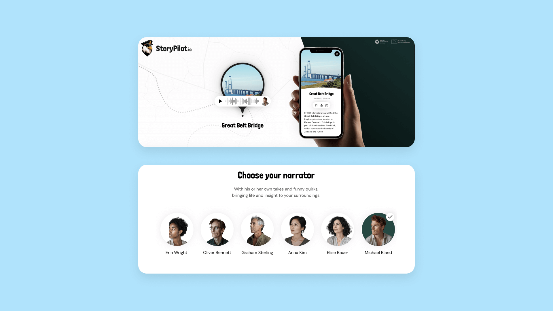
StoryPilot is a mobile app designed to make road trips more interesting by pointing out interesting sights along the way and telling location-based stories. The goal of their website is to get users to download the app. They’re using best design principles to accomplish that purpose through:
- Clear, intuitive UX (and UI)
- Mobile friendliness
- High content quality
- Focus on their purpose
The UI of their mobile app is stellar, but StoryPilot’s website keeps the UX clean and easy to use, too. A clickable button right in the header lets you start listening to a story right away to get an idea of the app.
As you scroll, the benefits and information on the site gives visitors key info about the app, while also being engaging. Click on a different narrator and hear the sample story change so you can experience the different voice options.
And because the site is responsive and mobile-friendly, it’s easy to navigate and explore from any device.
Aicado
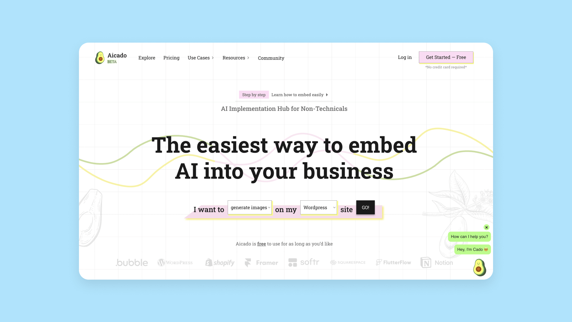
Aicado is a tool that helps businesses integrate AI into their workflows and/or websites through no-code, pre-built integrations, and APIs. The goal of the Aicado website is to help visitors start using their tool as quickly as possible. Aicado accomplishes their website’s purpose through three methods, right in the header!
- They offer an interactive way to get started with their tool by addressing the visitors’ problems: “I want to [do x] on my [type of website] site.” By adjusting these from the drop-down menus and clicking “go,” users are directed right away to a relevant no-code AI model they can integrate to their site.
- The small menu above the header (“Step-by-step” / “Learn to integrate easily”) lets visitors choose directly how they’d like to explore.
- The text below the header (“Aicado is free to use for as long as you like”) addresses and resolves a common problem right off the bat, encouraging the visitor to give it a try, risk-free.
Aicado makes great use of their above-the-fold header space to accomplish their purpose.
Not Quite Unicorns
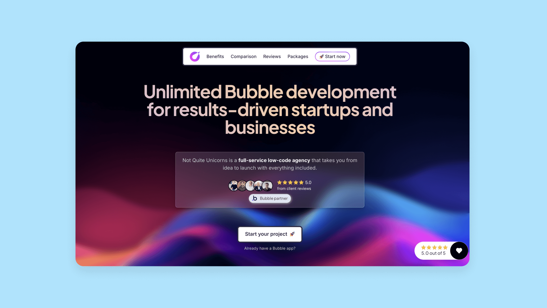
Not Quite Unicorns is a no-code agency helping founders and startups build and launch their apps faster with Bubble. The goal of their website is to give founders all the information they need about their agency to encourage interested founders to start a project.
They accomplish this with several key elements right from the hero section: a quick info box about their agency, two sources of social proof by highlighting client reviews, and a prominent “Start your project” button.
But their excellent design carries through the entire homepage (and website).
The main nav bar highlights key pieces of information visitors might want to know before starting a project: “Benefits,” “Comparison,” “Reviews,” and “Packages.” You can jump to the section you want from the top, or start scrolling to get the info.
As you scroll, high-quality content is well-designed, engaging, clear, and concise, giving users everything they need to know without overwhelming them. Their engaging design highlights their brand and expertise while also being delightful for users.
At the bottom of the page, rather than having a basic contact form, they’ve included a booking calendar where interested founders can immediately schedule a free consulting call if they’re interested but not yet ready to start a project.
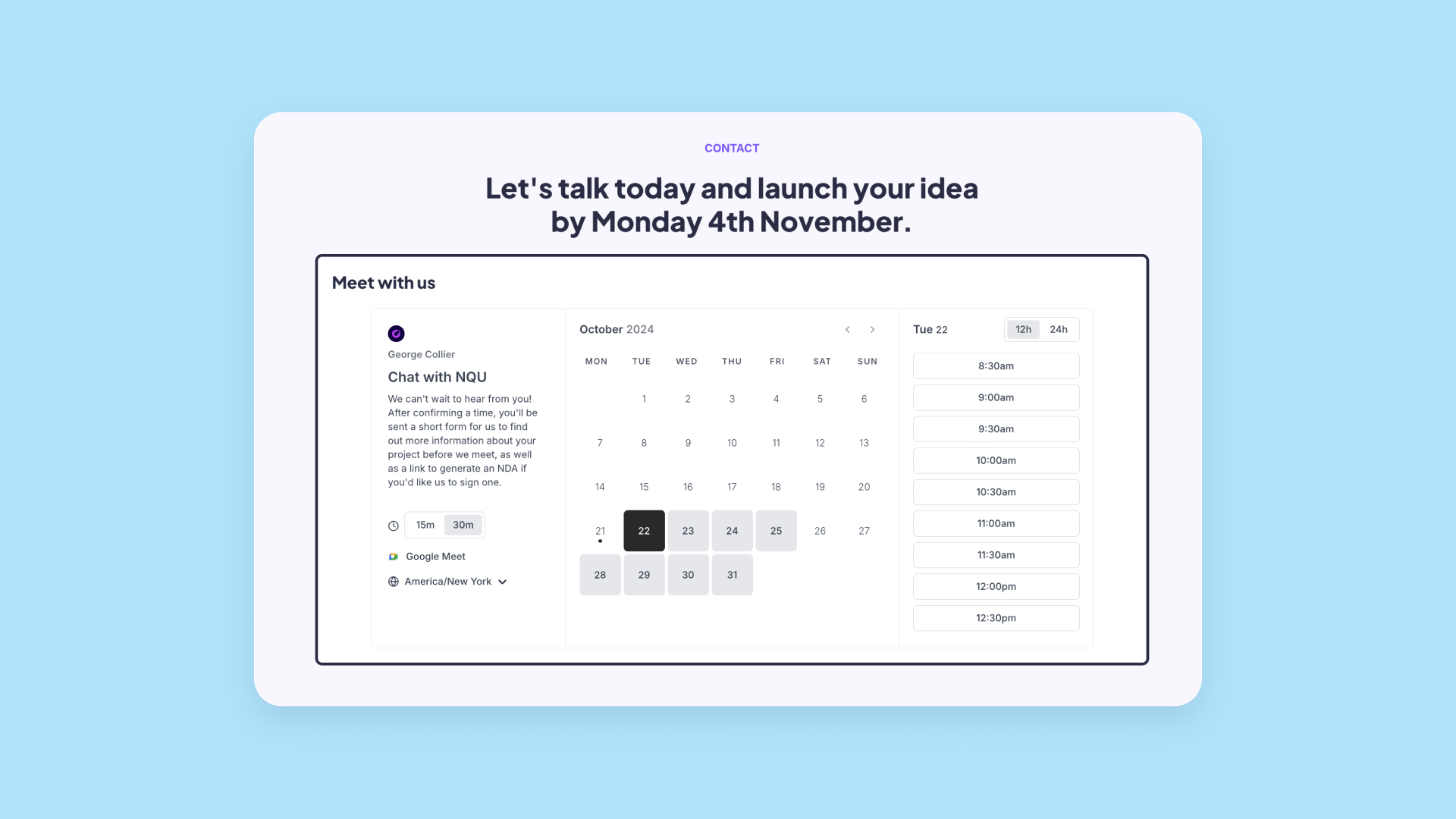
Bubble makes it easy to create an engaging, on-brand site that gives your visitors all the info they need and accomplish your goals.
Start by getting your hero section (that above-the-fold header) just right — we’ll walk you through it if you need a hand. Then use containers to include all the content you need for your homepage. Bubble plugins and integrations let you seamlessly add in booking calendars, social media posts, embed videos, and more.
Deezign
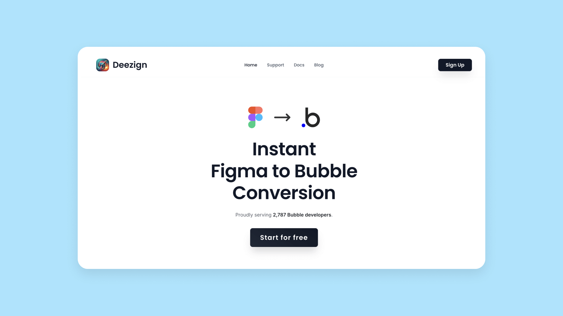
Deezign is available as a Chrome extension or Figma plugin to allow designs to instantly translate their Figma designs to Bubble layouts. The goal of their site? To get visitors to install their plugin.
You can see how their clear, minimalist homepage points to that goal. The header clearly and simply states what they do and gives some social proof. The main button helps you get started.
As you scroll, clean, responsive, and high-quality homepage content gives visitors information on how it works and pricing, offers social proof, answers FAQs, and gives visitors multiple chances to get started.
Creating clean, clear designs like this that promote your tool or product is simple on Bubble. Your designs are completely customizable, so you’re not locked into a template that may be more complicated or busy than what you want.
And if you’re importing from Figma (as Deezign supports), you can design and build your Bubble website even faster.
AudioPen
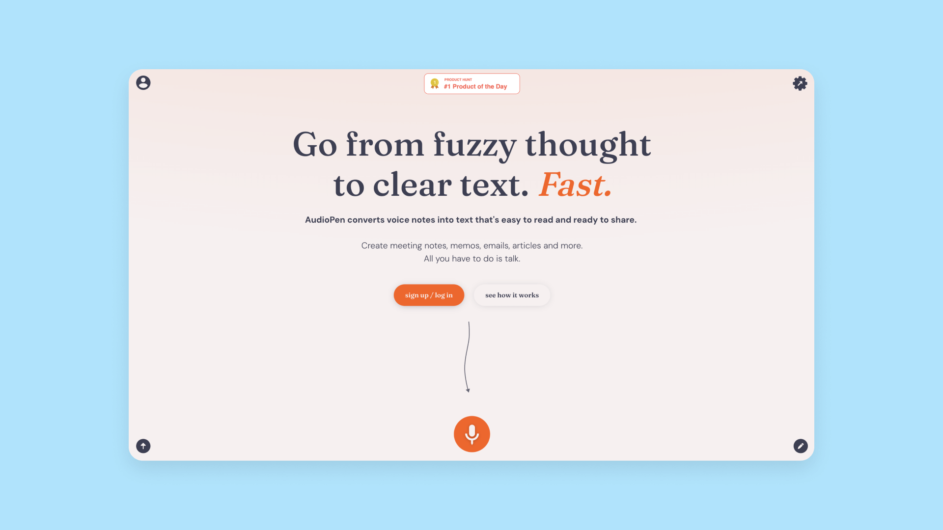
AudioPen is a tool that converts voice notes into text. It’ll summarize your ideas, take notes on a meeting, transcribe your dictation — whatever you need. The goal of the site, as with many sites, is to get visitors to try the product.
AudioPen does that well by providing a streamlined, minimal design experience that highlights trying the product above everything else:
- An engaging and clear headline that grabs the visitors attention
- A short line of clear content that explains the product
- Options to try the product out firsthand
On the AudioPen website, all the visual cues lead you to their goal.
If you click the first button, you can sign up for an account. Click the second button (“See how it works”) and you’re redirected to a video demo. Click the microphone button and you can start trying out the tool instantly. Avoiding all of those options? Scroll down the page and you’ll see a wall of reviews and positive social proof that lead you, once again, to demo the product at the bottom of the page.
AudioPen is a great example of a clean, well-designed, and focused website that highlights the product without getting bogged down in any other details. And because their product is also crisp and simple, their website design highlights their brand and product ethos as well.
Bubble is great for making websites like this. Sometimes, less really is more. When you want a clear, engaging website that really highlights your product or tool, you can build it on Bubble. Play around with different workflows and actions to give site visitors different ways to interact with your tool, test it out, watch a demo, or sign up.
The best business website builder
Creating a business website requires a keen eye and thorough knowledge of the end-user. Unless you have a degree in design and engineering, chances are it’ll be difficult to address all of these concerns at the same time.
That's where Bubble can make a difference.
Our no-code site builder removes the hassle of complex coding. Instead, clients can focus on a seamless, intuitive building experience that frees them up to focus on their customers and whatever their website design needs may be. While other no-code website builders can give you a website fast, a no-code programming platform like Bubble gives you complete control, flexibility, and customization. You can build your website exactly how you want it, to accomplish exactly what goals you have in mind.
Build for as long as you want on the Free plan. Only upgrade when you're ready to launch.
Join Bubble