Before an app takes shape with colors, typography, and branding, it starts with something much simpler, but just as crucial: a wireframe.
Wireframing is an essential step in building a well-structured and user-friendly product — skipping it can lead to costly design and usability issues down the line. But what makes a wireframe effective? And how can early-stage entrepreneurs, designers, and developers use them strategically?
Here at Bubble, where we’re all about empowering everyday people without a coding background to build and launch their big ideas, we’ve learned a thing or two about wireframing. That’s because every year, we host Immerse, a fully funded pre-accelerator that helps underrepresented founders build their MVPs in just a few weeks.
We built this guide after reviewing thousands of Immerse applications from founders across industries and using expertise from our head of product design. We’ll break down what wireframes are, why they matter, and how to create ones that set your app up for success.
What is a wireframe?
A wireframe is the blueprint of a product, outlining its structure and functionality before any visual design is applied. It helps builders focus on an app’s core features, user flow, and data needs without getting distracted by aesthetics.
While it may be tempting to skip this step, Missy Kelley, head of product design at Bubble, says they’re essential to answering some basic questions about your product.
“What information does my product need? What data should it capture? What is the pacing of the story I’m trying to tell? Wireframes help answer these questions quickly, ensuring you focus on solving the right problem rather than getting caught up in design or copy.”
When do you need a wireframe?
Wireframes are essential whenever you’re developing a web page, product, or app, as they can quickly highlight potential usability issues.
“Imagine a grocery app where the checkout button is at the bottom of a long list of items in your cart. A wireframe might immediately highlight the need to make that button sticky at the bottom of the screen, so users can check out anytime without scrolling,” Missy says.
Website wireframe examples
The look and feel and structure of your wireframes will look different depending on your product and goals. Here are some examples:
- Marketplaces: Often include dual user interfaces (buyer and seller), prioritizing search and discovery flows with filtering, clear product listing layouts (grid and list views), streamlined checkout processes, and more.
- Community organization platforms: Include discussion spaces, profile designs, event management systems with calendar integrations and RSVP functionality, and resource libraries.
- Blog and content platforms: Features like content discovery and consumption, and an organized homepage layout featuring content hierarchy.
- Social networks: Structure around engaging feed designs that accommodate multiple content types, profile pages, content creation flows, and clear interaction points (likes, comments, shares), etc.
What’s the difference between high-fidelity wireframes and low-fidelity wireframes?
Not all wireframes are the same. Usually, builders are producing either a low-fidelity wireframe or a high-fidelity wireframe, which are distinctly different:
- Low-fidelity wireframes are typically simple, grayscale sketches or diagrams that outline the structure and basic layout of low-fidelity prototypes. They focus on content placement, functionality, and user flow without much detail on design elements.
- High-fidelity wireframes (often called mockups) provide more detail than low-fidelity ones, often including colors, typography, and basic design elements to give a clearer visual representation of the final product. They are usually used for high-fidelity prototypes and are closer to the final design but still prioritize functionality and layout over aesthetic details.
The top 7 dos and don’ts of wireframing
1. Do make core user flows clear
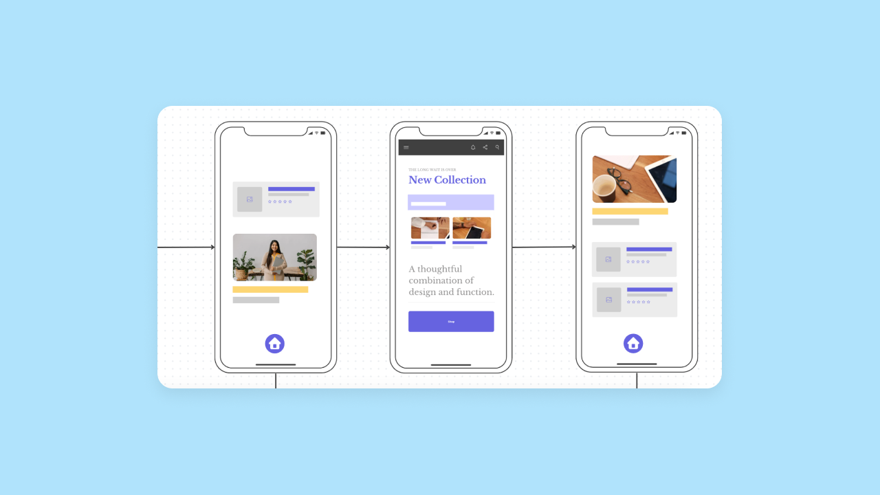
It’s not enough to sketch out a singular app page. Your wireframe should feature complete and detailed user flows — or a visualization of the series of actions a user takes from point A to point B. There should be details on how buttons and screens connect to one another and move the users toward the intended destination.
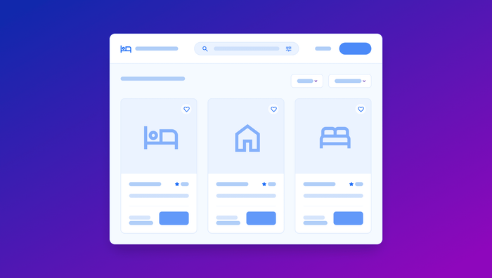
For example, in an e-commerce app (like this template from Figma), you’d need to map out the entire journey from product discovery to checkout. Show how users move between pages, what information they need at each step, and where key decision points occur.
2. Do map out the core functionality and features of your app
Your wireframes should explicitly showcase your app’s fundamental capabilities and basic functionality.
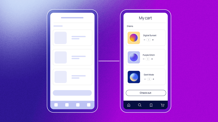
If you’re creating a social platform, for example, your wireframes might look like this example from Visme. Your design should demonstrate where users can create posts, interact with content, and manage their profiles. Each feature should have its designated space and clear interaction points.
3. Do consider copy
Even in wireframes, thoughtful copy matters. While it doesn’t have to be final, intentional copy placement helps inform decisions about layout, spacing, and content hierarchy — and the user experience as a whole.
Instead of using “lorem ipsum” everywhere, write real, purposeful text that guides users. Button labels should be action-oriented (“Start building for free” rather than just “Start”), and headlines should clearly communicate value propositions.
4. Do contemplate design specifics
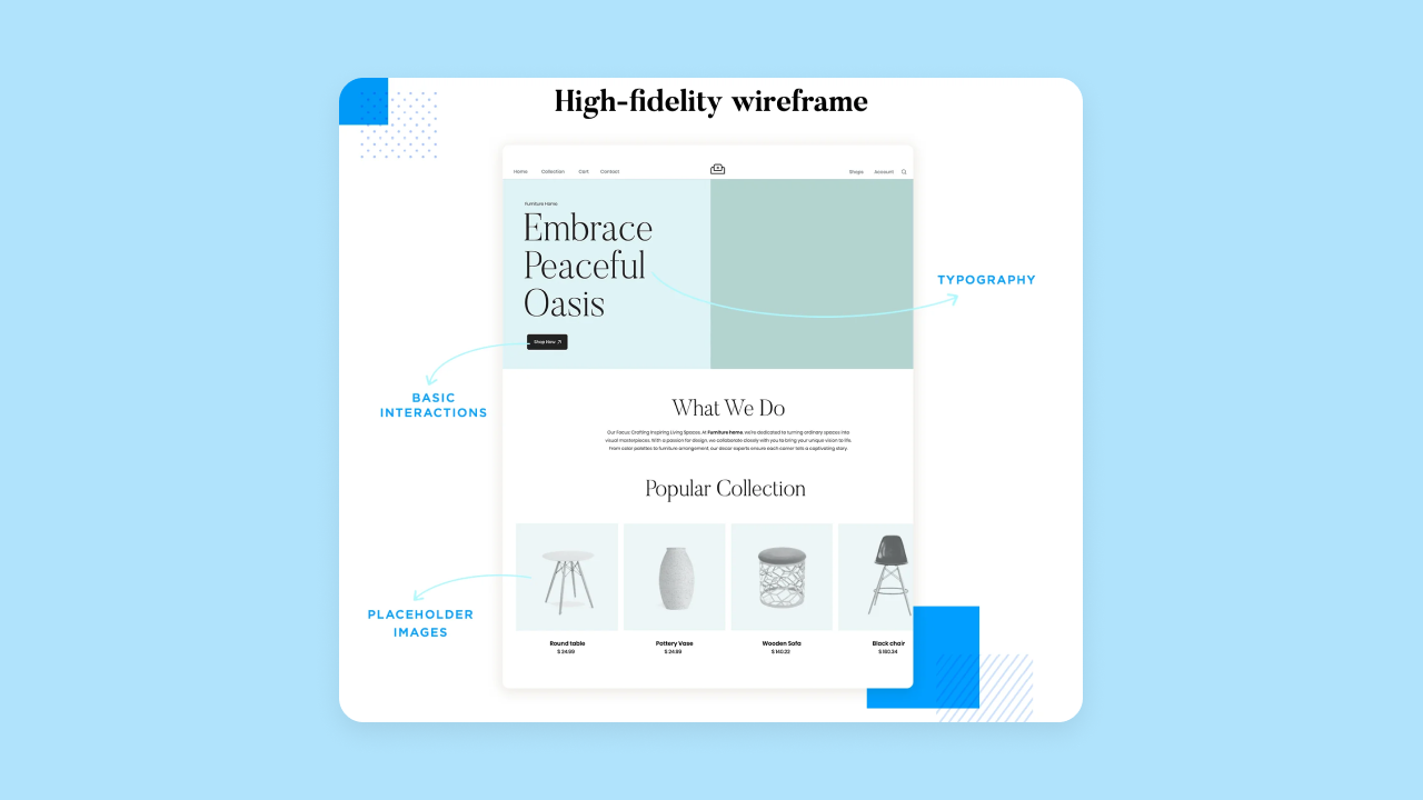
While wireframes are intended to help you focus on the architecture and functionality of the app, you shouldn’t disregard design completely. In fact, you should start to think about it — especially if you’re designing high-fidelity wireframes.
Think about hierarchy — what information needs prominence? Where should calls to action be placed? How should navigation be structured? What kind of design features or colors will signal to users that they’ve taken action? Will there be animations or specific imagery?
5. Don’t ignore spacing
“Make sure that you’re paying attention to spacing when wireframing. We often try to cram a whole lot into spaces. We forget that white space is our friend,” says Missy.
Poor spacing can make the most feature-rich applications feel cluttered and unusable. Take this Canva template, for example — your wireframes should account for proper padding, margins, and overall layout breathing room in order to ensure that it’s as user-friendly as possible.
6. Don’t neglect error states
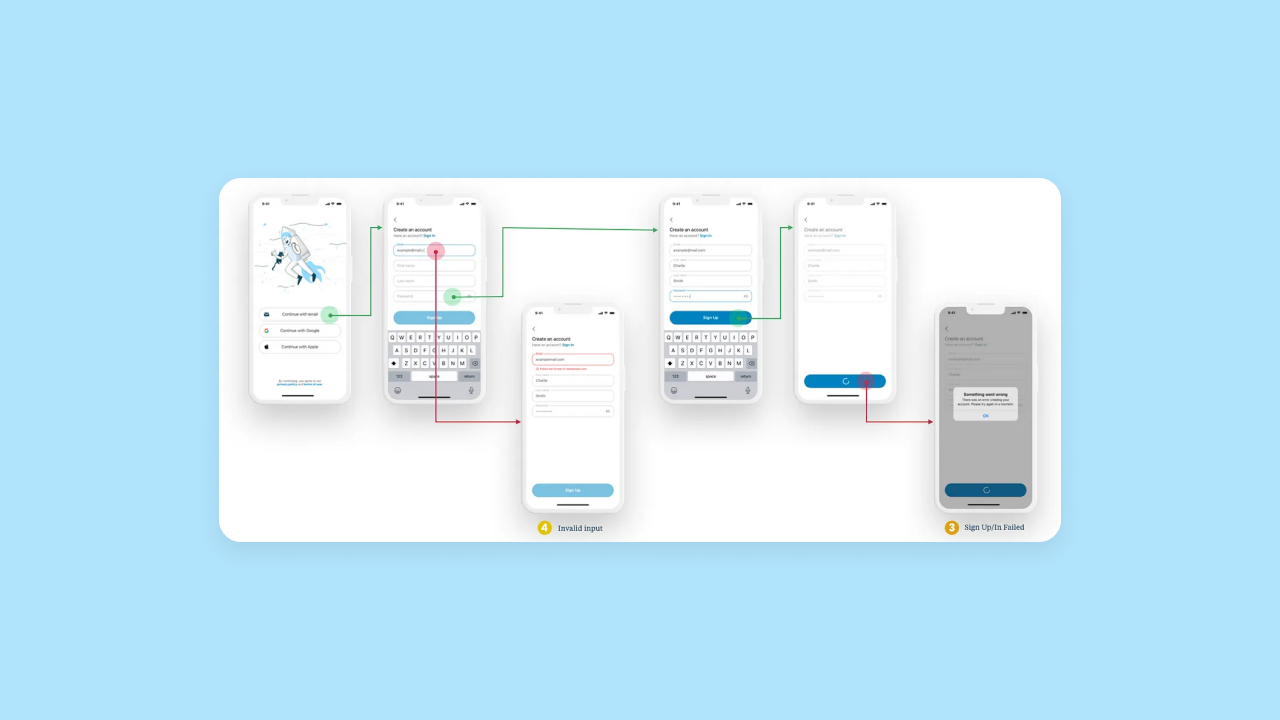
Whether we like to admit it or not, every interaction can fail.
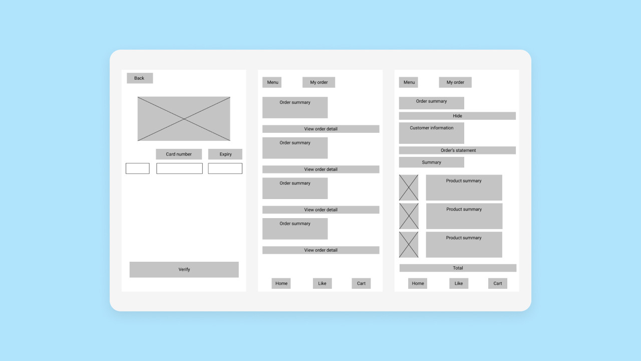
When making your wireframes, map out how your app will handle invalid inputs, failed operations, or system errors, like this wireframe from Livefront does. What feedback will users receive? How can they recover? Considering these states ensures that users feel guided and supported, not frustrated and confused.
7. Don’t forget empty states
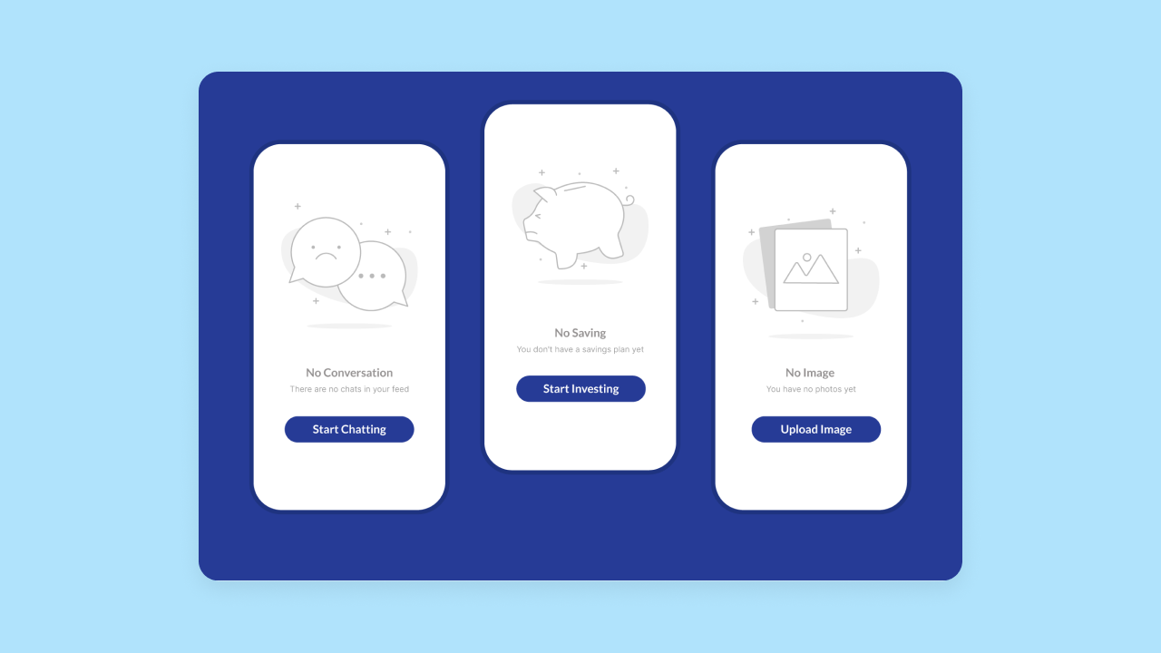
Empty states are crucial moments in user experience — what does your app show when there’s no data to display?
When building a messaging app, for example, a builder would have to consider what the inbox looks like before any messages arrive. Is there copy? What does it say? What options are users given to take action?
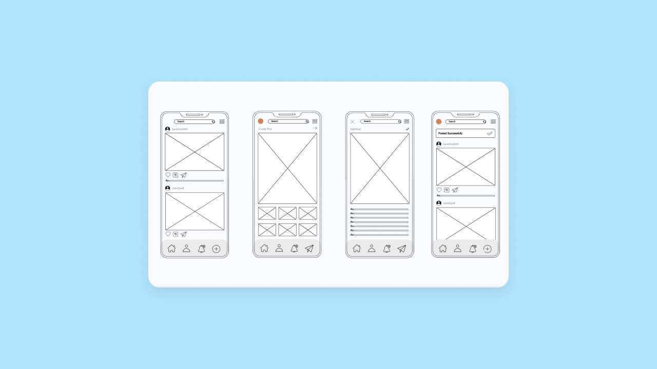
When done well — like in this Figma template — empty states can be great opportunities to guide and engage users, rather than confuse them.
How to make a wireframe
Ready to start building? We suggest starting using one of these methods:
Think holistically
Wireframes are just one part of the larger process of planning your app. Before diving in to your wireframe, you should take a step back and spend time thinking about your business as a whole. What are your goals? What are the key features you want to build for your users?
Find inspiration
Exploring apps and websites to inform your design is another perfect starting point. Browse sites like Dribbble or Mobbin, or analyze your favorite app’s user flows and experience. How can you apply those insights to your own app?
Put pen to paper
It may be old-fashioned, but one of the best ways to start your wireframe and design process is just by getting out a scrap piece of paper and sketching. Consider where the hero image would go, the navigational panel, and more.
Build mockups
After finding some inspiration and putting pen to paper, create mockups of your wireframe on platforms like Canva or Figma. This will allow you to get a clearer, more detailed sense of your wireframe beyond a rough sketch.
If you’re working with Figma, use the Bubble-recommended Deezign plugin for seamless import of your designs.
Use Bubble
Take advantage of tools like Bubble’s AI app generator to help get a jumpstart on your app structure. Simply describe your app idea, and it will generate a fully functional framework in minutes, complete with a structured design, data setup, and core logic.
“Bubble’s AI tool helps you visualize data relationships and uncover user flows you might not have considered. It highlights workflows beyond just solving the core problem, revealing nuances in how users interact with your product,” says Missy.
Start and finish your next app on Bubble
With the right strategies, tips, and tools, you can create a wireframe that lays the foundation for your product’s success.
Whether you’re brand new to app development or are a seasoned pro, Bubble has all the tools you need to make your next idea a reality — from start to finish. No coding required.
Build for as long as you want on the Free plan. Only upgrade when you're ready to launch.
Join Bubble