Given the infinite number of websites today, you need yours to stand out in the crowd. Good website design is the best way to make your mark while simultaneously accomplishing your business goals. Quality designs make it easy to communicate key messages to your target audience. They enable users to gather vital information, visit important pages, and take the call-to-action (CTA), whether that be establishing contact, placing a subscription, or making a purchase.
What Makes for the Best Website Design in 2022?
There are a number of modern design trends you can use to create or enhance your online presence. Today's users expect modern web designs; thus, a high-quality site is critical in the digital economy. So what makes for a good website design? Trendy designs like large typography or colorful illustrations will come and go, but there is no substitute for streamlined navigation, a logical flow, and responsive interfaces on both desktop and mobile.
Here are key examples of best practices in web design trends for 2022:
1. One-Page Websites
Simplicity has become popular in web design, and the one-page website is a manifestation of this trend. This approach avoids menus and nested pages in favor of straightforward site content that uses a scroll-based navigation approach.
Consider this design concept if you have a focused topic or portfolio site or you want to minimize distractions and convey your key messages clearly.
A disadvantage of one-page websites is that they can take longer to load if they aren’t designed correctly. Users expect pages to load in a few seconds, so follow Bubble’s guidance on how to improve your website’s performance with its no-code app editor, including focusing on perceived performance instead of total page load time.
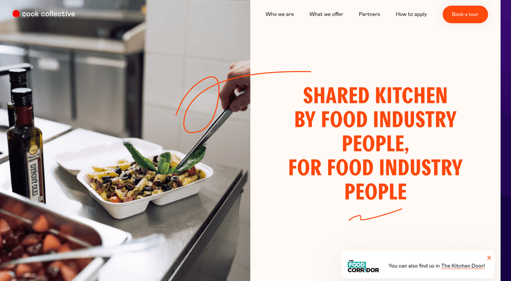
The cookcollectivekitchen.com is an excellent example of a one-page design that beautifully conveys the necessary information in a clean, elegant manner. The page scrolling ends with a contact form CTA.
HBO Max's website uses a single page to effectively highlight its content, plan options, and supported devices. There are plenty of "Sign Up Now" buttons along the way that make it easy for anyone interested to sign up for the service.
2. Mobile Responsive Websites and Apps
With more than half of web traffic now coming from smartphones, optimizing your site's pages for mobile devices is critical. Optimization includes using responsive themes that look great on mobile devices and desktop computers. If customers can't easily conduct business with you using their phones, you will be missing out.
dribbble.com is a great example of a responsive site that looks great on mobile devices and has a larger screen. Implementing a flexible grid design enables an optimized experience on any device. You can use Bubble's powerful, no-code editor to create responsive pages that look great on any modern device. dropbox.com is another site that works great on any device.
A common technique on mobile interfaces is using a hamburger icon for menus and buttons for CTA forms. When the user interacts with these elements, they expand to preserve the screen real estate while browsing the site's content.
3. Minimalistic Illustrations and Icons
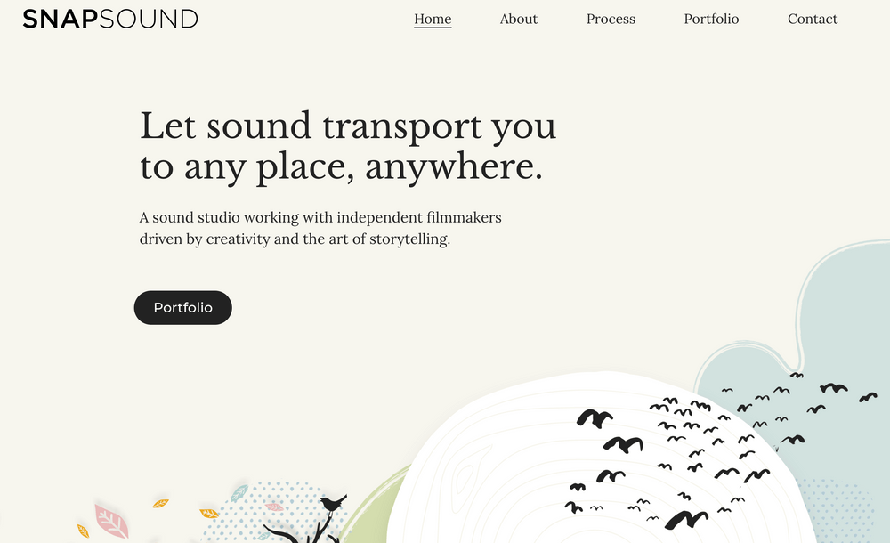
The use of illustrations in favor of photography as a design element to create visual interest has grown in popularity recently. Illustrations have smaller file sizes which equal faster page load times. Minimalist designs create streamlined user experiences that are visually pleasing. They help to organize information and simplify the communication of key messages.
Unique illustrations can also set your site apart from the rest. You can express your brand in a creative way. It is often worth investing in original artwork that users will not find elsewhere.
One caveat to this guideline is that e-commerce sites should always use high-quality product images because it's the best way for customers to know what they are getting.
The sound studio snapsound.com has some beautiful illustrations on their homepage that make for an unforgettable site experience.
You can find a great selection of free graphics, vector art, illustrations and photos to set your website apart at freepik, pixabay and Unsplash, to name a few.
4. Parallax Scrolling and Animated Scrolling
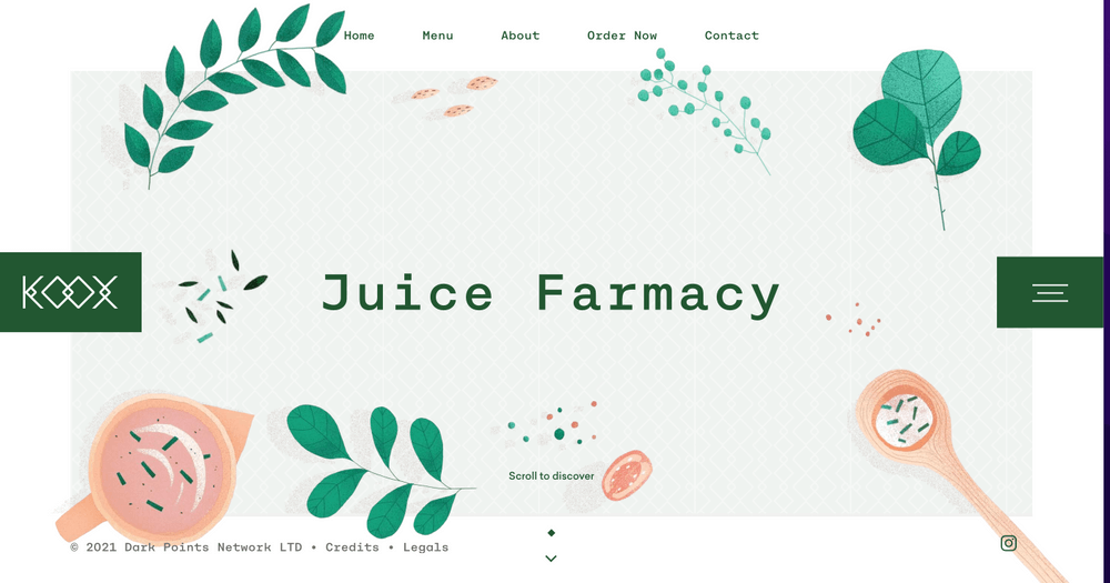
Parallax scrolling creates a 3D effect by moving the background graphics more slowly than foreground elements when the user scrolls. The parallax effect adds depth to the site and can be used to create stunning visual effects. It remains a popular technique that captures the attention of audiences.
Small animations on pages are also popular as they make the user experience more interesting and engaging. They draw attention to key content on the page and create a more interactive feel as a user navigates through the site.
The food site Koox uses a combination of illustrations and scrolling animations to engage the user as they learn about their unique menu and food process.
5. Consistent Color Themes and Styles
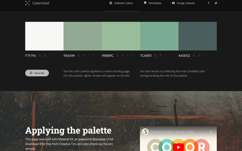
Colors have a strong impact on your site visitors, so the selection of color themes is critical when designing your site. Generally speaking, you want to choose a palette with a small number of colors based on a color wheel. You can use sites like Colormind to find interesting palettes if you are looking for inspiration.
Consistent color themes make your site easy to look at and pleasing to the eye. You can even choose to use a simple black-and-white color theme or incorporate background colors or white space. Whatever theme you choose, remember to use high-contrast colors for the primary text for accessibility and to aid users with impaired vision.
The Lush website highlights its products and benefits with earthy and playful color tones. Most website builder applications support preset color themes that work well together and meet standard accessibility requirements. Bubble comes with excellent templates and color themes that you can use out of the box, and they have a marketplace with many other templates from which to choose.
Building The Best Web Design with No-Code
Whichever approach you choose for your business website design, focus on a quality design that aligns with your business goals and brand identity. In the digital economy, your online presence is critical to your success and customer interactions. Bubble can help you create amazing sites quickly and efficiently using these design concepts.
About Bubble
Bubble is a leader in the no-code movement. Bubble offers a powerful point-and-click web editor and cloud hosting platform that allows users to build fully customizable web applications and workflows, ranging from simple prototypes to complex marketplaces, SaaS products, and more.
Millions of users are building and launching businesses on Bubble – many have gone on to participate in top accelerator programs, such as Y Combinator, or raise $365M in venture funding. Bubble is more than just a product. We are a strong community of builders and entrepreneurs that are united by the belief that everyone should be able to create technology.
Build for as long as you want on the Free plan. Only upgrade when you're ready to launch.
Join Bubble
