TL;DR: Barely-there UI (stripped-down, near-invisible interfaces), Machine Experience design (building pages that AI agents can read as easily as people can), and nature-inspired design are just emerging. Tactile realism, bento grids, anti-grid brutalism, scrollytelling, and kinetic typography are established, though each comes with tradeoffs worth knowing before you use it. Generic AI imagery and scroll-jacking are fading.
AI can spit out a polished, functional web design in minutes. But people are getting tired of the sameness it produces, and designers are answering that in some pretty different ways. Some are turning up the texture and the volume. Others are stripping everything back to near silence.
At the same time, sites are increasingly getting built for AI agents, not just people. Designers now have to think about the order content sits in behind the scenes, even when the visual layout follows its own logic on the page.
We asked our design team what they're seeing right now. Here's the rundown, grouped by how established each trend already is.
Emerging web design trends to watch in 2026
These trends are still forming. They haven't hit the mainstream yet, but the signals are consistent enough across the design world that they're worth getting ahead of.
1. Barely-there UI turns restraint into a signal
The word: Quiet
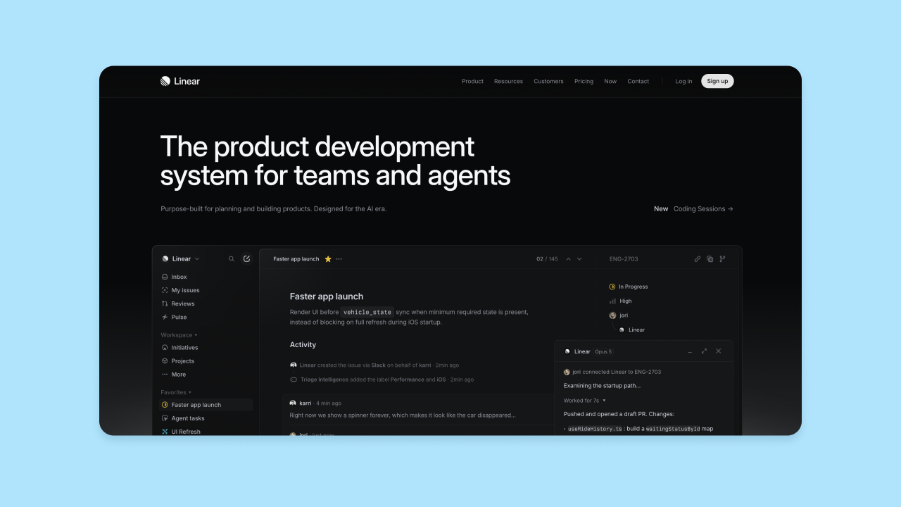
Barely-there UI strips interfaces down to near invisibility: a single typeface doing most of the work, and borders thinned into low-opacity hairlines instead of solid containers. Structure comes from white space and typographic weight instead of boxes and shadows.
The trend is starting to show up in AI and SaaS products. A lot of AI companies are young and well-funded, and need to look serious fast. Extreme restraint signals stability and intelligence in a way a busier interface doesn't. It's a deliberate move away from "soft UI," the heavy drop shadows and pastel palettes that defined the last wave of AI tools.
This trend suits brands built on data and trust, like dashboards and developer platforms. It's a tougher fit for brands that depend on personality or storytelling, since a barely-there interface doesn't leave much room to carry that kind of weight.
Try it in Bubble: Reduce your color palette to two or three tones and lean on one font family across your app. Use low opacity settings on backgrounds and borders instead of solid containers, and let generous spacing do the work of separating sections. The visual editor makes it simple to dial back visual weight without losing structure.
2. Machine Experience (MX) design plans for readers who aren't human, without losing sight of the ones who are
The word: Legible
As more people search through AI agents instead of typing into Google, designers are starting to build pages for a second audience: the machines reading them. Some call this Machine Experience, or MX.
That doesn't change who the design is ultimately for. Human-centered design stays the priority — MX is about making sure a page's structure holds up for both audiences, not designing for machines at people's expense.
In practice, MX changes what a page actually looks like as much as what's happening in the code behind it. A heading needs to visually match its semantic level, since an agent can't tell that a big, bold paragraph is meant to function as a headline the way a person can. And content needs to sit in a rigidly structured order in the markup, even when the layout gets creative: A page with content scattered across the screen reads fine to a person scanning it, but an agent reads elements in the order they sit in the code, not the order they appear on screen.
Try it in Bubble: Use Bubble's SEO and meta tag settings to keep your page titles and descriptions accurate, and turn on the option to expose H1, H2, and H3 tags on your text elements so your page structure is actually semantic, not just styled to look like one.
3. Nature-inspired design borrows warmth from the physical world
The word: Organic
This one's a bit different in kind from the rest of this list. Barely-there UI and MX design are about how an interface behaves; nature-inspired design is really about mood — the feeling a site is going for, not its structure or texture.
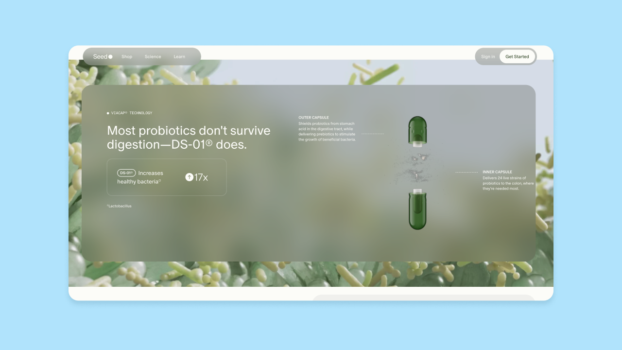
Nature-inspired design brings earthy color palettes, soft edges, and organic shapes into digital experiences: think forest greens and terracotta instead of the saturated primaries or stark neutrals that have defined most product design, and asymmetrical layouts instead of sharp grids. It's partly a reaction to the same fatigue driving tactile realism, just aimed at theme instead of texture — as AI-generated visuals and sterile SaaS interfaces start to look the same, a warmer, more physical palette signals a person made the decisions behind it.
It's an easy fit for wellness, food, and sustainability-adjacent brands, and a growing number of tech and B2B companies are borrowing it to soften an otherwise clinical product. The risk is treating it as decoration: an earthy palette dropped onto a generic layout just reads as this year's trend. It works best when the palette and shapes actually reflect something true about the brand, rather than a currently popular mood board.
Try it in Bubble: Build a custom style with an earthy color palette and rounded, soft-edged containers instead of sharp corners, and apply it consistently across your app's design system rather than one section at a time. Bubble AI can generate a starting palette from a prompt describing the mood you're after, which you can then refine directly in the style editor.
Web design trends holding steady in 2026
These trends have already proven themselves in the wild. That doesn't mean they're settled — each comes with tradeoffs worth knowing before you use it.
4. Tactile realism turns texture into a trust signal
The word: Human
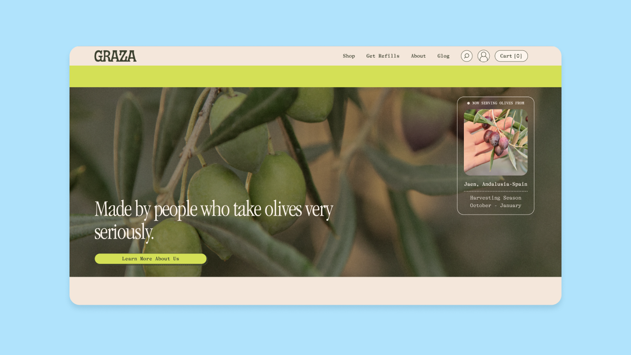
As AI-generated visuals get technically flawless, designers across illustration, graphic design, and web design are pushing the other way: grain, film scratches, and other slightly imperfect physical details that signal a person made the thing, not a prompt. On the web it shows up as CSS noise and grain overlays, plus finishes that mimic paper or brushed metal.
The logic is simple: AI-polished visuals have gotten so common that "clean and competent" now reads as generic instead of premium. Grain and imperfection are one of the more effective ways designers have found to signal that a person was behind the work.
Execution matters. Well-built tactile design creates that grain through lightweight CSS gradients or small compressed assets instead of large image files. Done carelessly, with heavy uncompressed images or bloated animated backgrounds, it becomes the kind of slow, over-decorated site that kills conversion.
Try it in Bubble: Layer a subtle grain effect behind key sections using the HTML element with lightweight custom CSS, or apply soft shadows and slightly irregular spacing to break up an otherwise flat layout. Keep an eye on file size. A small compressed asset does the job a large image file shouldn't have to.
5. Bento grids are having a moment as a term, but the pattern is a classic
The word: Established
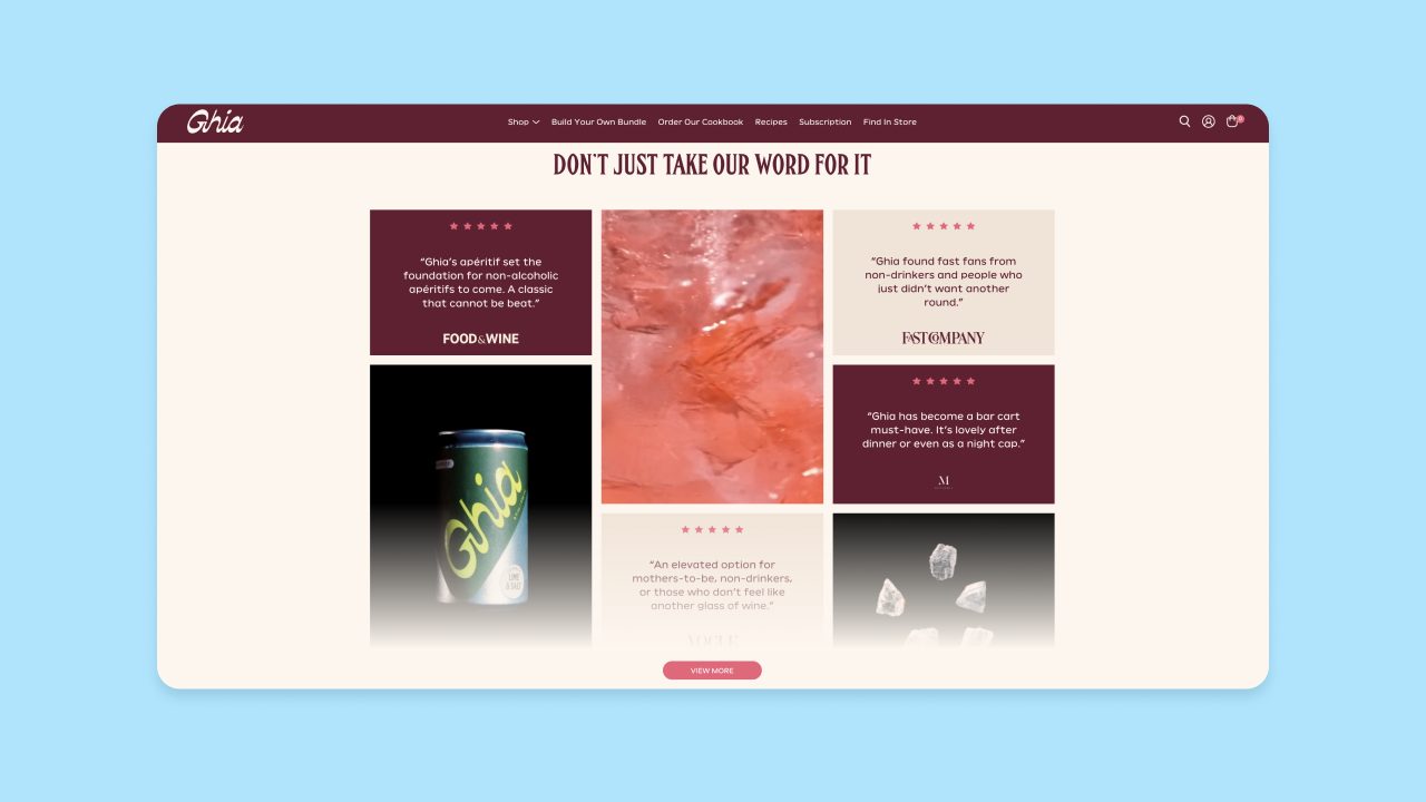
"Bento grid" is having a moment as a phrase. Search interest and design commentary have spiked since Apple started using the term in its own product marketing, and it now gets used as shorthand for any modular layout of differently sized panels. But the pattern itself isn't new: compartmentalized grids that give each piece of content its own frame within one cohesive whole have shown up in editorial and print design for decades, long before the web design world had a name for it.
That's worth knowing before you decide how much weight to put on it. What's trending is the vocabulary; the technique itself has been around for decades. A bento layout earns its keep when panel size reflects the importance of what's inside it: a bigger panel for the thing you want noticed first, smaller ones for supporting details. It stops working when every panel is the same size, since then it's not doing any real layout work.
Try it in Bubble: Use a repeating group or a set of grouped containers with different fixed widths to build asymmetric panels, and let one panel anchor the layout as the largest element on the page.
6. Anti-grid brutalism swaps polish for rawness
The word: Raw
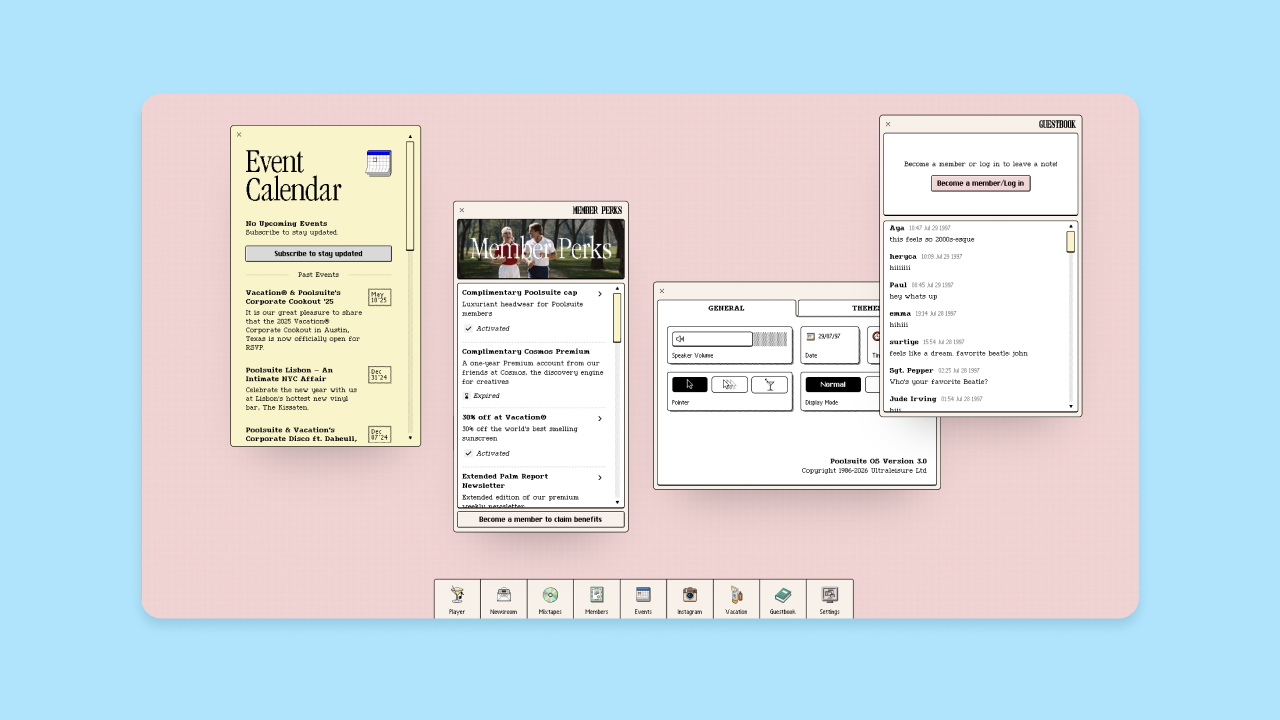
Brutalism has been part of web design for years, but in 2026 this trend has turned into something more specific: a pushback against the bento-style layouts covered above, which have taken over everywhere else. StudioMeyer's mid-year retrospective on 2026 design calls it anti-grid brutalism, and the look is unmistakable: broken layouts, raw HTML aesthetics, monospace type, zero border radius, stark single-pixel borders. Add a little CSS noise or film grain and the whole thing feels engineered rather than flat.
It comes from the same place as tactile realism, just with a different toolkit: A raw, imperfect layout stands out precisely because AI-polished design can't fake it. It's also going after the same "soft UI" look that barely-there UI is reacting to, just from the opposite direction, with edge instead of restraint.
It's not without risk. Get the contrast wrong, or let attitude win out over usability, and the whole thing falls apart. The best examples earn attention without losing usability along the way.
Try it in Bubble: Set border radius to zero across key elements and pick a high-contrast color pair. Layer in a subtle grain texture through custom CSS to avoid a flat, purely geometric look. Test your contrast and navigation clarity before you ship it.
7. Scrollytelling turns scroll position into a storytelling tool
The word: Guided
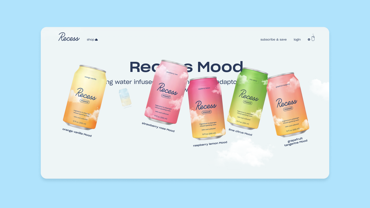
Scrollytelling triggers animations and content reveals as a visitor scrolls, turning a page into a guided narrative instead of a static stack of sections. It's a refinement of parallax scrolling rather than a brand-new idea, and it's held up well because, done right, it reacts to scroll position instead of taking control away from it. That's the whole difference between this and scroll-jacking, which is fading (more on that below): one works with the browser's normal behavior, the other fights it.
The technique works best for product launches and long-form storytelling, where each section is meant to build on the last. Apple's own product pages are the reference point most designers point to, and they hold up because they're engineered carefully. That's also the catch: done without that care, scrollytelling adds real performance cost and can break for anyone using reduced-motion settings.
Try it in Bubble: Use Bubble's animation tools to trigger reveals and transitions when an element scrolls into view, and build the sequence one section at a time rather than animating the whole page at once. Test it with reduced-motion settings on before you ship it.
8. Kinetic typography works best as a strong opening move, not a system
The word: Measured
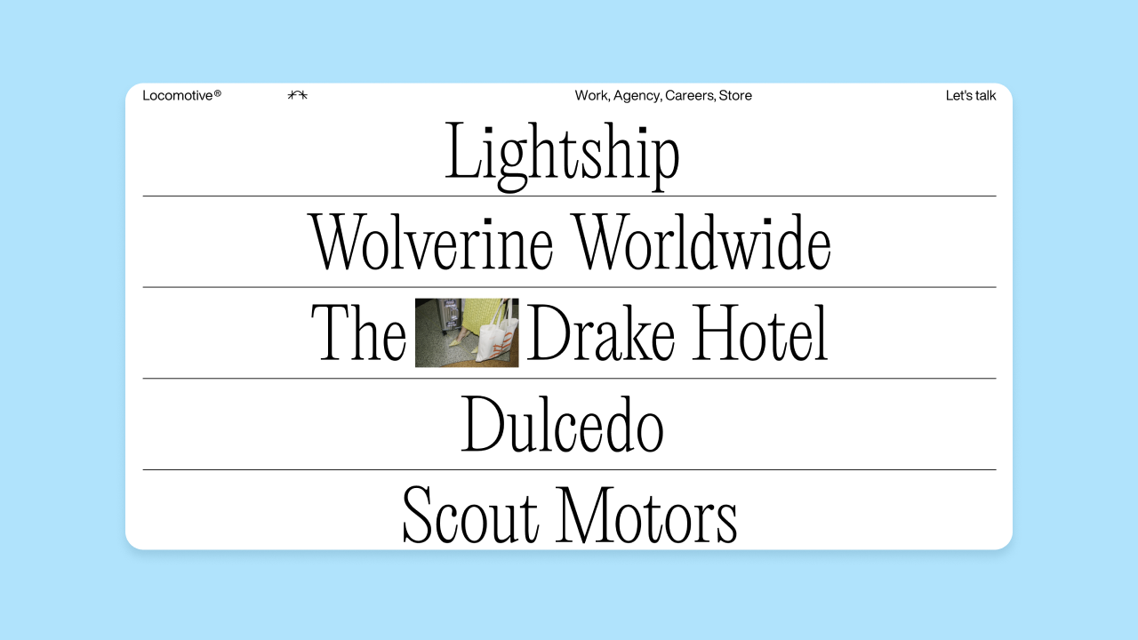
Bold typography has been building for a couple of years, and in 2026 it started moving: letters expand and compress as you scroll, headlines animate in and out. Full cross-browser support for CSS scroll-driven animations means designers who aren't engineers can build type that reacts to the user without writing custom code.
The reality is more modest than the demos suggest. A widely cited retrospective on 2026 design called kinetic typography "more polish than substance," and it tends to work best as a single hero-level moment rather than something applied page-wide. One strong animated headline makes an impression. Repeat it in every section, and it reads less like a deliberate choice and more like a habit.
It also needs to respect reduced-motion settings, and skipping that is one of the most common mistakes teams make with this trend — a genuine accessibility problem, and one that's easy to catch before launch.
Try it in Bubble: Use Bubble's animation tools to trigger a single strong text animation on your hero section, instead of animating every heading on the page. Pair it with large, variable-weight text. For anything more complex, the HTML element and custom CSS can extend what's possible, but treat this as a highlight, not a system to apply everywhere.
Web design trends on their way out in 2026
Not everything from the last few years earned its keep. Here's what's fading, and why.
Generic AI-generated imagery. A 2026 survey of working designers found widespread frustration with AI image defaults that have become instantly recognizable, most notably a specific overused yellow hue. Sites like Little Lagniappe, which builds its visual identity around AI-generated art, show how central this look has become for some brands — and why it's increasingly easy to spot. The defaults are easy to spot now, which makes them a liability for brands trying to look distinctive. It's the same fatigue driving tactile realism and anti-grid brutalism elsewhere on this list, just applied to imagery instead of interfaces. AI-generated imagery tends to work best as a starting point that gets edited heavily before it ships.
Scroll-jacking. Hijacking the scroll experience entirely — as opposed to reacting to it, the way scrollytelling does — is fading for a simple reason: it's slow. Heavy scroll-jacked animations compete with a browser's ability to respond to a tap, showing up as lag on everyday devices. For most teams, it's not worth the tradeoff.
Build the next design trend with Bubble
AI can spin up a website fast, but it still takes a person to decide whether that site should be loud or quiet, textured or bare, and whether an effect is actually worth what it costs. That judgment call is exactly what separates a talented designer from a template.
With Bubble's visual editor, you can build any of these looks without writing a line of code, quiet and barely-there or loud and heavily textured. Chat with the Bubble AI Agent (beta) to try out a direction fast, then switch to the visual editor to fine-tune it yourself. And when something's off, you can see it and fix it right there. That's the kind of control that turns a good design into a great one.
Start building with Bubble for free and join the Bubble community for design inspiration, feedback, and builder success stories.
Want to learn more about building well-designed apps on Bubble? Explore our design best practices in the Academy or browse the App Gallery for real examples built by the community.
Frequently asked questions about web design trends
How do I know which of these trends fit my project?
Match the trend to what your brand needs to communicate. Restraint, like barely-there UI, suits products built on trust and data; texture, like tactile realism or anti-grid brutalism, suits brands that want to feel handmade or distinctive. Test any trend against your actual content and users, not just a polished demo.
How long do web design trends usually last?
It varies by type. Structural patterns like bento grids can stay useful for years once designers show they solve a real layout problem, while surface-level effects tend to fade faster, especially once they show up everywhere at once.
Are these trends right for every kind of website?
Trends built around restraint or heavy texture tend to work best for marketing sites and brand experiences where personality is the point. Web apps and dashboards that prioritize speed and clarity benefit more from the lighter-touch versions, like a single kinetic typography moment or a subtle grain effect, rather than a trend applied wall to wall.
What's the difference between a web design trend and a best practice?
A trend is a stylistic choice that rises and falls with the design world's mood. A best practice, like fast load times or motion that respects reduced-motion settings, doesn't go out of style because it's about whether the site actually works for the people using it.
Build for as long as you want on the Free plan. Only upgrade when you're ready to launch.
Join Bubble