I'm Eve, Creative Lead at Bubble and head of our brand team. I'm responsible for how Bubble shows up in the world — defining, protecting, and evolving our brand identity.
Over the past few years, we've been experimenting with small but impactful incremental changes to the brand, exploring different edges of our core visual identity. Our experiments paid off and it’s now time to make it official and document the elements that make up our new identity system — an interactive experience where anyone can learn about the brand and download approved assets.
With new visual elements and a vibrant color palette, we're unveiling our latest brand evolution — one that speaks to builders everywhere, matches a massive shift in our industry, and allows Bubble to evolve into the AI visual development platform it was born to be.
A house with good bones
When I joined Bubble in 2022 as the first brand hire, it felt like purchasing a house that needed a little bit of fixing up. The foundation was solid, so the work was in breaking down walls to open up rooms and create a better flow. Discovering hardwood floors underneath an old carpet. Staying true to the history and personality of the house and updating what was no longer serving it. The house knew what it wanted to be, and it was my job to listen to it and tend to it.
And of course, the work is never truly done. As a custodian of the brand at Bubble, my job is to listen to what the product wants the brand to be, what the community needs it to be, and what the moment demands it to be. And build an identity system that will help express that.
We started by aligning on what this initial launch would include and what we would save for future iterations. This helped limit scope creep and have us laser-focused on what was attainable in a short space of time.

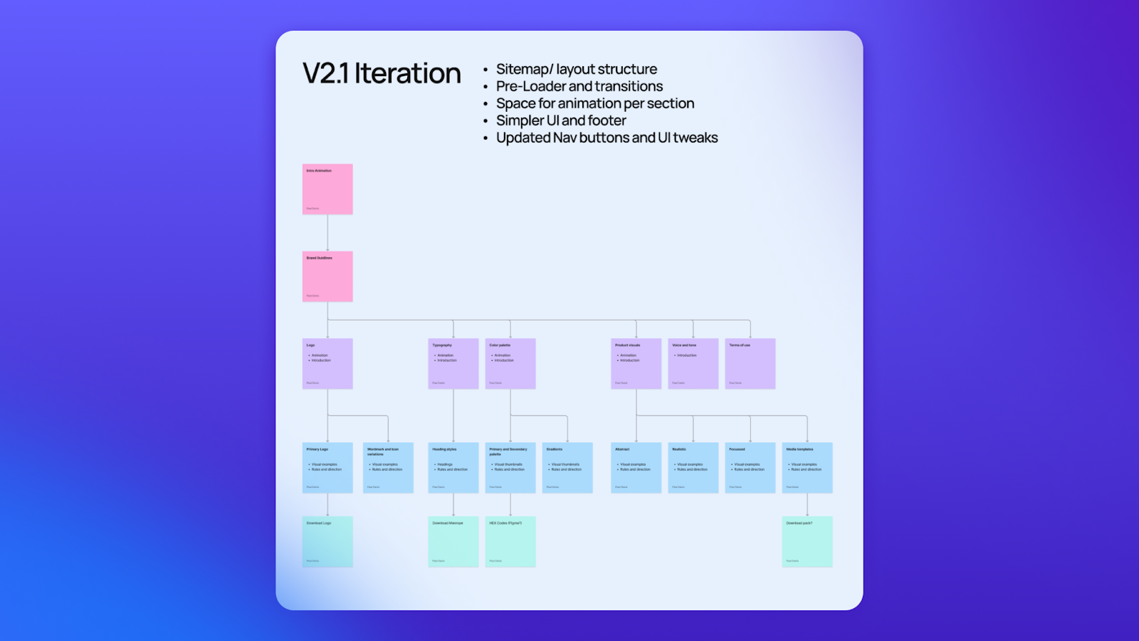
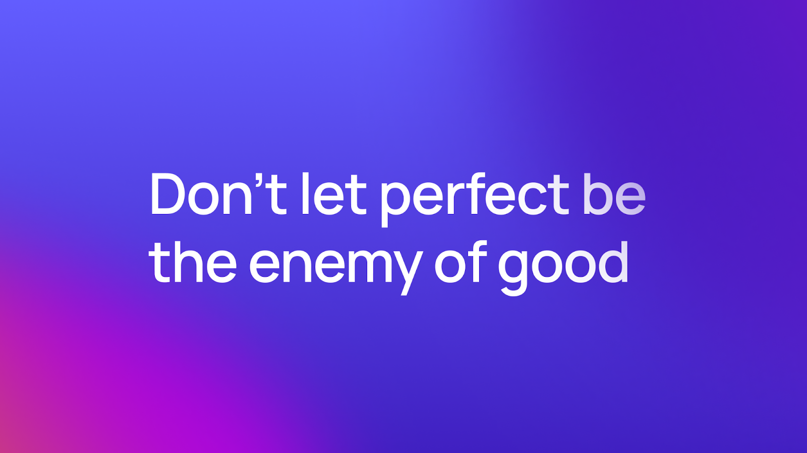
One of our mantras on the creative team is “don’t let perfect be the enemy of good.” Meaning, prioritize progress. The future sections will come in time, so why wait? We knew we could easily put together the first four sections: logo usage, color palette, typography, and product imagery. At the same time, we could create a modular UX design with the capacity to hold more sections as we make them.
Then it was time for the nitty-gritty work of auditing our existing brand system and Marie Kondo-ing what no longer brought us joy.

Our moodboard was ourselves
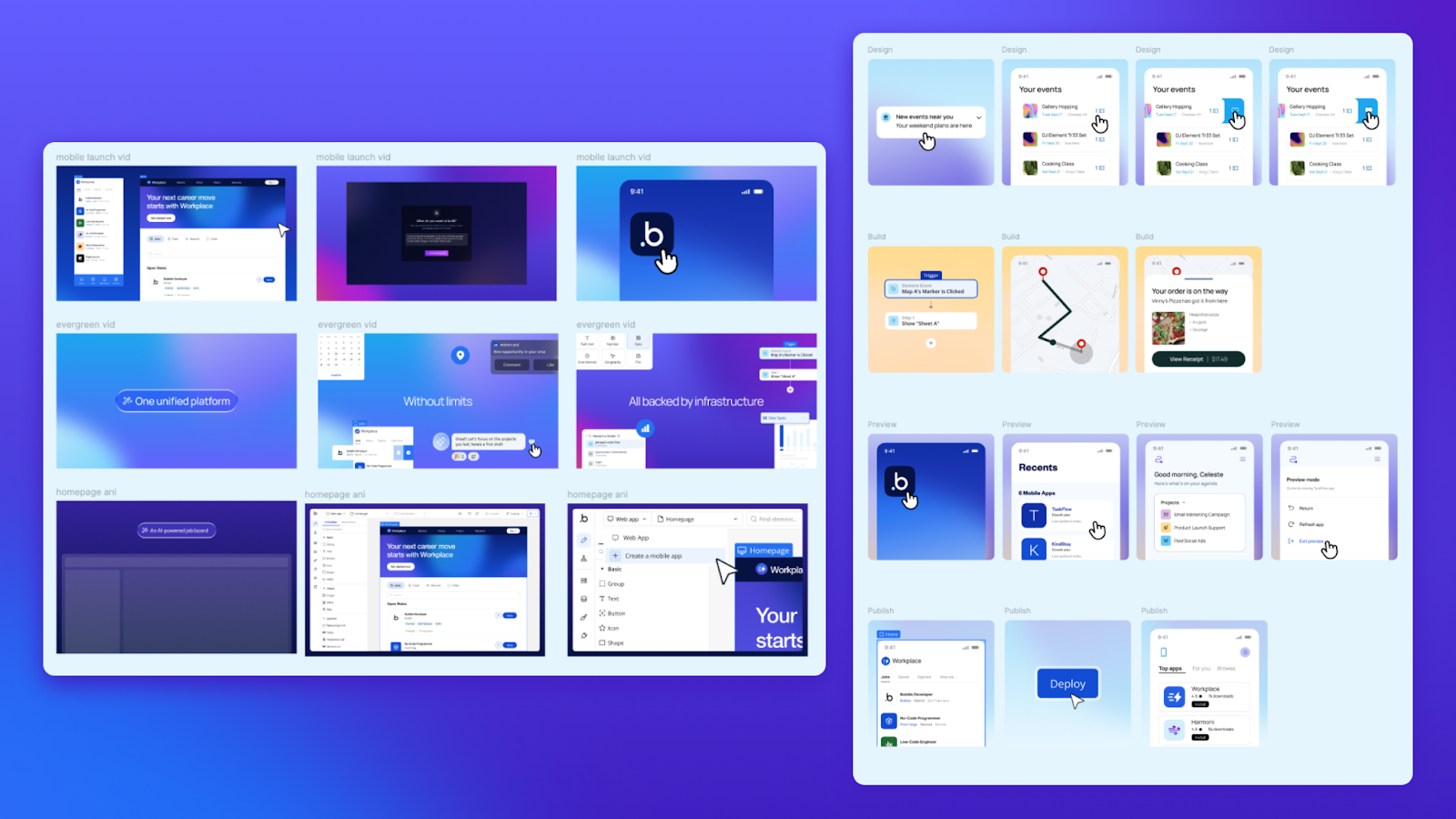
The first place we needed to look was right under our noses — we started by examining all our latest and greatest pieces from our product launch videos, web updates, and user conferences. Each of these projects helped level up our brand storytelling, and this would inform what the interactive experience should look like.
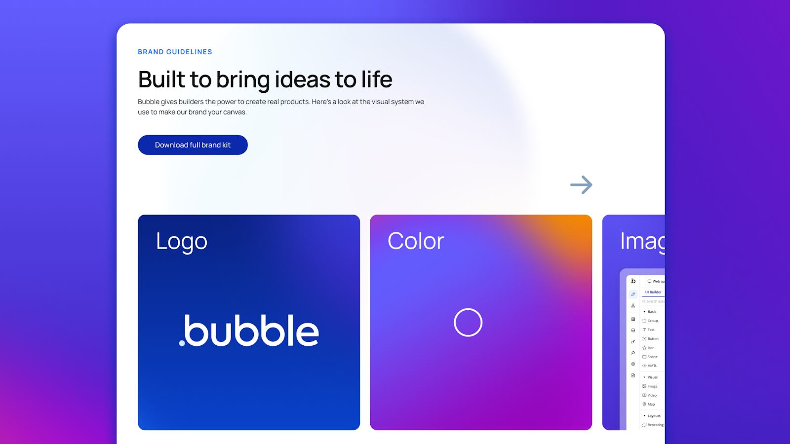
The glow up of the century: A one stop brand shop
I’m almost hesitant to include this but it’s probably worth mentioning what the page used to look like — it was our most outdated page on the entire site, completely pared back to just legalese and logos. Needless to say it was going to be fairly easy to improve this page.
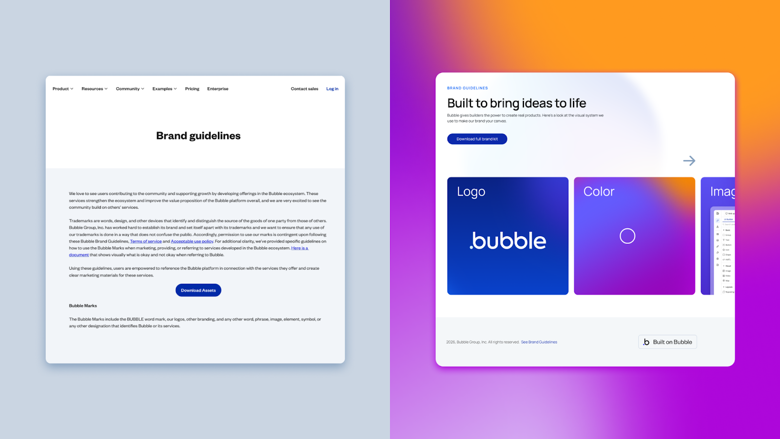
A visual language built for transformation
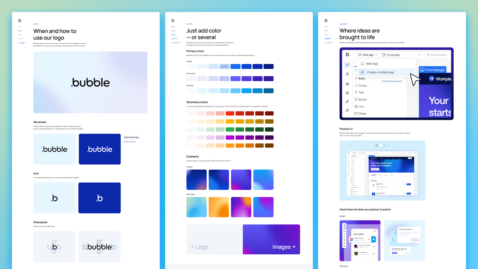
Color: Inspired by nature
We designed an expanded color palette that’s bright and vibrant, just like our product and community. We created an official gradient palette so decisions like “orb placement” and levels of layer blur are no longer guesswork. We drew inspiration from iridescence, sunrises, and sunsets — giving a sense of movement and possibilities, with a balance of warm and cool tones.
Typography: A flexible font for a flexible brand
We designed a robust type scale for our brand font Manrope so we could easily roll it out across every webpage. It’s a flexible, variable font that's free to download — embodying our ethos of building in public and making every piece of our brand accessible. No gatekeeping.
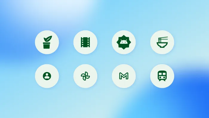
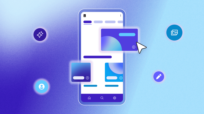
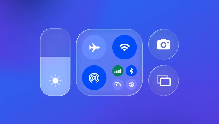
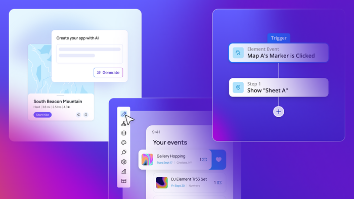
Imagery: Showing the full range
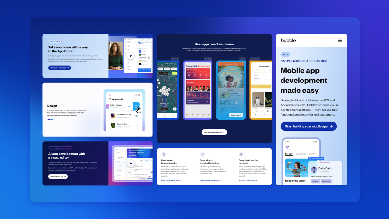
We created an illustration system for product screens ranging from abstract to detailed. Showcasing our full range of product features and functionality — the Bubble AI agent, native mobile apps, design, data, and logic.
Bubble enables everything from simple prototypes to complex, production-grade applications. Our imagery represents that spectrum.
The team
A fun fact about Bubble is that we build every page of our website on Bubble. The brand guidelines page is no exception — we wanted it to be a shining example of what’s possible on the platform. And we were able to accomplish that with an incredible duo of internal Bubble Developers, Maria and PJ, and product manager Elisabeth.
Paul, leading UX design, brought this vision to life with site architecture and interactive experiences that feel intuitive and exploratory. He ensured that each section had a unique interactive moment — from a beautiful hero animation, to copying a hex code, to seamlessly switching between a mobile and desktop product screen.
Our brand designer Dani curated every piece of imagery and animation on the site — each one a testament to how far our brand has come.
And Sara, our content strategist, helped put all of this into words that make it fun to learn about the brand.
Together, we created a beautiful home for our work.
A flexible system for what's next
We are living through a massive shift in how software gets made. Bubble is at the forefront of that and our brand system is flexible to match the moment we are in.
Our new brand guidelines represent thousands of decisions — bold and subtle — all in service of creating a foundation that can support where we’re going.
A system that is collaboratively built, and tended to with care.
Article credits:
- Creative Direction and Brand Strategy: Eve Spears
- UX Design: Paul Davis
- Imagery and Animation Curation: Dani de los Santos
- Animation: Matt Dunne
- Copy: Sara Merg
- Development: Maria Posa and PJ Yancey
- Built on: Bubble (of course)
Build for as long as you want on the Free plan. Only upgrade when you're ready to launch.
Join Bubble