Great UX design examples can be hard to find — and not because they’re rare. The best UX is invisible.
That is: Really great UX design feels intuitive and effortless, so you don’t notice it much at all. Everything just works, exactly as you’d expect it to.
Of course, getting your own app and design to that point of ease is much more difficult. However, studying others who have been able to do so can make it a lot easier to pinpoint exactly what great UX is and how it works. With the help of Bubble’s design and product teams, that’s exactly what we’ve done in this article.
What is UX?
User experience (UX) design focuses on how the user perceives and interacts with your app, website, or product. Great UX design enhances the user experience and makes the user journey intuitive, efficient, and easy.
UX designers focus on user interactions and user flows. For example, thoughtful UX design asks questions like:
- Is this app easy to use?
- Can the user solve their problems quickly and easily?
- Is it intuitive for the user to find what they need?
UX designers tend to work collaboratively with many teams in your org. UX projects and tools can cover a large umbrella of tasks, from UX research and testing, wireframing and prototyping, and final designs.
Five key qualities of good UX
There are many best principles and practices for great UX, but here are five key qualities of brilliant UX design to add to your list.
1. Focused on the user
More than anything else, good UX design examples stay focused on creating a positive user experience, no matter what the goal or function of the app is. Great UX takes into account all the user needs — who they are, what their mindset is, how they’re using the app, and what they’re trying to accomplish. It makes sure the design and the functionality are consistent with a user’s mindset and desires.
2. Feedback-informed
Feedback-informed UX involves using direct feedback from individual user surveys and research into your target audience. In addition, letting users provide feedback within the app, and reviewing user behavior in the app, can provide great insight as part of your design process. This can look like:
- Doing usability testing and user research to validate and improve your UX designs
- Personalizing what screens or options the user sees based on their in-app behavior to show them the most relevant templates or tools
- Using in-app feedback such as pop-ups or micro-surveys to improve UX elements
Asking for and gathering feedback through the design and development process, as well as after your app is live, allows you to continue to improve UX based on what your users need from your app.
3. Simple
Sometimes, the most innovative UX examples are the simplest. Simplicity can come in the solutions the app provides and the visual design. Both give your app more intuitive navigation and improve the user experience.
A simple UX provides a seamless user experience that reduces the cognitive load of learning a new interface. Keeping the design pattern simple and consistent lets users feel confident in the app more quickly and complete the tasks they’re trying to accomplish.
4. Internally consistent and logical
Good UX design is about form and function. Both should be internally consistent and logical. For example:
- If clickable buttons on one screen are blue, they should be blue on all screens.
- If you have the “confirm” button on the right on the first page, it should always be on the right going forward.
- Your menu items should be consistent from screen to screen.
With a clear visual hierarchy and visual cues throughout your app, you can help create a more seamless user experience. The user isn’t having to re-navigate each screen from scratch — they can take what they’ve picked up from other parts of the app and apply it to new tools and features.
5. Accessible UX design
Many elements of accessible UX focus on making the app easier to navigate for users using assistive technology, but most principles are good for everyone. For example:
- Making sure the color contrast is high enough to easily read text and see images
- Making touch targets large enough to easily tap and navigate
- Not relying on interactions specific to mobile devices to complete major tasks
- Using consistent components and navigation elements
Accessible UX principles create more thoughtful UX design that makes your app easier to use and navigate.
10 great UX design examples
Good UX design examples can come from anywhere — major brands and new startups just getting off the ground alike. We asked our product and design team to send us their favorite examples of great UX in the wild, and here’s what they said.
Keep in mind that many of these examples illustrate many great UX design principles. To make it easier to follow, we’ve highlighted just one UX feature per example.
- User-centered experiences: GoodCourse
- Clear user flows: Stripe
- Focus on user needs: Headspace
- Personalized onboarding: Cuure
- Clean signup flow: Jason's Careers
- Simplicity: Cash App
- Clear user prompts: Notion
- User-centered solutions: Rustle
- Internally consistent design: BlaBlaCar
- Feedback-informed design: BluBinder
GoodCourse: User-centered experience
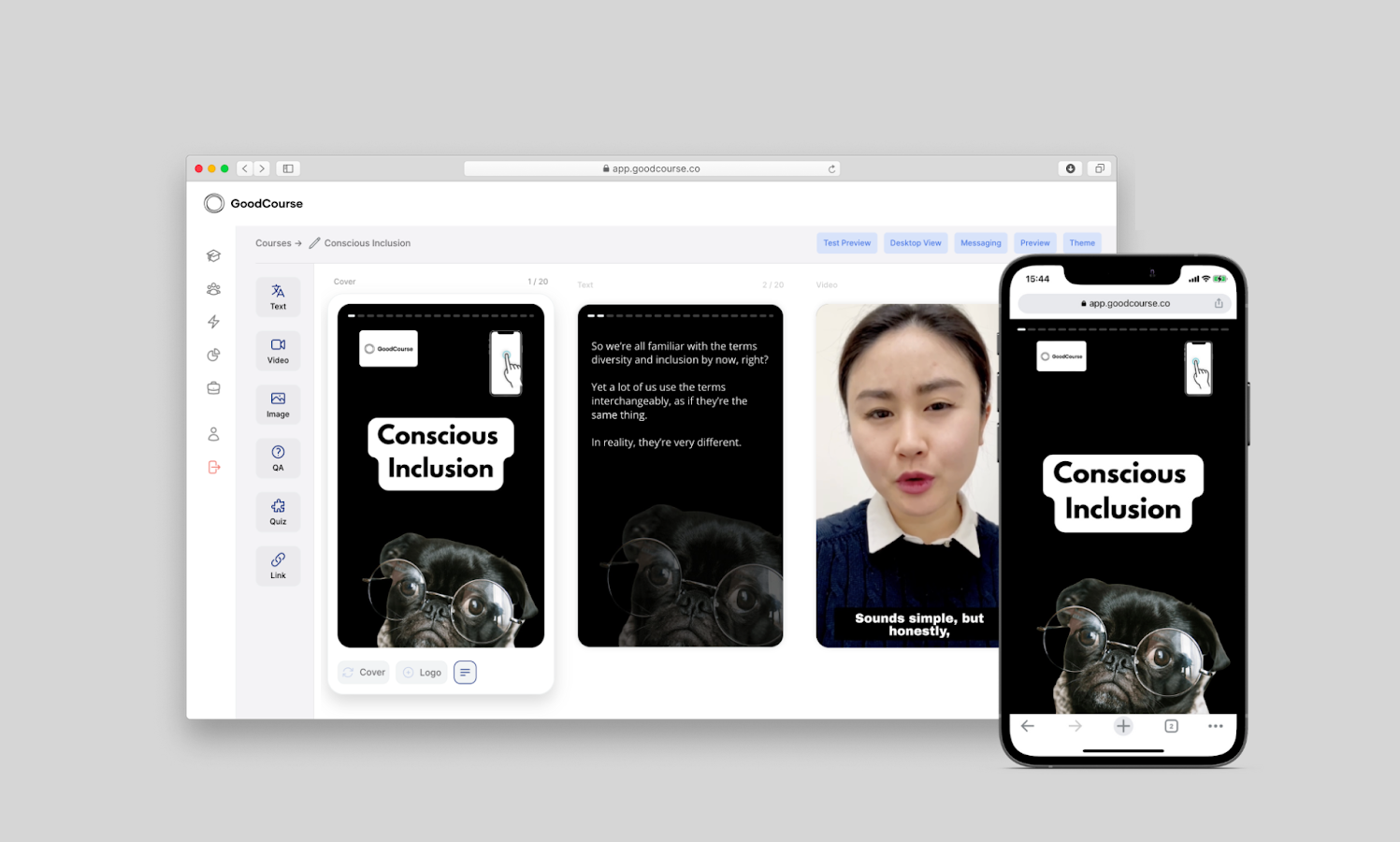
GoodCourse is an app where experts can create training with research-backed content, displayed for the learner in a TikTok-esque feed that keeps learners engaged and creates meaningful change.
This UX example centers the entire in-app experience around the user's needs, creating ways for experts to deliver content and training in a format that will motivate users to continue the training.
Why this works:
Centering the user makes this app a super-clean experience for both experts and learners using the app. That’s not easy to pull off, but GoodCourse does it well by keeping user needs in mind at every turn.
Major UX and UI decisions like creating a course or engaging with a training focus on user needs. But smaller decisions make a difference, too.
Leslie Winston, Senior Product Designer at Bubble points out that “the landing page is super clean and they have a nice color palette, too.” These smaller UX decisions make the app feel intuitive and cohesive for users at every step.
Bubble templates can help make these smaller UX decisions easier by giving you a solid foundation to build from and customize as needed. That way, you can spend more time focusing on the user’s needs and experience, and less time finding the best way to organize page elements.
Stripe: Clear user flows
Stripe is a payment processing app that involves a lot of complicated workflows. This could easily create a UX nightmare where new users have no idea how to navigate the app or get started.
However, their web app UX is designed to make these workflows intuitive for the user, and organizes payments and financial data clearly and simply. For example, instead of having a blank page for users who haven’t created any payments yet, they highlight common first workflows, guiding users to get started with some of the key features.
Why this works:
Stripe is following two golden UX design principles: progressive disclosure and no empty spaces. They don’t give the user all of their information available at once, nor do they leave unused spaces completely blank. Either of these options can be overwhelming for the user, leaving them unsure of how to get started.
Instead, they focus on a few key user flows that can be done easily — giving the user only the information they need at that time.
Headspace: Focuses on user needs
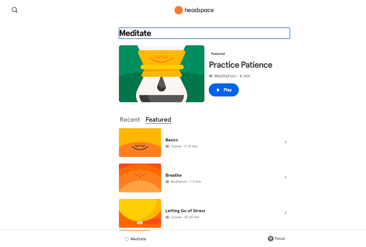
Headspace is a great example of an app that incorporates user needs and motivations into every stage of the user journey.
As a meditation app, Headspace knows that their users are stressed and overwhelmed. In response, they provide a calm, focused user experience and design that helps users find their next step at every stage.
Why this works:
The UX design supports user goals and needs (to slow down and meditate) with a very simple design that stays visually consistent with their brand. Even their meditation screens are simple and clean while remaining visually consistent with their brand.
The result is a user experience that feels consistent, calming, and intuitive — UX design that truly supports the experience they want users to have.
Cuure: Personalized onboarding process
Cuure is a supplements and wellness company, with dozens of supplements and vitamins available for purchase.
Their personalized onboarding quiz makes it easy for users to get started with the right supplements for them, without feeling overwhelmed by all the options.
Why this works:
The onboarding survey personalizes to the user based on user feedback and responses within the survey. It works through a variety of potential lifestyle, dietary, and wellness needs to arrive at a personalized recommendation.
At the end of the survey — which only takes about five minutes — the user has their recommendations. The recs are presented simply and clearly, showing exactly why they were chosen based on the survey responses.
Since Cuure is so personalized, they knew they wouldn’t be able to use a pre-built shopping engine to power their site. Instead, the Cuure team turned to Bubble’s visual, no-code development software to create their personalization algorithm using workflows.
Their onboarding flow manages to stay focused on the user and is extremely simple, while also providing an easy “in” to the product. By incorporating user feedback into the survey questions and directions, Cuure provides a personalized experience that meets user needs.
Jason’s Careers: Clean signup process
Jason’s Careers offers another slick, streamlined onboarding experience that stands out from other career-related platforms. This helps establish its brand right away while also creating an experience that will engage users.
Instead of making users fill in dozens of boxes with work experience, skills, dates, and details, they simply ask for a resume up front. Then they ask a few specific, broader questions to match job-seekers with the right firms.
Why this works:
By building a clean onboarding flow that focuses on the individual’s needs and job-seeking goals, they set themselves apart immediately as a bespoke option for job seekers. The clean onboarding solves a real problem (matching accountants with firms) while avoiding asking too much of the user.
Cash App: Simple solutions
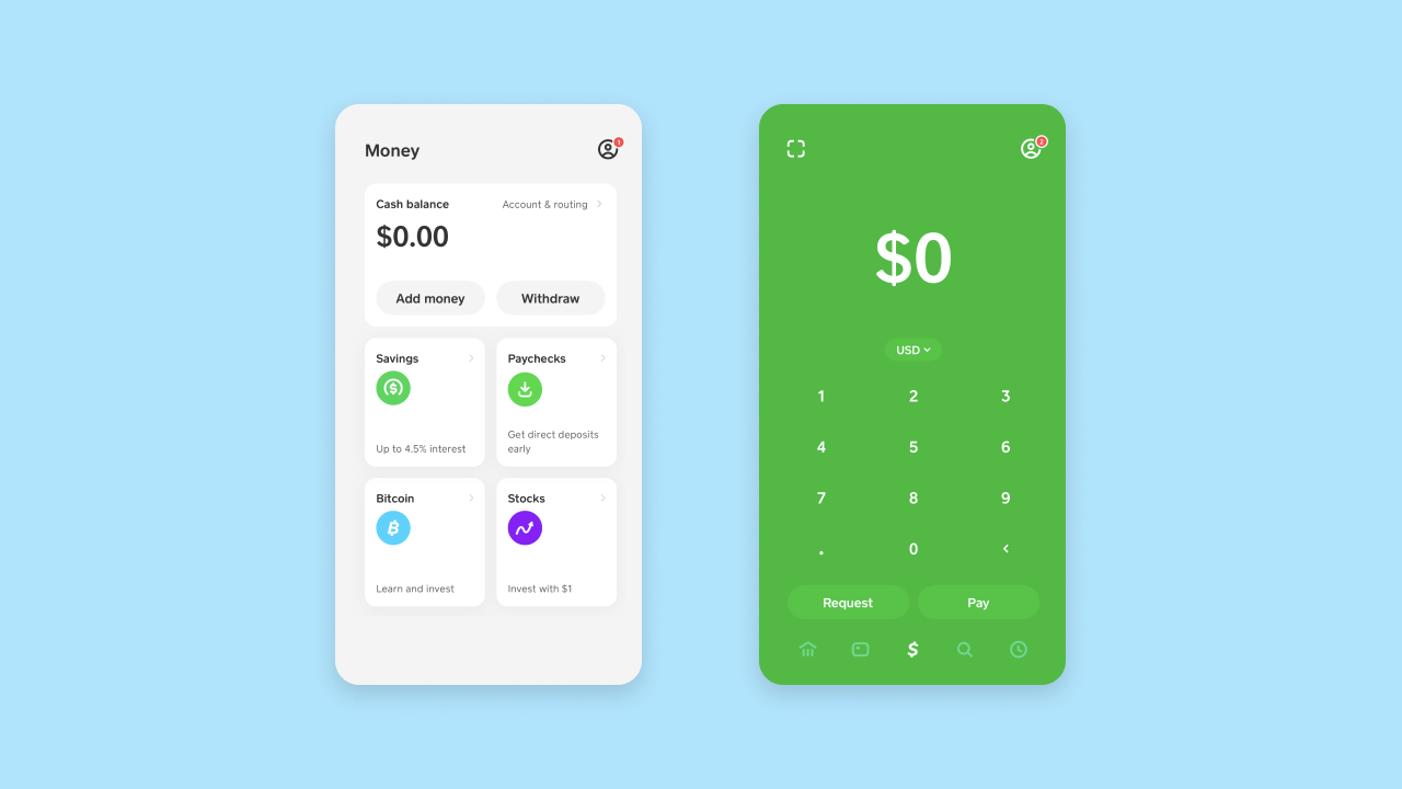
Cash App prioritizes simplicity in its UX, which makes the user experience seamless. Open the app, enter an amount, and then request it or pay it to another user. There aren’t many bells and whistles — just a clean, straightforward design that anyone could use easily.
Why this works:
Missy Kelley, our head of product design, noted Cash App as a great example of solution-focused simplicity.
“It was the BEST example of an MVP with a crystal clear purpose. The interface is straightforward. They don’t try to do too much. It’s just so simple.”
And as a result: It serves its purpose perfectly.
Notion: Clear user prompts
Notion is another example of a tool with many complicated workflows and endless directions a user could take. With Notion, you start with more or less a blank slate, and no two user journeys will look alike.
So, how does Notion guide the user in the right direction?
By prioritizing user prompts, templates, and a clear design system to enable users to learn the key features. For example, a new user homepage provides a prompt to connect your Google Calendar to see upcoming events, create a homebase dashboard (complete with prompts on what that could look like) and common templates and how-to articles to help users get started.
Why this works:
Nishita Aswani, senior product designer at Bubble, breaks this UX example down:
“Notion has a good balance of features that range from beginner to advanced, and they do a good job of giving users tools as they engage with it and not a moment before! I also love their modular “blocks” concept that spreads throughout. I feel like they prioritize working in systems. Users don’t even have to think about it, but it makes it more efficient with little to no effort.”
A clean, simple design paired with user prompts and templates customized to a user’s interactions makes a complicated tool accessible to beginners and experts alike.
Rustle: User-centered solutions
Rustle is a cook-along recipe app that blends food cooking videos with straightforward UX design to help users navigate the recipe, plan their cooking, and create shopping lists. The UX is simple, but every element included is done so with the user in mind.
For example, on this recipe cook-along, users can see all the tools and utensils needed and create a shopping list of all ingredients (automatically extracted from the video). When they’re ready to cook, they can choose whether they want to play the whole video or “cook along.” The cook-along option highlights all the steps in the sidebar and pauses the video at each step to let you keep up with the video.
Why this works:
By keeping the UX completely focused on user needs, it stays clean and simple to use while providing exactly what the user wants — no more, no less. The app stays focused on its main value while also giving the user just the right tools at the right time.
This creates a seamless user journey and makes the UX effortless to navigate.
BlaBlaCar: Internally consistent design
BlaBlaCar’s simple and clean design keeps their app consistent and logical, even with a lot of moving pieces.
With BlaBlaCar, users can book a ride with other users heading in the same direction. There’s a lot of underlying logic and data — where you’re going, who you’re going with, what time you want to travel, what rides are available. But Bla Bla Car manages to keep every screen in the booking process clean.
Why this works:
A consistent, logical, and minimal design means no more information gets on each screen than is necessary. Bla Bla Car embodies the old design adage:
A design isn’t done when there’s nothing left to add, but when there’s nothing left to take away.
By keeping each screen clean, the user is never overwhelmed by the amount of information and data being processed. In addition, each screen and design is logical and consistent with other designs in the app.
For example, all buttons are blue, even if they’re not “buttons.” To change the direction, click the blue arrows. To change the time of the trip, click the blue time listing.
Bubble makes consistent UX design easy by supporting scalable design systems and offering component libraries you can build from. With pre-set components to use and re-use throughout your app, you can build beautiful, consistent interfaces faster and keep your user experience consistent from screen to screen.
BluBinder: Feedback-informed templates
Blubinder helps employers and individuals navigate major life events and transitions with legal and financial expertise, documents, and organization.
In general, the user experience of navigating complex legal and financial paper isn’t an easy one. But Blubinder manages to make it simple and intuitive.
Pre-set templates and documents for major events give users the right information to get started. Want to buy a house or navigate a divorce? Blubinder gets you started — in the process and on their platform — by showing you exactly what documents, contacts, and records you need.
Why this works:
BluBinder Founder Liesl Leach worked with an early team to research, design, and test product-market fit, adjusting templates and UX designs based on user feedback. By gathering feedback before and during the build process, Blubinder created a UX that helps users complete their goals without overwhelming them.
Liesl also partnered with Bubble-Certified Developer Erik Silk to both build the BluBinder app. Using custom code snippets, they’ve been able to build custom plugins and functionality for the app to help users move through the user flows even more simply.
For example, they built a Bubble plugin for BluBinder that enables a phone or tablet’s camera to take multiple pictures of something — often needed for ID or document verification — and stitch it together into one file.
By keeping user feedback at the forefront and pairing it with Bubble’s customizable and speedy development platform, they’ve been able to build an intuitive, feedback-informed user experience.
Set a great foundation for UX on Bubble
One of our UX design principles here at Bubble is: Don’t start from scratch.
We’ve built that into our process and our product. As Bubble Senior Product Designer Christine Shiba explains, “Don’t start from zero is one of our design principles here at Bubble. Use component libraries within your no-code tool — Bubble has a component library you can use.”
By working from pre-built components and then customizing, you can achieve the look and feel you want, while also prioritizing a clean, consistent user experience.
Bubble’s no-code development platform offers ready-made templates and component libraries to work from. Even more: Our visual, drag-and-drop editor makes development faster and easier than ever, which means you can incorporate user feedback more quickly and stay focused on the user.
Build for as long as you want on the Free plan. Only upgrade when you're ready to launch.
Join Bubble