When we first launched Bubble, we wrote about a fundamental principle: Computers should speak humans’ language, not the other way around. That vision has guided every decision we've made since, from how we think about visual development to how we approach AI-powered app generation today.
But we've also learned that truly accessible technology needs to be easy to learn, intuitive from the start, and built to support how you actually work. That's why we rebuilt the property editor from the ground up.
Starting today, we're rolling out the redesigned property editor (beta)in phases, starting with 25% of users. Our goal is to make Bubble more approachable for new builders while streamlining workflows for experienced ones.
A powerful editor that had grown complex
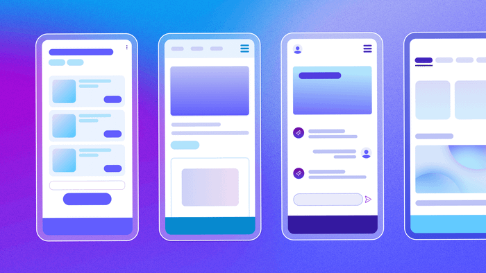
The property editor is where you control every aspect of your app, from visual design to workflows to data. But as we added capabilities over the years, the interface became denser and harder to navigate, especially for new users.
Builders would quickly generate apps with AI, then slow down trying to customize them. Properties were scattered across tabs that didn't match how people actually build, and important features were buried behind unlabeled icons.
Even straightforward actions felt more complicated or time-consuming to learn than they needed to be, so we decided to rebuild it.
What our redesign changed
Over the past several months, we've redesigned the property editor based on ongoing user research and feedback and testing from our power user community. All of these changes are built on a rearchitected codebase that sets the foundation for faster updates and future AI-powered features.
The changes span everything from updating the property editor’s codebase to better tab organization and property naming, and more welcoming visual design.
Clearer organization that matches how you build
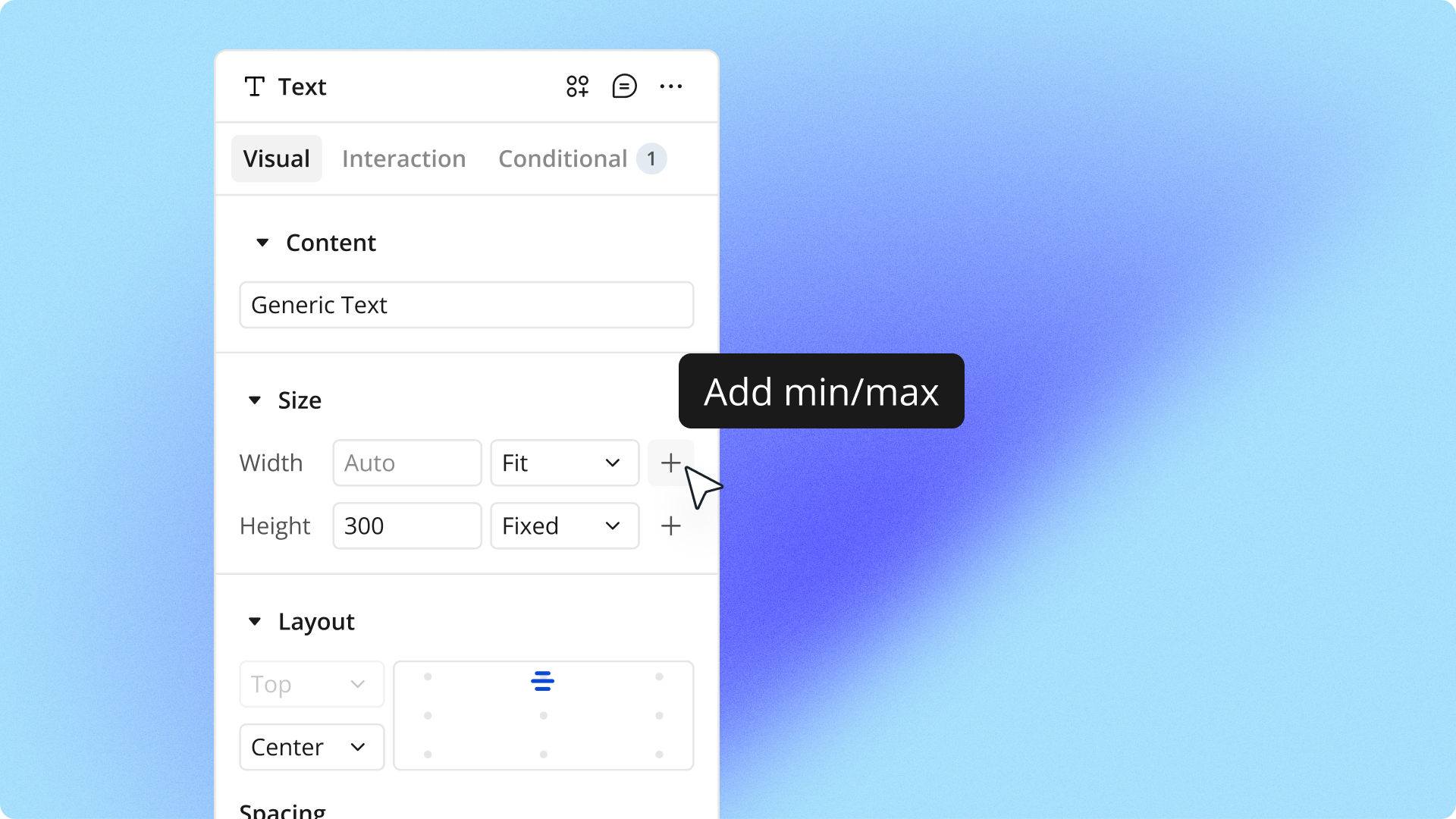
The old property editor scattered related properties across different tabs in ways that didn't match how builders actually work. You'd adjust an element's size on one tab, then switch to another tab to set its layout, then switch back to make visual tweaks. All that tab-switching added up to wasted time.
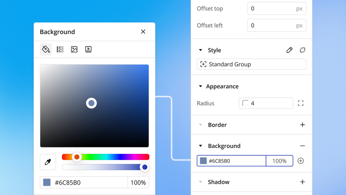
We reorganized the entire structure based on user research showing how builders actually approach their work. Properties you typically use together now live on the same tab. To better reflect what’s actually inside them, we renamed tabs from Appearance and Layout to Visual and Interaction.
When you drop an element onto your page, the first thing you typically do is adjust its size and position. Both properties are now together on the first tab. We also added clearly labeled sections within each tab and made them collapsible, so you can focus on what matters for your current task.
Language and design that feel more intuitive
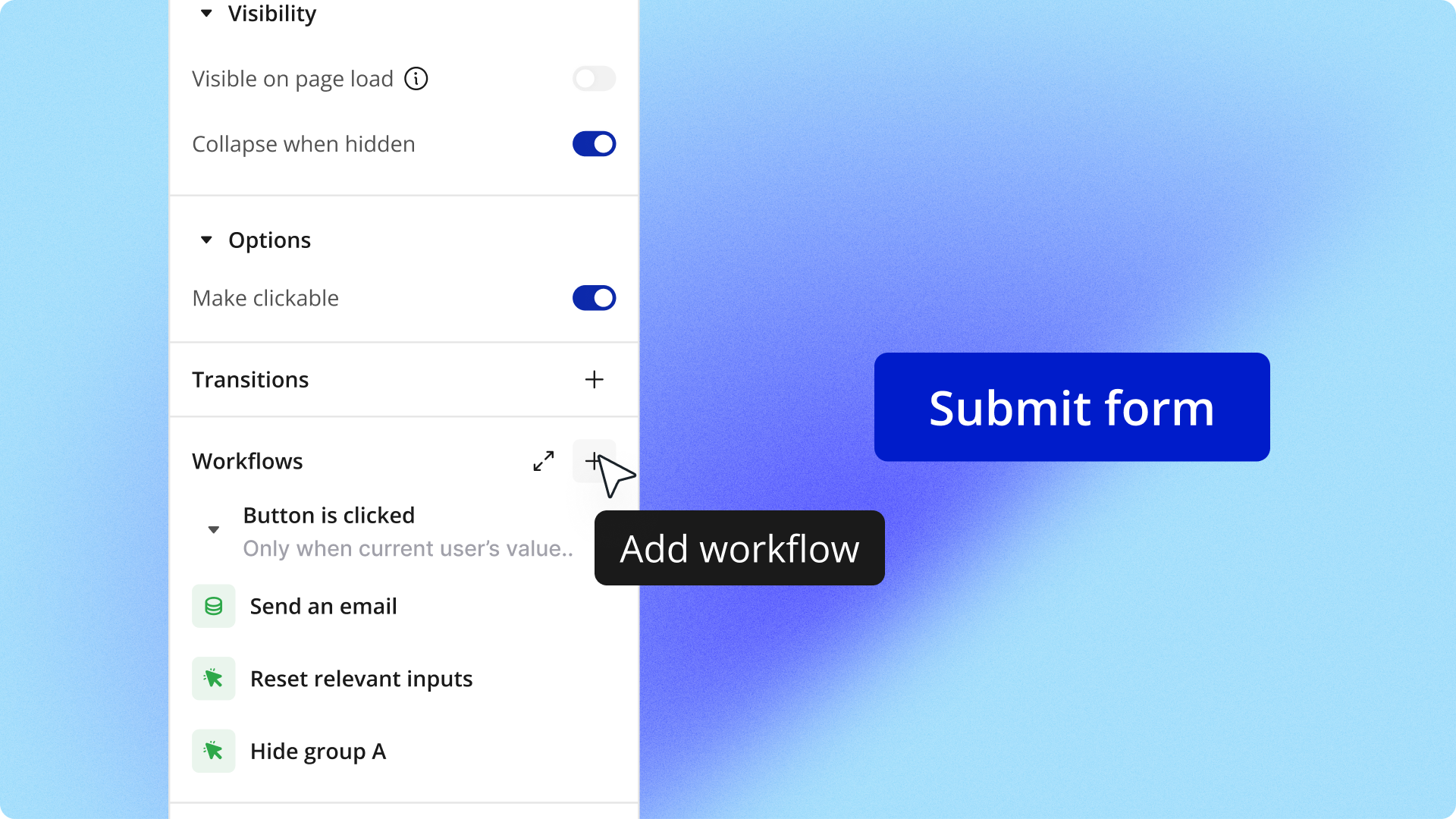
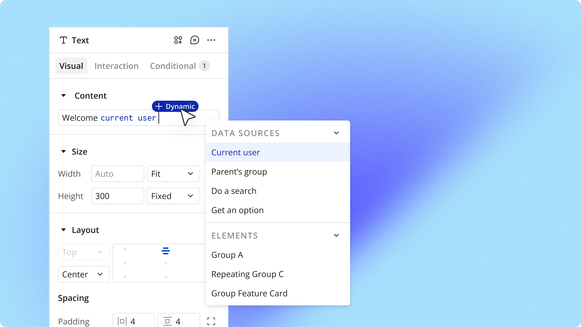
We designed the interface to speak more natural language instead of technical terms. When you're just getting started, you see essential properties. As you build more, you can expand sections for deeper options. This keeps things approachable if you’re just starting out with Bubble while maintaining full power for experienced builders.
Throughout the editor, we've replaced confusing phrasing with straightforward, action-first language. For example, instead of This element isn't clickable, you'll see Make element clickable. We’re also surfacing important information with workflows attached to elements appearing in the property editor, and custom states prominently displayed in the header.
The visual design now follows patterns from modern design tools, with familiar icons and clear hierarchy.
Foundation for working with AI
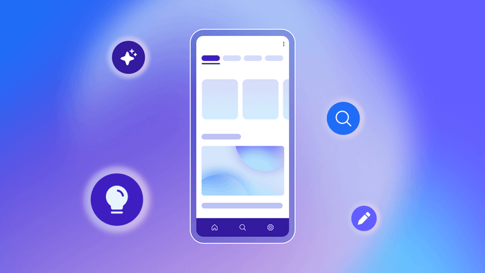
These changes work hand-in-hand with Bubble's AI capabilities. You can generate apps with AI, then use the redesigned interface to understand exactly what was created and refine it to match your vision.
And because the interface now uses clearer language and better organization, it's much easier to understand what the AI generated and how to modify it to match your vision exactly.
Start building with the redesigned property editor
For new builders, the redesigned property editor makes it easier to get started on Bubble. Everything you need is where it makes sense, helping you build more intuitively from day one. The goal is to reduce the learning curve so you can focus on launching your product instead of getting stuck trying to understand a confusing interface. We’re rolling this beta out in phases, starting with 25% of users, so you may not see it in your editor right away.
To learn more about how it works, check out the full migration guide to see what's changed and where everything has moved.
Build for as long as you want on the Free plan. Only upgrade when you're ready to launch.
Join Bubble