• Start by defining your website's purpose and understanding what your users need to accomplish
• Create a design system early: Document your colors, fonts, components, and styles for consistency
• Use AI to generate initial layouts and pages, then refine visually without code
• Follow modern trends like old colors, purposeful animation, AI personalization, and playful minimalism
• Keep it fast: Compress images, optimize code, and test page speed regularly
• Prioritize accessibility from day one with sufficient contrast, clear labels, and keyboard navigation
• Test with real users and iterate based on their feedback and behavior data
• Avoid common mistakes: Forgetting error states, designing in a silo, and sacrificing accessibility for aesthetics
Ever looked at an old website screenshot in a tool like Wayback Machine and been surprised at how different it looked? Old photos of sites like Yahoo, Amazon, or Apple make it clear just how much web design has changed over the past 20 years — or even the past five years.
User needs, online conventions, and what’s possible with web design continue to change and therefore shape what’s expected when you design a website.
But you don’t need to be building the next Amazon or Apple to need a website. And good website design can help set your brand apart and create an engaging experience for your website visitors.
This guide focuses on how to design a website that’s modern and user-friendly, covering every step from planning to launch, plus real-world examples and best practices you can put to work right away.
Jump to what you need:
- What is web design?
- How to design a website, step-by-step
- Website design mistakes to avoid
- Four examples of great website design
What is web design?
Web design is a subcategory of building a website, involving the design and structure of the visual side of your website.
The web design process impacts how your site looks, feels, and works for your audience. Besides choosing colors and fonts, you’re also shaping how people experience your brand online.
Web design may encompass the building of that design, such as with a no-code builder, or it may involve the design only (i.e., in Figma). Either way, the goal of web design is to create cohesive, engaging, and beautiful visual elements and structure for your website.
Web design trends to consider
Your website's design signals whether you're keeping up or falling behind. Here are the trends to consider as you’re designing your website:
Bold colors and authentic layouts: Vibrant palettes and smooth gradients help brands stand out. This works especially well for creative portfolios and brands that want to feel genuine rather than corporate.
Animation that guides, not distracts: Scroll-triggered animations and parallax effects add depth when done right. Interactive 3D models let users explore products by rotating and zooming. The key is purpose: Every animation should guide attention or provide feedback, not just look cool.
AI-powered personalization: Websites can now adapt to individual visitors, showing different content based on behavior, recommending relevant products, and adjusting layouts for different user types.
Playful minimalism: Minimalist design is still in style, but it’s evolved. Instead of sterile layouts, modern sites use bright accents, unique icons, and soft textures to add character. The result is a clean design that feels lively and human while keeping focus on usability and clarity.
How to design a website
Designing a website can be overwhelming — but a step-by-step process makes it much easier. Here’s ours, with advice from our product designers and in-house experts:
Step 1: Define your website’s purpose
One of our product designers, Paul Davis, says that when someone wants to design a website, the first question he asks is, “Are you sure this can’t just be an Instagram page?”
It sounds basic, but it gets at an essential question:
Why does your website need to exist?
By defining the answer to that question clearly from the beginning, you’ll give yourself a strong foundation for future work and make a lot of decisions easier in the process.
After all, different types of websites have different functions — and therefore, different design needs. Ask yourself:
- What is the point of this website?
- What information are we trying to convey?
- What are users going to want to do or find on this website?
- How will this website be helpful to the user?
For example, a website for an upcoming conference will need to give details about location, dates, the agenda, and so on. Most site visitors will be trying to find out more information about the conference and may want to buy tickets.
On the other hand, a website for a local restaurant has different goals. Its visitors are likely looking for hours and a menu. Perhaps they want to make a reservation or order online.
These different purposes and needs will shape your design, so get them out clearly on paper before you start designing and building.
Step 2: Gather what you need to design a website
With your purpose in mind, you now need to gather your tools. The most basic things you’ll need to design a website include:
- A domain name: This is the URL of your website and gives visitors a place to find you online, such as www.bubble.io or www.facebook.com. Domain names can be purchased on their own, or you might get them with a website hosting or building service.
- Website hosting platform: This is the service that will store your website online and make it accessible to visitors. You can manage web hosting yourself by purchasing hosting directly from a provider, or you might get hosting “built-in” with a website builder.
- Website builder: One option is to hard-code your website from scratch, but that’s rarely the most efficient option. An AI visual development platform is the fastest and simplest way to design and launch your site.
Bubble puts you in complete control of your website from start to finish. Our AI visual development platform lets you bring your vision to life in a visual editor, without technical barriers holding you back. You can start from scratch, or use Bubble’s AI page generator to generate your initial pages, then refine everything to match your exact vision.
With Bubble, you can build and design anything you can imagine for your website — and get web hosting built-in once you’re ready to launch. Adding a custom domain name is easy too, so you can be up and running in no time.
✅ A domain name and hosting provider
✅ A plan for how you’ll design and build your website (i.e., traditional code, website builder, etc.)
Step 3: Sketch out your website layout and content with a wireframe
With your foundation in place, it’s time to start sketching out what your website will look like and what content will be on your web pages.
This includes thinking through the information architecture of your website. Which web pages do you need? This depends on the purpose of your site and your users’ needs (see step #1). For example, the essential elements of a SaaS website will be different from a local restaurant or a business website.
It also helps to think about user journeys. Your visitor lands on your homepage. What are they trying to do? Where do they need to go? A user journey is just the path someone takes through your site to complete a goal (buying something, signing up, finding contact info). Map these journeys out first, and you'll design a layout that’s most intuitive.
Once you've organized your content based on those user journeys, create a logical structure. In short, you want to design the pages and information on your site in a way that's easy for users to navigate.
Test your structure with card sorting before you commit to building. Hand your content to a few people and watch how they organize it. Their instincts reveal where your navigation clicks and where it confuses. This simple exercise helps you build a structure that works for search engines and visitors alike, keeping people on your site longer and guiding them toward taking action.
“Start with simple boxes and arrows. Focusing on UX first avoids the UI constraints that can rush decisions. Design systems can lead to high-fidelity wireframes too early, giving a false sense of finality and limiting exploration. [Instead], explore and iterate. Try flipping your design on its head to uncover new ideas and validate assumptions.” — Missy Kelley, Head of Product Design
✅ A list of all the pages you need for the foundation of your website
✅ A basic idea of how those pages will be organized (navigation, menu bars)
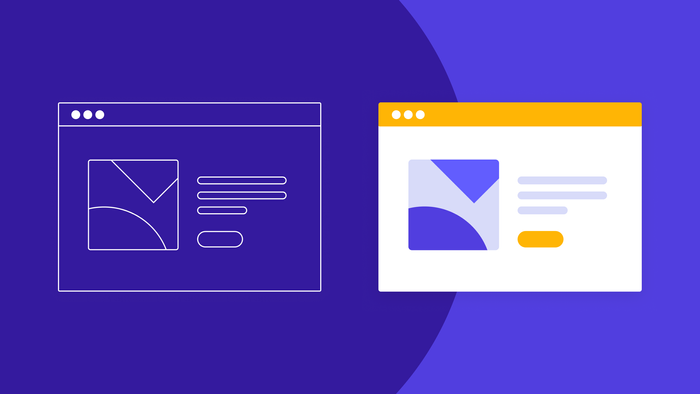
✅ Wireframes of your key pages with low-fidelity designs
Step 4: Create a design system
Now you’re ready to start creating more high-fidelity designs, based on your wireframes and the building blocks you have in place.
For example:
- You know what kind of menu bars you’ll have and where they’ll be on the page — now you need to decide what color they’ll be, how exactly they’ll look, what size they are, what font you’ll use, and so on.
- You know where the images will go on the page, but now you need to select those images.
- You know where the header will be, but you need to finalize the copy and choose the appropriate typeface, color, and font.
However, making all of these decisions one-by-one will take a long time. Creating a design system gives you a documented catalog of key website elements, styles, and patterns for your design that you can use to save time and keep your design choices consistent across your website.
Christine Shiba, Product Design Lead at Bubble, said:
“Starting with a system or having some sort of system-level idea of your brand and tone helps a lot. So if you’ve set up your style variables, font tokens, buttons styles, all of that on Bubble, that will help you with everything else moving forward.”
Your design system should include things like:
- Standard components and variations (i.e., what buttons and popups look like, and what they look like when they’re clicked)
- Page structures and layouts
- Illustration and images styles
- Styles, fonts, and a color scheme for your web pages
- Design principles
While big-picture design elements like components and page layouts are obviously important, don’t neglect “smaller” pieces too. For example, as Missy told us, something like “typography [is] a key design element — it’s essential for defining content hierarchy.”
So define your design system before you start building everything — this will make many, many decisions simple and keep your website consistent.
✅ A simple, user-friendly design system that brings consistency to your site design
✅ A shared definition of the fonts, colors, icons, and other visual elements that define your brand
Step 5: Start building — but don’t start from scratch
To start developing your website, you can create high-fidelity design layouts in a tool like Figma first that can be then handed off to their development team to code for their website.
AI visual development platforms like Bubble make this stage much easier by eliminating the need for multiple tools. Instead, you can design using AI prompting and visual editing, and then add functionality and features without coding, all in the same editor.
Whatever tools you use, don’t think you have to start from scratch at this stage either.
“Look at a few examples of websites you really like and riff off of them,” Christine said. Missy seconded her sentiment: “Copy what you love. Drawing from appealing designs can help you define your own style.”
When in doubt: Keep it simple.
“Simplicity and speed are key! Fancy animations and graphics can never be a substitute for a simple, fast website that gives users exactly what they need.” — Rhys Thomas, Senior Product Designer
On Bubble, simplicity is baked into our editor and programming language. For example:
- You can use styles to reduce editing time. This also comes in handy when updating fonts and primary colors on your site.
- Reusable elements prevent you from having to design the same components across multiple pages.
- Start with a pre-built template, to reduce the amount of building you have to do before customizing.
- Build from our component libraries to use and customize common components (like visual elements, UI components, and form inputs) without having to custom-build everything.
- Use Bubble’s AI website generator to generate dozens of different kinds of webpages for you in a few seconds based on a text prompt. You can customize from there using the tools above.
Overall, you want to follow the best practices of the platform you’re using. If you’re not sure about how to build something, ask the community!
✅ Fully-designed, high-fidelity site pages
✅ Some core templates for building new web pages in the future that align with your design system
Step 6: Follow best design principles as you build.
As you build, keep best design principles in mind.
Some design principles are true across time, such as the accessible design principles, or basic design principles such as proportion and balance.
Other best practices are more trendy — what worked 10 years ago may not work at all today, or may make your brand seem outdated. For example, our designers pointed out a number of design trends that have been popular but now seem outdated, such as:
- Manual sign-ups (i.e., filling in a form with inputs for email, password, and so on) vs. using one-click with Google or something similar.
- Large background videos in the hero header. These just slow down the website page and make it more difficult for users to complete tasks, without providing any real value or branding.
- Abstract people illustrations or cartoon-ish people designs.
- Flat design with block elements, lots of standardization, and primary color, geometric shapes. These used to be “in,” but now they just look “cutesy.”
Instead, look to today’s design trends to give your brand a website that stands ahead of the curve:
- Micro-AI moments: Carefully placed AI-powered UI elements can make small tasks, like filling out forms or submitting feedback, faster and smoother.
- Parallax scrolling: Background content that moves at a different speed from the foreground can add visual depth and motion without harming usability.
- Gradients: Color gradients continue to be popular, especially for tech and AI brands that want a modern, dynamic look.
- 3D depth and texture: Adding subtle texture or dimensional elements helps your site feel more tactile and engaging, creating a sense of depth and realism.
Beyond following trends, great websites balance visual appeal with deeper design principles that serve your users and values. Take motion design, for example. Purposeful animation enhances user experience when it:
- Provides feedback: Buttons that respond to clicks confirm actions
- Guides attention: Scroll-triggered animations reveal content progressively
- Creates delight: Subtle hover effects and transitions add polish
Good website design should never come at the expense of page speed. Beautiful visuals, animations, and effects can draw attention, but if your pages load slowly, visitors will leave before they see them. Fast websites deliver a smoother experience, perform better in search, and help more visitors convert.
Here are a few ways to keep your site fast and responsive:
- Compress and resize large images before uploading
- Avoid heavy animations or auto-play videos
- Use efficient file formats such as WebP
- Remove unnecessary plugins and external scripts
- Optimize code and clean up unused CSS or JavaScript
- Test speed regularly with tools like Google PageSpeed Insights
Finally, ethical web development has become a non-negotiable part of good design. Modern websites respect users through:
- Privacy by design: Collect only necessary data, and provide clear opt-outs. Bubble’s security dashboard gives you visibility and control over what data your app collects and who can access it. You can visually define privacy rules that determine exactly what information each user role sees.
- Transparent practices: Explain how you use data in plain language
- Accessible to all: Meet Web Content Accessibility Guidelines (WCAG) standards without exception
- Honest interfaces: No dark patterns that trick users into unwanted actions
So in short: Follow the tried-and-true best design principles, but then don't be afraid to stand out and make bold, playful, new design moves that will help your brand distinguish itself. Learning how to design a website means balancing timeless fundamentals with modern trends, and always prioritizing your users' needs and trust.
Step 7: Test with your users and iterate
Most importantly: Test your design with your users. User testing can happen at almost any stage of the design process, but it’s especially important to test with users shortly before or after you launch. You might want to run testing like:
- User acceptance testing to make sure your website works on different browsers and screen sizes and meets the needs and expectations of your users
- Usability testing to make sure that your users can navigate and use your website easily
- Beta testing to find and resolve any bugs or errors with your site
- A/B testing to see which versions or iterates of your design resonate most with your audience
Once you’ve done your user testing, you can then iterate on your website design and improve your UX based on user feedback, and make it easier for visitors to use your website. Effective website optimization follows a continuous cycle:
- Measure: Collect data on current performance across key metrics like page load times, conversion rates, and user engagement
- Analyze: Identify problems and opportunities. Where do users drop off? Which pages have high bounce rates? What elements are users ignoring?
- Hypothesize: Form theories about why issues exist and what changes might improve performance
- Test: Run experiments to validate your hypotheses through A/B tests or multivariate testing
- Implement: Roll out winning variations that prove successful in your tests
- Repeat: Start the cycle again with new data and insights
Building your website with AI on Bubble makes testing and iteration easy. You can integrate several testing and user feedback tools, like Hotjar and Mixpanel, directly into your Bubble website.
Hotjar reveals where users actually click, how far they scroll down your pages, and where they get confused or frustrated through heatmaps and session recordings. You can watch real users navigate your site and spot friction points you'd never catch otherwise. Mixpanel helps you track page views, session duration, traffic sources, conversion goals, and user behavior, giving you a complete picture of how visitors interact with your site. This makes it easy to run tests and collect feedback all in one place.
Then, you can iterate directly with Bubble's AI editor, easily incorporating feedback into the latest version of your website without needing to coordinate with developers or wait for deployment cycles.
✅ User feedback you can use to iterate on your design
✅ Data from analytics tools showing how visitors use your site
✅ A launched or ready-to-launch website!
Web design mistakes to avoid
These common web design mistakes are easy to miss — use our designers’ tips to avoid making them yourself.
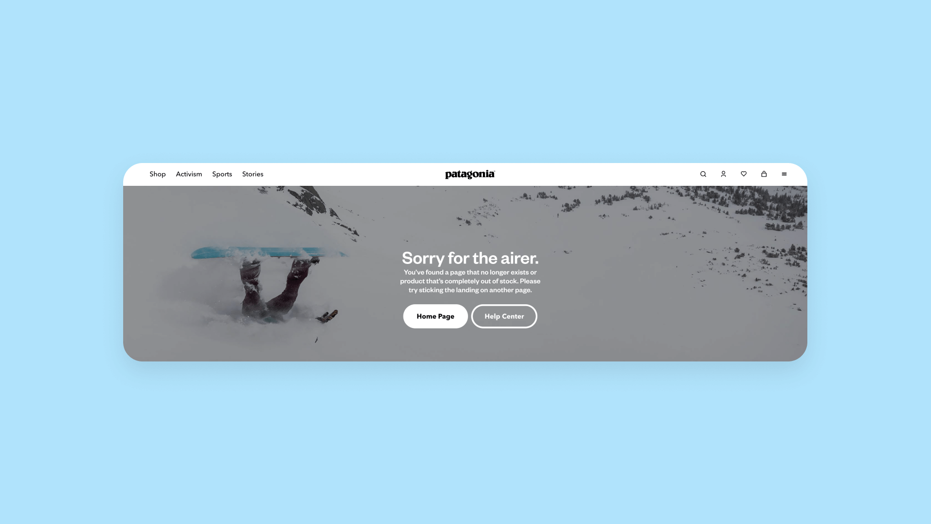
Forgetting about empty and error states
Missy Kelley told us,
“Don’t forget to plan for empty and error states. For new users, empty states guide their next steps. Since errors are inevitable, design error states that help users understand and correct their mistakes.”
Empty values and error states include things like:
- 404 “page not found” pages
- Out-of-stock messages
- Invalid form inputs
- An empty cart
- An empty search result
- A search or form input field
Filling an empty field with prompt text (e.g., “Looking for something?” for a search bar, “Email” for an email input field) makes it clear to the user what to input where, and reduces errors and friction as they’re learning your website.
Well-designed errors mean clear error messages that tell users why the error is happening and how to fix it, as well as adding some branding, improves user experience while also reinforcing your branding.
Losing sight of your user and their problems
As with many things, keeping the customer first is crucial. Christine told us that one of the most common website design mistakes is losing sight of “the user and their goals and problems.”
A pretty site isn’t successful if it doesn’t work smoothly, is incoherent to the user, or makes it difficult for them to accomplish what they need to do. This goes back to step one: understanding what your website is for, and how users will want to use it.
Effective user testing can also help you keep the user’s needs at the forefront. User acceptance testing, UX testing, and usability testing can all help you make sure your website meets users’ needs and expectations.
If it doesn’t — or if their needs change over time — iterate on your website’s design to make things easier for the user.
Not prioritizing accessibility from the start
Similarly, we all love cool design, but it also needs to be functional and accessible — for every user. Following web accessibility best practices isn’t just good for users who may be using screen readers or accessibility devices — it’s almost always a more positive user experience for everyone. This means things like:
- Choosing text and background colors with sufficient contrast
- Labeling forms and buttons
- Including alt text on any images
- Making your design easy to navigate using a keyboard
- Choosing easy-to-read font styles
- Responsive web design to ensure your site looks and works well on mobile devices or other devices.
Prioritizing website accessibility from the beginning is much easier than trying to make your design accessible later, with everything in place.
Designing solo without input from the wider company
An enticing mistake: designing in a silo. Although it can often feel easy to manage the design within the design team, design is a collaborative activity.
Most websites are the “face” of an entire brand or organization, so “it needs to reflect the whole organization,” Paul said, “not just reflect through the designers’ lens.”
This means a well-designed website should reflect the brand’s mission, vision, ethos, and so on — which often requires collaborative iteration to get right. Although designers are often the “keepers” of the visual brand identity, don’t assume that you don’t need input from other teams to express that fully.
Four examples of great website design
Getting inspired by other websites that are crushing their website design is a great way to create your own layouts, design systems, and illustrations that showcase your brand. Here are a few of our favorites to get you started.
Lattice: Modern design that supports UX
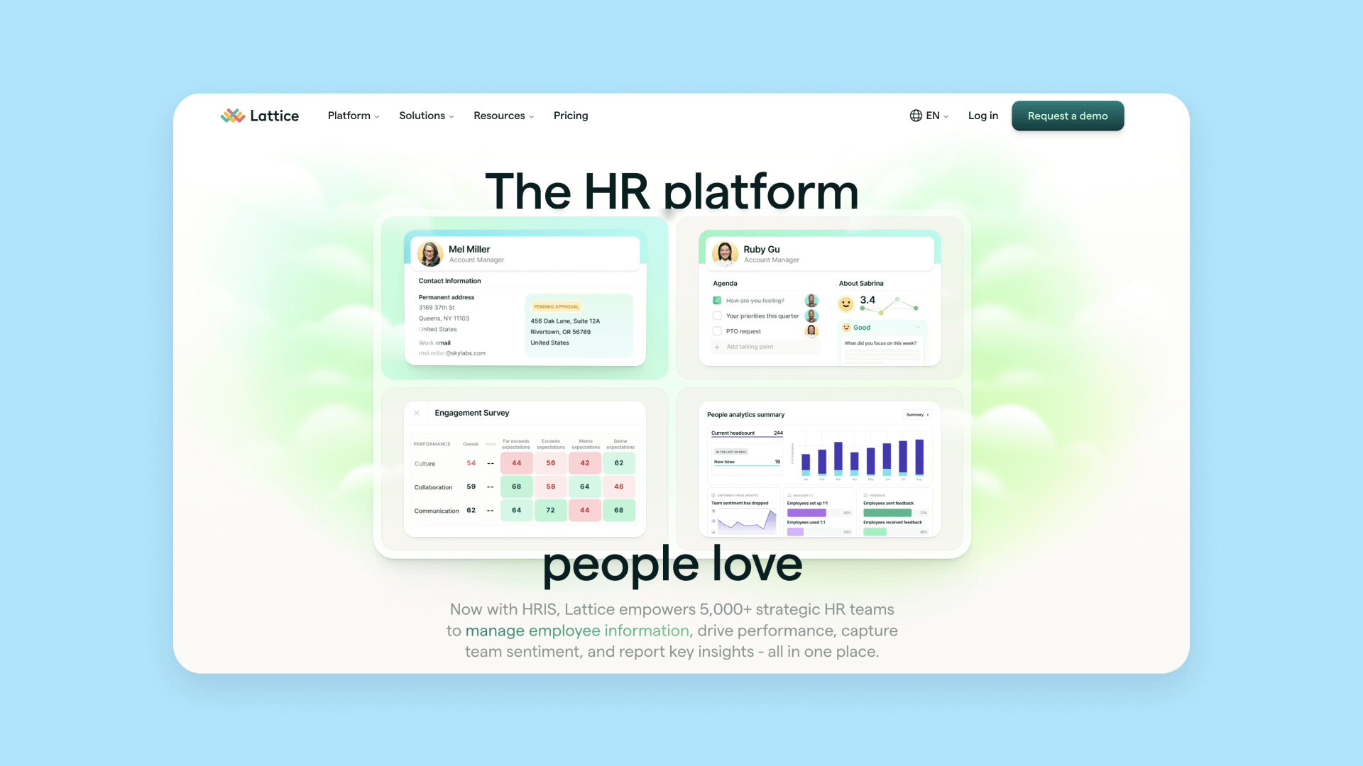
Lattice is an HR SaaS platform and their website does a great job of incorporating modern design while still prioritizing UX. You’ll notice many modern design elements on their website, such as:
- Gradient colors and backgrounds
- Subtle motion design
- 3D graphics and images
At the same time, they also follow basic design principles around consistency, hierarchy, contrast, and so on, which help create a consistent and easy-to-follow user experience.
Amaterasu: Interactive motion design
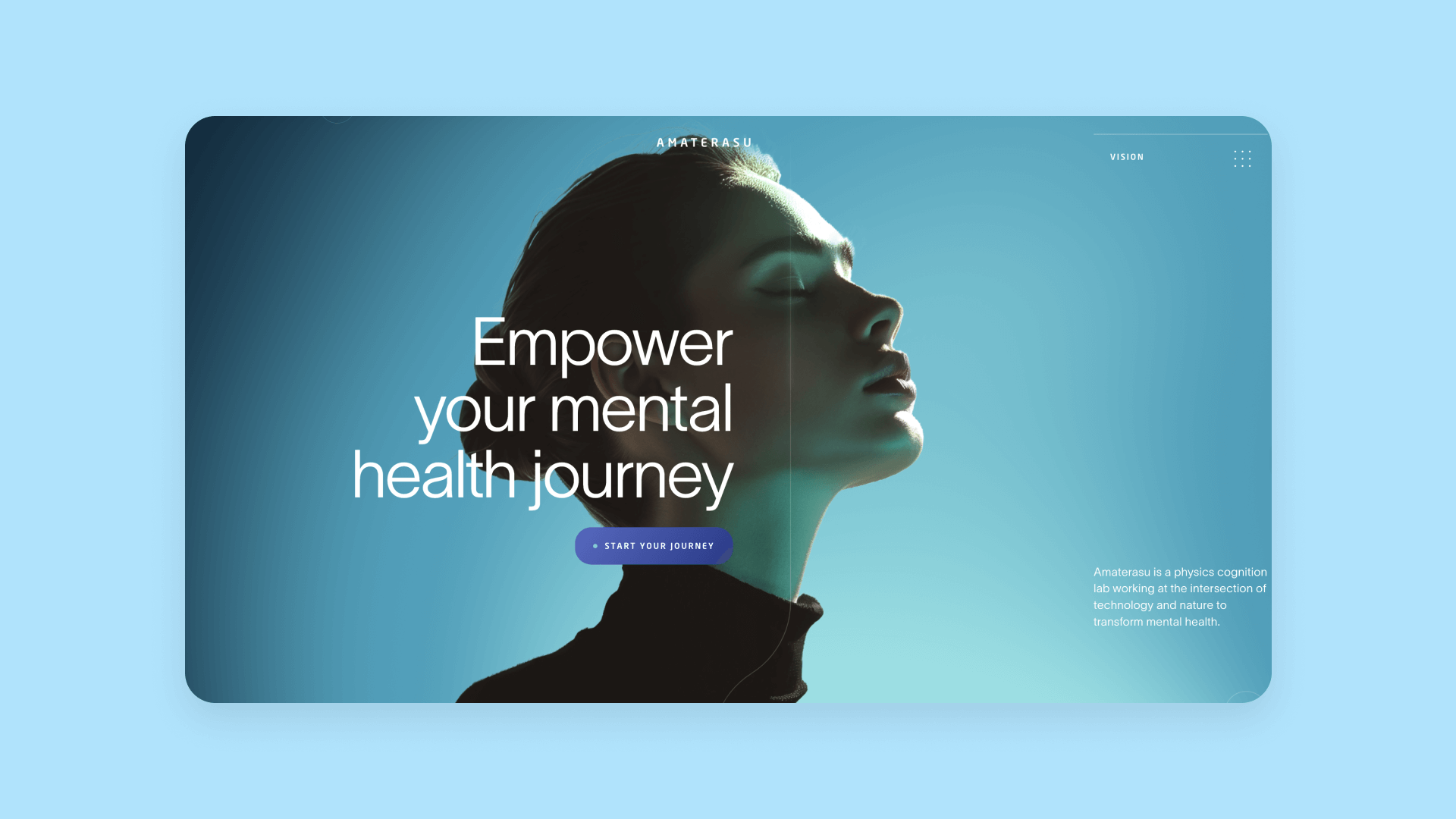
Amaterasu is a physics cognition lab, and their website is a great example of a business website that uses interactive design, bold colors, and 3D design.
Their site immediately stands out from other medical or healthcare sites — they’ve used design to significantly distinguish their brand from other similar organizations. This is clear from small details like the menu bar design and the cursor icon to major design choices like how they’ve designed the hero section or how the page graphics move with your scrolling or interaction.
Minimum Studio: Clean, minimalist design
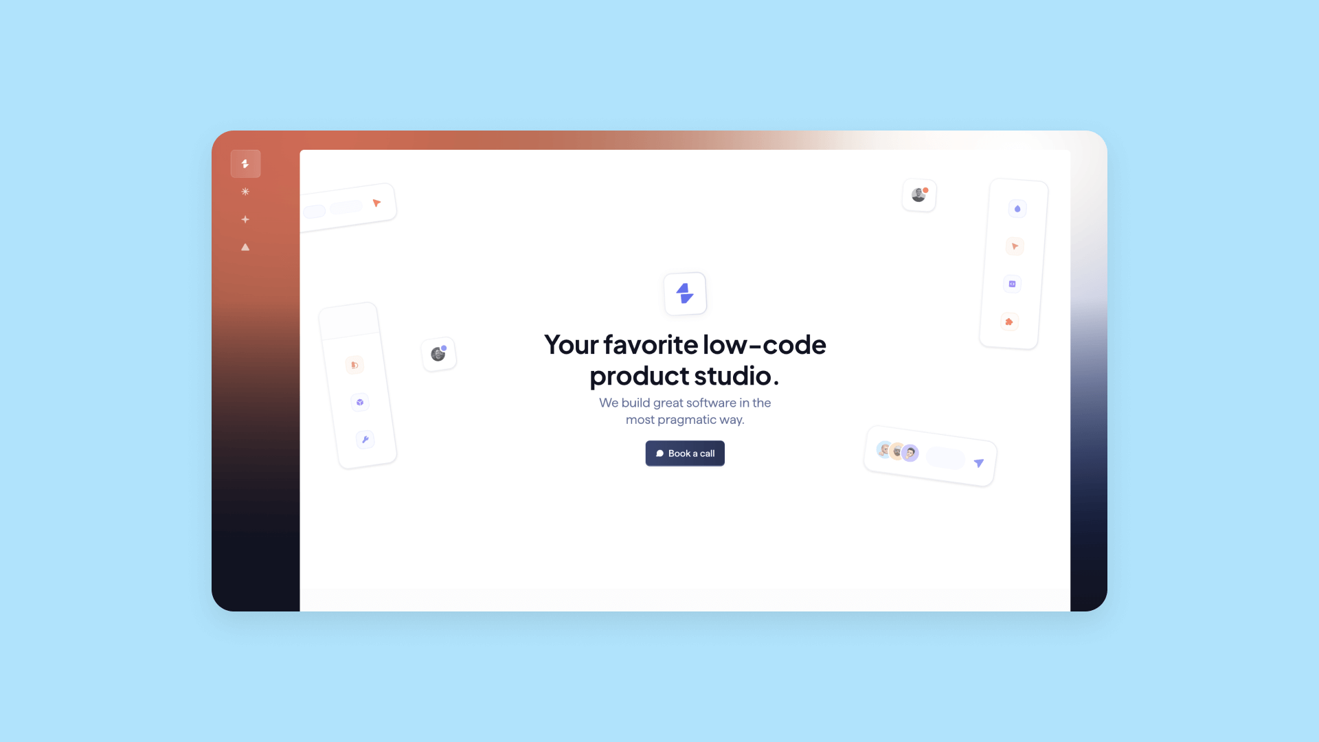
Minimum Studio is an excellent example of a clean, simple, and minimalist website that nonetheless hits all the marks. In fact, their website won “Best Homepage Design” in Bubble’s 2024 Bubble Con Awards.
One of their core principles as an agency is “We love to simplify things,” and their website demonstrates that very clearly — creating a strong design system that reinforces their brand.
Besides that, their site is very easy to use and navigate. It also follows all the best design practices, while also incorporating some modern design elements, without being overwhelming at all. Better yet: Minimum Studio’s website is built on Bubble — a great example of being able to do a lot of custom design without code.
Otherlife: Creative motion design
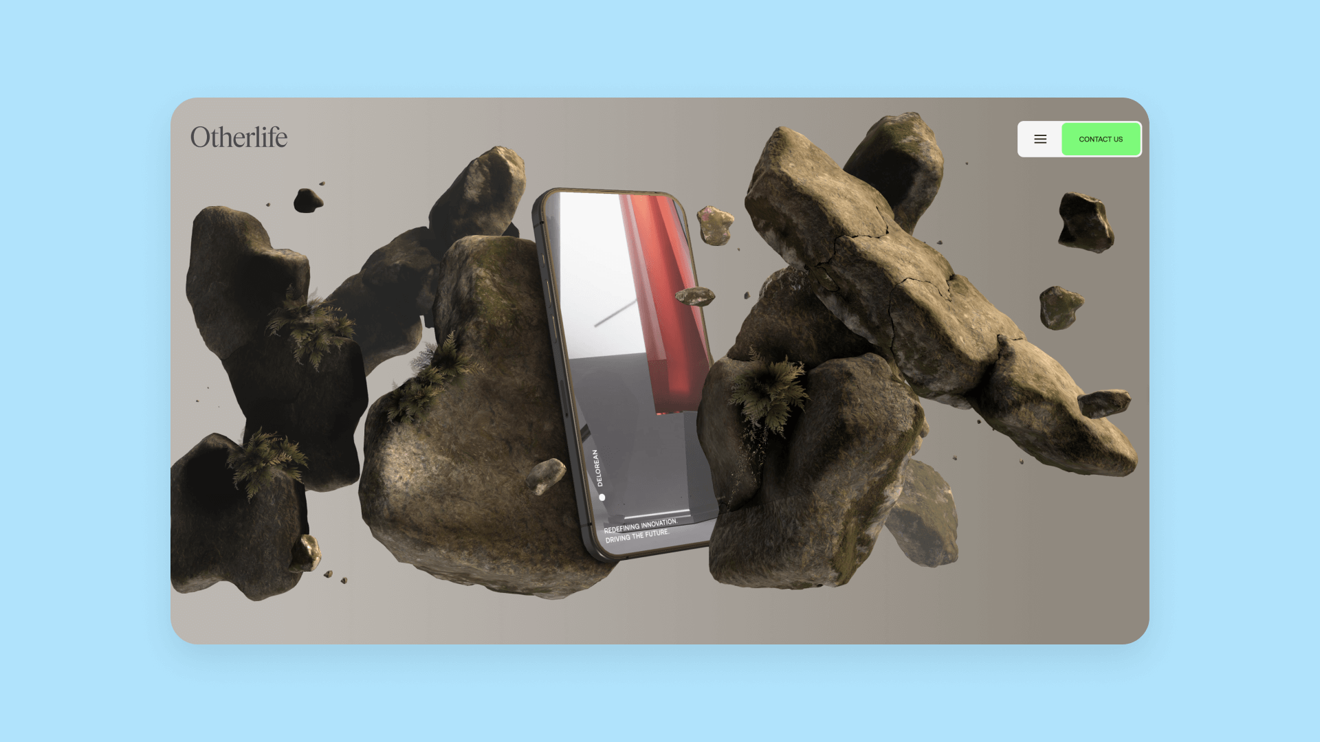
Otherlife is a creative agency focusing on digital experiences — and they showcase that well by creating their website as a kind of mini digital experience.
3D graphics and parallax scrolling are core elements of their homepage design. Another fun element of their website: infinite loop scrolling. Scroll through their homepage and you’ll notice you never reach the bottom — you’re just given an infinite loop of the homepage sections — which highlights their claim that they design differently.
Overall, they’ve done a great job between a simple portfolio site that meets their needs and their visitors needs, and fun, experiential design that showcases their agency’s brand and work.
Want more examples of great website design? Check out this year’s Bubble Con Awards winners or our guide to SaaS website elements, including dozens of websites that hit the mark.
Design your website with Bubble
Design can be a creative and engaging part of building your online presence. With AI visual development, it's faster and more accessible than ever. Bubble combines AI-powered generation and iteration with complete visual control, so you can create professional websites without code or design experience.
Bubble's AI development platform generates web pages from a simple description: layouts, navigation structures, and content organization for marketing sites, portfolios, business pages, or landing pages. Then you refine every detail by adjusting colors, typography, spacing, and interactions with an editor that gives you pixel-perfect control.
With Bubble, your website decisions become simple. You get all the tools you need in one platform:
- AI-powered generation: Describe your website's purpose and pages, and AI creates full layouts with structure, content sections, and navigation. Customize everything visually afterward.
- Visual editing for precision: Refine layouts, adjust design systems, modify interactions, and perfect every detail without touching code
- Built-in hosting and custom domains: Launch directly from Bubble with professional URLs, SSL certificates, and global CDN included
- Website templates for any use case: Start from dozens of free templates for business sites, e-commerce, agencies, portfolios, and community pages, or generate your own with AI
- Real-time collaboration: Work with teammates, clients, or stakeholders in the same editor, with changes visible instantly
- Fast and accessible: Create sites that load quickly, work beautifully on all devices, and follow accessibility best practices
Work with your team, try different layouts, test with real users, and perfect every detail. But trust us: With Bubble's AI generation, intuitive editor, and design guides, you'll need less time than you think.
Frequently asked questions
Do I need coding skills to design a website in 2025?
No. AI visual development platforms like Bubble let you design and build professional websites without writing code. You can generate layouts with AI, then customize everything visually — from colors and fonts to page structure and interactions. This means you can focus on design decisions rather than technical implementation.
How long does it take to design a website from scratch?
It depends on your site's complexity and your approach. With AI generation, you can create initial page layouts in minutes. From there, expect to spend a few days to a few weeks refining your design, building out pages, and testing with users. Using templates or pre-built components can cut this time significantly. The key is starting simple and iterating based on user feedback rather than trying to perfect everything before launch.
What's the difference between web design and web development?
Web design focuses on the visual elements — layouts, colors, typography, images, and user experience. Web development is the technical implementation that makes those designs functional. Traditionally, designers create mockups in tools like Figma, then developers code them. AI visual development platforms like Bubble combine both, letting you design and build in the same editor without switching between tools or teams.
Should I design my website mobile-first or desktop-first?
Consider mobile-first if your audience primarily uses phones, or if you're building e-commerce or content sites where mobile traffic dominates. Desktop-first works better for B2B tools, complex dashboards, or professional services where users typically work from computers. The best approach? Design responsively from the start. Modern platforms make it easy to create layouts that adapt beautifully to any screen size, so you don't have to choose.
How do I know if my website design is working?
Test with real users and track key metrics. Use tools like Hotjar to see where people click, scroll, and get stuck. Monitor analytics with Mixpanel or similar platforms to track page views, session duration, and conversion rates. Run A/B tests on different design variations. Most importantly, watch how actual users interact with your site through usability testing. If users accomplish their goals easily and quickly, your design is working. If they get confused or leave without converting, iterate on your design.
Build for as long as you want on the Free plan. Only upgrade when you're ready to launch.
Join Bubble