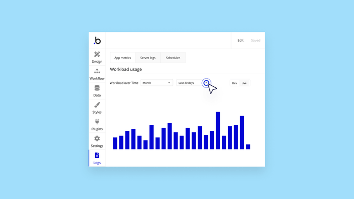
Workload usage — the amount of work that Bubble does to power your app — is a key metric to track, both to make your app run more efficiently and to keep your Bubble subscription costs down. To do that, you can use the charts in your app’s App Metrics tab, which let you see real-time reporting and data over time. You can even get super granular and identify exactly which activities are consuming the most workload.
This step-by-step walk-through will introduce you to those charts and help you navigate them. Hover over and click the blue hotspots in the window below (or click the arrow, if you’re on mobile) to check it out.
How are you using the workload charts to optimize your app’s workload usage? Join the conversation on our Forum.
Build for as long as you want on the Free plan. Only upgrade when you're ready to launch.
Join Bubble