We’ve all had this happen: You download an app only to delete it soon afterward. Maybe you just wanted to see what it looked like, or needed to complete one task, or your friend raved about it, but it wasn’t right for you.
The thing is, if you’re the one building and creating an app, how do you make sure users don’t bounce?
Learning to measure and improve user retention in your app helps make it possible to:
- Grow your audience consistently
- Reduce marketing and user acquisition costs
- Improve customer lifetime value
- Understand why customers churn and reduce turnover
Whether you’re building a mobile app or a web app, user retention is essential for your success. In this article, we’ll break down everything you need to improve user retention, including the best ways to measure and track customer retention, benchmarks to know, and practical tips for increasing retention.
How to measure app user retention
Tracking user retention over time is a must. Measuring user retention can obviously show you how things sit currently, but it also gives you data to inform longer-term strategy.
Watching big-picture trends over time shows you if your current customer retention methods are effective or not. But first: Here’s what to measure.
App user retention metrics
User retention rate
This one’s pretty clear. Measuring your user retention rate provides a quantitative way to measure what percentage of users you’re retaining over set periods.
To calculate user retention rate, you’ll first need to find three numbers:
CS = number of customers at the start of the period
CE = number of customers at the end of the period
CN = number of new customers during the period
Then, you can use the following formula:
For example, let’s say you have a health and fitness app and you want to see how many users you’ve kept during the first quarter of the year. At the beginning of the period, you had 450 users. Throughout the next 90 days, you gained 150 new users. At the end of March, you had 500 users.
[(500 - 150) / 450] x 100 = 77%
This indicates you’ve retained 77% of your app users, which is great!
Customer churn rate
Your churn rate is the inverse of your customer retention rate. It shows you how many customers are “lost” during a given period. For example, if you’ve retained 77% of your customers, then you have a customer churn rate of 23%.
You can also calculate customer churn rate individually using the following formula:
If you don’t have any easy way of tracking lost customers, you can calculate it with the following formula:
Daily (DAU) and monthly (MAU) active users
This metric shows you how many users are active on your app on either a daily or monthly basis.
You get to define what “active” means to you. Some companies define “active” as logging in or opening the app. Others use a specific action, such as clicking a button or performing a task. Either way, once you've set your “active” metric, you’ll then define a way to identify unique users.
The most common options are a user email, user email, or some other user ID. Then, you’ll use a product analytics platform (like Mixpanel) to gather the data.
Customer lifetime value (CLV)
CLV measures how much value (or revenue) you can expect to earn from a single customer over their “lifetime” with your brand.
CLV is calculated with the following formula:
The average customer lifespan is how long the average customer tends to stick with your brand.
The customer value is the average number of purchases a customer makes in a given timeframe multiplied by the average value of a purchase.
The longer you retain users, the more they’re likely to spend with your brand, so tracking CLV can give you an indirect picture of retention and loyalty.
Tracking user retention
Each technology company has to track user retention in a way that makes sense for their goals and product.
A work management app may find Daily Active Users a more helpful metric than monthly, while a travel booking app may find monthly active users enough.
An app with a recurring subscription model might track user retention rates on a monthly basis, while a consumer social media app might track their app’s retention rates on a daily basis.
The important thing to consider is that you are tracking metrics consistently. You’ll get the most benefit out of these metrics if you can see how customer retention improves or declines over the long run, not just in the current moment.
User retention benchmarks
User retention benchmarks vary significantly based on industry. However, it can still be helpful to understand some general benchmarks to get a sense of how your current retention stacks up.
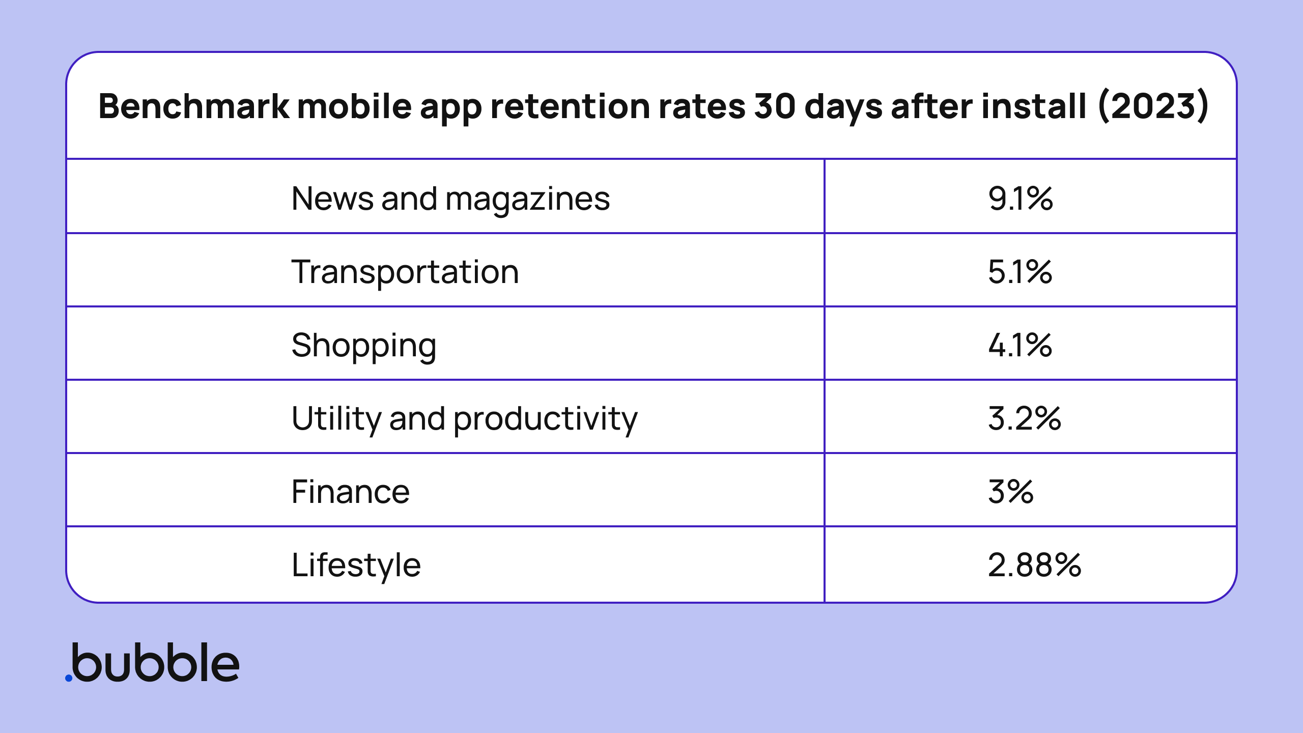
In general, a good user retention rate at the 30-day mark after download is 10% or higher for mobile apps. Depending on your industry, even lower user retention rates can be considered successful.
Churn rates across industries are similar. The average iOS app has a 30-day churn rate of 96%. Android apps have a slightly higher churn rate of 98%.
Looking at these numbers can feel bleak. After all, how are you supposed to run a successful business if 96% of your customers are churning after the first month? Keep in mind that these are simply averages. There’s a lot you can do to increase customer loyalty and user retention.
How to increase user retention in your app
When you think about user retention, consider two aspects:
- How to meet your users’ needs
- How to meet your business’ needs
Within each of those categories, you can find opportunities for increasing positive user engagement and decreasing negative user engagement.
Looking at this on a matrix can help:
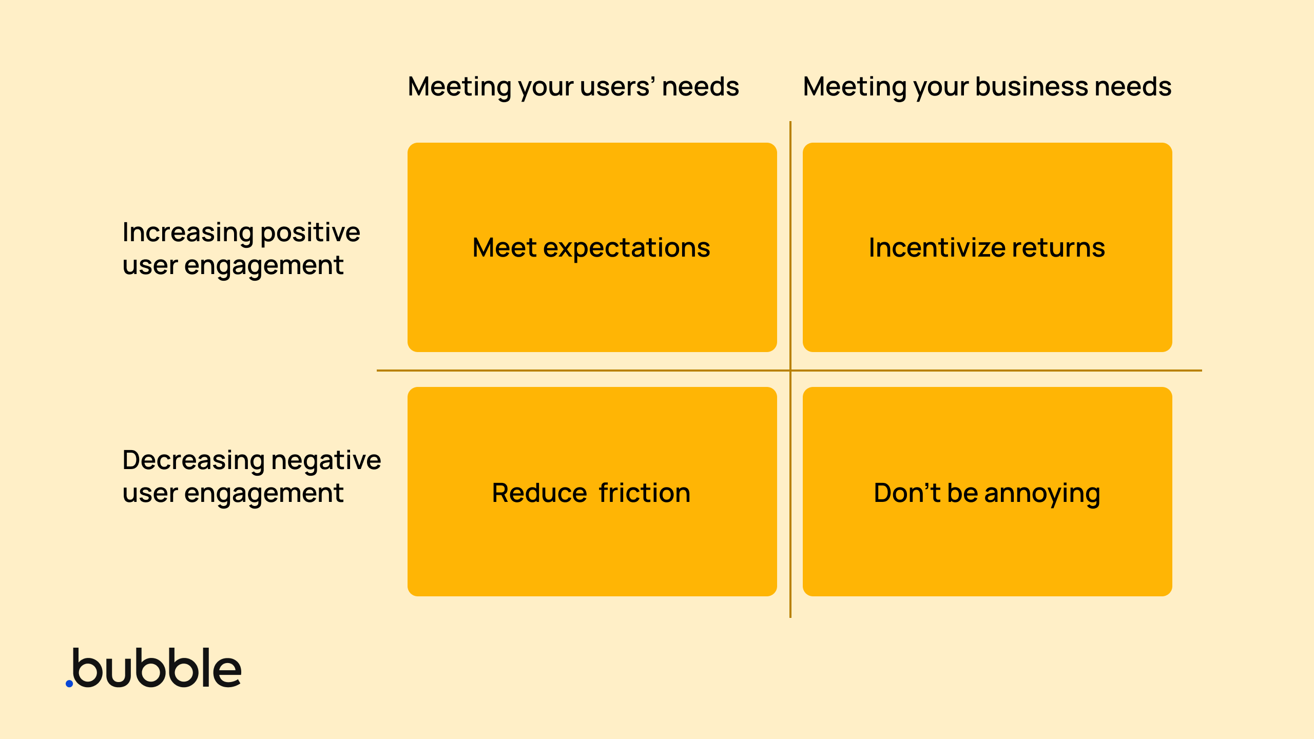
Each of these categories can provide a framework for improving customer retention.
Meet expectations
Delivering on users’ needs in a positive way is essentially just meeting expectations for customers. Why did users sign up for your app in the first place, and how can you deliver better and better value for those expectations or needs?
Set clear expectations. Before a user even signs up for your app, you should set their expectations accordingly. Your web copy, app store copy, onboarding flow, and so on should all clearly and accurately depict your current user experience. This includes descriptions and images. No one wants to see beautiful mockup images in the app store only to be hit with a low-quality design in your app.
Use best practices for app store optimization to find the right users for your app. By being clear about what you offer and how you deliver on those promises, you’ll better attract your target users from the start and reduce churn.
Don’t hide key features. This one happens mostly by accident. As your app grows and expands, you start moving high-priority features behind paywalls to increase signups, raise subscription prices, or something similar. This isn’t wrong, but it can increase churn as customers realize the key features they expected to use when they signed up aren’t available to them anymore.
Instead, it can be more effective to keep your MVP (minimum viable product) free, and then reserve upgrades for advanced features to make sure your MVP is able to solve core customer needs.
Collect user data. With better data, you can understand what leads people to sign up, what they primarily use the app for, and then better deliver on those expectations. This includes data that users explicitly provide and data that can be gathered from their activity in the app itself.
If you’re building on a no-code tool like Bubble, you can integrate user data and customer feedback tools directly with your app to make gathering valuable data seamless for your team. Integrations like Mixpanel and Hotjar give you insights into how customers are using your app.
Reduce friction
Delivering on users’ needs while minimizing negative engagement means reducing friction within your app.
This is one of the easiest user retention strategies: Don't make it hard for users to do whatever they signed up to do!
Some key ways to do this:
Align with UI/UX expectations. When you’re designing the user interface (UI) and user experience (UX) of your app, follow best practices and standard web and app design principles. That is, buttons and behaviors should reflect established norms and avoid dark patterns (i.e., don’t make the “cancel” button green and the “continue” button red). When you align with common expectations and best practices, your app immediately becomes more intuitive.
Make an app that actually works. This is a key way to reduce friction from the backend: Make your app work seamlessly and consistently. You can do this by:
- Reducing load times
- Eliminating or reducing outages and crashes
- Reducing the number of steps involved in each task
- Making sure your servers can handle the current traffic of your app
Run usability testing. With usability testing, you’ll test how easy and intuitive your app is to use — and perhaps even unearth technical bugs along the way. This is a great way to uncover key areas of your app to reduce friction. Usability testing should be run before you launch your app, but it can also be run at regular intervals after launching to make sure new features and elements are all working as designed.
Use A/B testing. A/B testing is another great way to understand common points of friction within your app (and then reduce them). A/B testing runs in the background as users move through your app, showing how different versions of your app impact user behavior.
You can then use the resulting user actions to understand which option is better for your customer retention and satisfaction.
For example, you might test whether users who got a two-week free trial are more likely to continue their subscription compared to those who got a percentage-based discount instead. Or you might test things like:
- Timing of push notifications
- Onboarding flow screens
- Messaging of popups after onboarding
- In-app directions or “helps”
- New features
Make onboarding seamless. Onboarding is a core factor in customer retention. Current data shows that most apps only have a one-day retention rate of less than 25%. This means that 75% — or more! — of new users never come back to an app after they install it.
Your onboarding process plays a big role in making sure that users stick with your app beyond day one. A good onboarding process should:
- Be quick and simple for the user
- Gather contact information or create an account for them
- Personalize their experience in the app
- Set contact preferences (i.e., notifications, emails)
- Educate users on your app's best features and how to get started
With a great onboarding process, users can get more value from your app right away, which makes them more likely to stick around.
Incentivize return visits
When thinking about app user retention, you also need to consider your own business needs. By meeting your business needs in a way that creates positive engagement for the user, you can think about how to incentivize returns.
By incentivizing return visits, you reassure your users that they’re going to continue to gain value from your app every time they come back.
Gamify app usage. One of the easiest ways to get people to do something: Make it a game! This is just as true for apps as anything else. Gamification uses gaming principles (i.e. scores, badges, earning rewards, etc.) to keep users engaged or encourage users to take specific actions. Any type of app can benefit from gamification.
Some examples of gamification within apps:
- Challenging users to earn rewards
- Putting leaderboards in your app
- Daily streaks
- Limited-time challenges
- Allowing users to add friends to their network to see others’ scores
- Showing users stats, challenge goals, bonuses, rewards, and so on
- Creating levels within your app to encourage users to “level up”
Send helpful push notifications. Push notifications can be a great way to prompt users to come back to your app. Just make sure they’re valuable for the user (and not just for your business). If you send push notifications too often, you’ll push users away from you instead.
Some effective push notifications tactics include:
- Reminding a user to complete a task or challenge (e.g., Duolingo’s notifications to maintain a users’ lesson streak)
- Alerting users of anticipated new features or elements (e.g., Netflix’s notifications when new series get added)
- Personalizing notifications (e.g., Airbnb’s notifications that prompt users’ to book experiences related to their recent stay)
Encourage loyalty. Brand loyalty stats show a dedicated loyalty program can incentivize and reward loyalty to your app, therefore increasing customer retention. Loyalty programs work by either rewarding customers with something they want or rescuing them from something they don’t want.
Common loyalty programs include:
- Points-based programs that let users earn points to spend on rewards
- Tiered programs that give users increased rewards for spending more or being more active in the app
- Referral programs that reward customers for referring new users
- Paid membership programs where users pay an additional fee to join in exchange for ongoing rewards
For more ways to increase loyal users, read our full guide to improving customer loyalty.
Increase personalization. The more personalized your app's content and experience, the more likely users are to stick around.
Spotify is a great example of this. They consistently personalize your experience in the app based on your music taste, listening history, and so on. They also have personalized features like Spotify Wrapped at the end of the year, Discover Weekly and Daily Mix playlists, and more.
Don’t be annoying
Finally, you want to meet business needs for your app while decreasing negative engagement for your users.
Don’t spam users with irrelevant content, push them to use the app constantly, or ask them for engagement that’s disproportionate to their investment in your brand.
Striking the balance between “engaged” and “annoying” can be easier said than done, though! Here’s a few key principles to keep in mind:
Always provide value. Whether you’re sending a push notification, an email, or putting a CTA on an in-app notification, always provide value for the user. We can all think of apps that constantly send notifications that are completely irrelevant to our use of the app or our experience.
Letting users customize their notification settings is a great way to avoid this. However, you should also be considering how every communication, feature, and app element will provide value to the user. More value = more retention.
Be mindful of messaging frequency. Even if you’re providing users with valuable content and communications, you don’t want to remind them of their needy ex. Consider how often users expect to hear from you, and align your messaging timing with customer expectations to avoid over- or under-communicating.
For example, travel apps should send limited notifications generally, and plenty of notifications if the user has an upcoming flight (i.e., notifying users to check-in, which gate to go to, any flight changes, etc.). A social networking app can notify users much more frequently. However, the notifications should be directly related to their activity in the app (i.e., reactions to their own posts, but not reactions to their friends’ posts they never interacted with).
Keep your UX ethical. This aligns with meeting expectations and reducing friction. Always design your UX in a way that is intuitive and ethical for users.
Don’t try to “trick” users into doing things they're not intending to, even if it would be valuable for your app. This includes things like:
- Making the “X” button on an ad too tiny to easily tap out of
- Creating an overly long cancellation flow
- Making the “confirm” and “cancel” buttons or “yes” / “no” buttons intentionally misleading
- Forcing users to sign up for the most expensive subscription plan to get access to the free trial
These are called “dark patterns.” Besides being frustrating for the user and reducing customer retention, using dark patterns in many contexts is now illegal in the US and EU. Make sure you’re familiar with laws around design, data, advertising and messaging to avoid landing your company in legal trouble.
Build an app that retains users with Bubble
There aren’t any shortcuts to user retention, but building your app with no-code can make it easier.
Building with no-code gives you the ability to:
- Build and launch your app faster so you can grow your audience and get feedback sooner
- Integrate user testing and feedback tools directly with your app, making it easier to run and analyze tests
- Easily iterate on your existing app, making it easier and faster to improve based on user feedback
- And more!
With Bubble, you can build and launch an app in just weeks or months, allowing you to focus on getting your app out quickly to more users. Once it’s out in the world, you can turn your attention to testing, iterating, and improving user retention in your app.
If you want more support with app user retention — regardless of how you built your app — our community is here to help. Check out our community forum of builders, founders, and developers to see what others are doing to help with user retention.
Build for as long as you want on the Free plan. Only upgrade when you're ready to launch.
Join Bubble