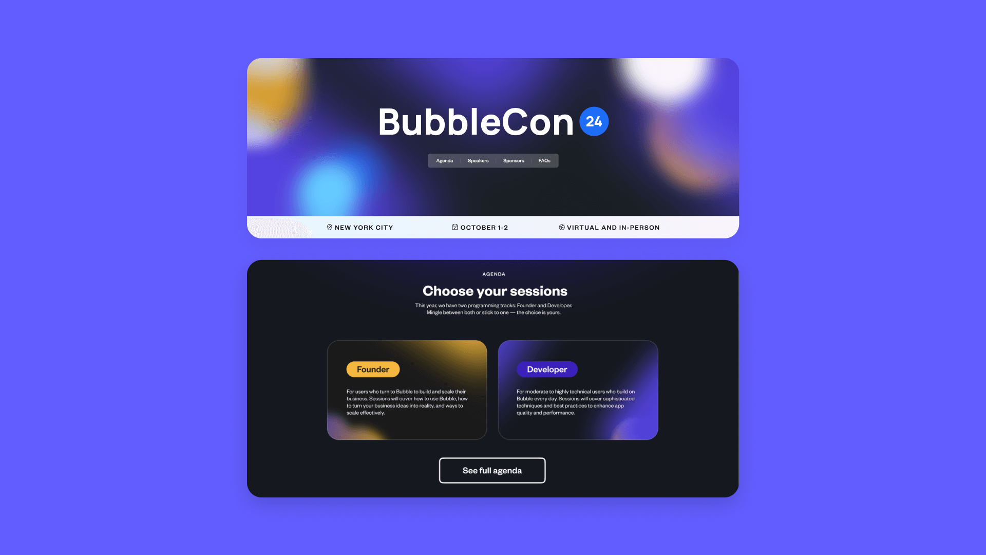
When tasked with creating a landing page for BubbleCon, our annual conference, the internal team of developers at Bubble decided to make the build a challenge. “Pretty early on in this project, the design team came to us and said, ‘We want to swing a little bit bigger than normal,’” says Andrew Vernon, one of the developers involved in the project.
Each year at BubbleCon, the community comes together to share knowledge, techniques, and new ways to use Bubble. The team wanted to reflect the liveliness at the heart of the conference with a design that felt like the movement of ideas. With that goal in mind, Bubble Developers Andrew and John Carter and Brand Lead Eve Spears took a more iterative approach to designing and building, filling in the animation gaps with custom CSS, plugins, and AI.
A more collaborative design and development approach
Almost all Bubble projects, John says, begin the same way. “Normally, we’d start with a Figma file, get inspiration from other landing pages, and then create a layout on Bubble, which is always very straightforward and easy to do.” But building the BubbleCon landing page wasn’t an average development project.
BubbleCon was a chance to do more — and look for new sources of inspiration. “We were heavily inspired by the solar eclipse back in April 2024. This extremely rare cosmic coincidence had us all looking at the sky (with protective eyewear, of course) in pure awe,” says Eve Spears, Bubble’s brand lead. The team started playing around with how to combine Bubble and the solar eclipse into a coherent visual language. “We wanted BubbleCon to evoke these ideas of infinite possibilities, freedom to build anything, and looking toward the future.” The best way to do that, they decided, was through animation.
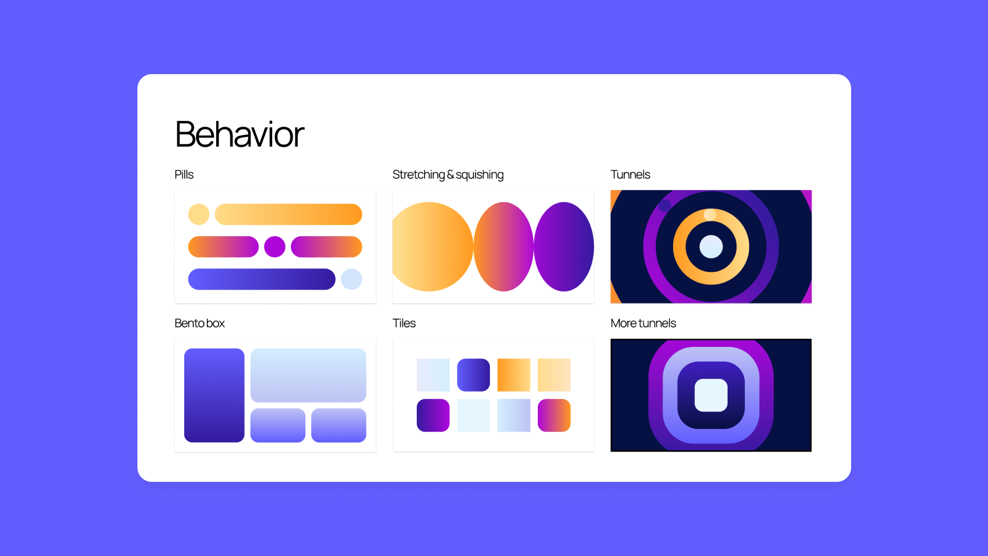
There was one sticking point: “Most of Bubble’s animation tools are designed to run in the context of a workflow,” says Andrew. To achieve the desired effect — a user seeing the animation as soon as the page loads — they experimented with a few options. After testing video and CSS, Andrew and John ended up using CSS for the page background and a Lottie animation for the hero section. “It’s a special animation file that is much lighter than video,” explains Andrew. “But more advanced than simple CSS.”
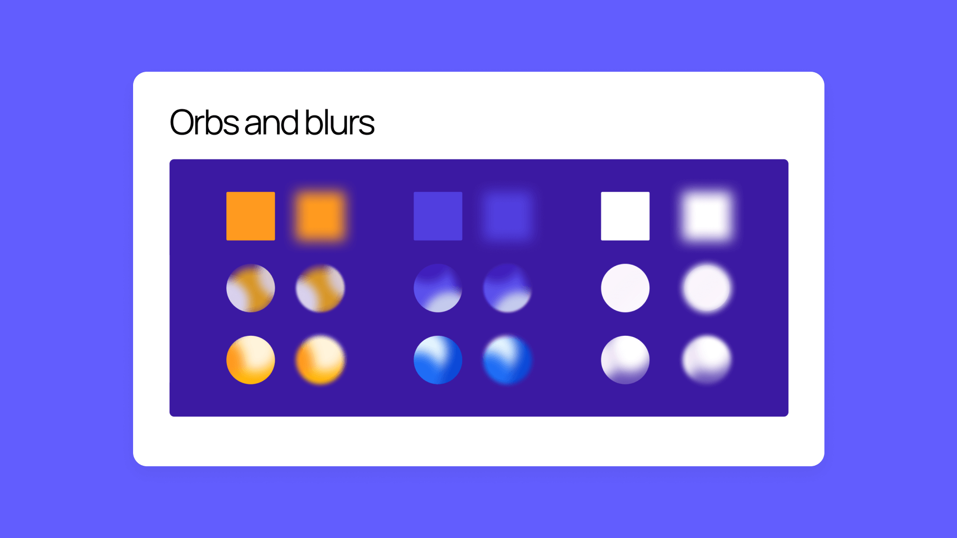
The build was a learning process that included multiple touchpoints, discussions, and iterations — rather than the typical, straightforward handoff from design to development. “For all the content of the page, the review and iteration process was normal, but there was more conversation around the animation. For the lava lamp-like feature, for example, we asked questions like: ‘How fast should [the circles] move? Should they move along this way? How blurry should they be?’” says Andrew.
Leveraging CSS, plugins, and keyframe animations
After multiple meetings with the design team, Andrew and John had a clear picture of what they wanted the page to look like — including where they needed to fill in the Bubble gaps. “We knew we could take the page to a certain point with some great out-of-the-box features on Bubble, but would need to supplement with some custom work. Ultimately, we found CSS and Bubble’s shape elements to be more flexible and simple than animating everything through video,” says Andrew.
A key technique that enabled complex animations was the separation of content and animation layers, Andrew says. “Bubble has this incredible feature called align to parent, which allows you to position elements regardless of other elements. That ended up making it really easy to position a content layer directly on top of the animation layer.” Likewise, Andrew and John relied heavily on keyframe animation code, which allowed them to set the parameters for how far an object on the page would move, in what direction, and over what time span — and even allowed them to create repetition in the animation, too.
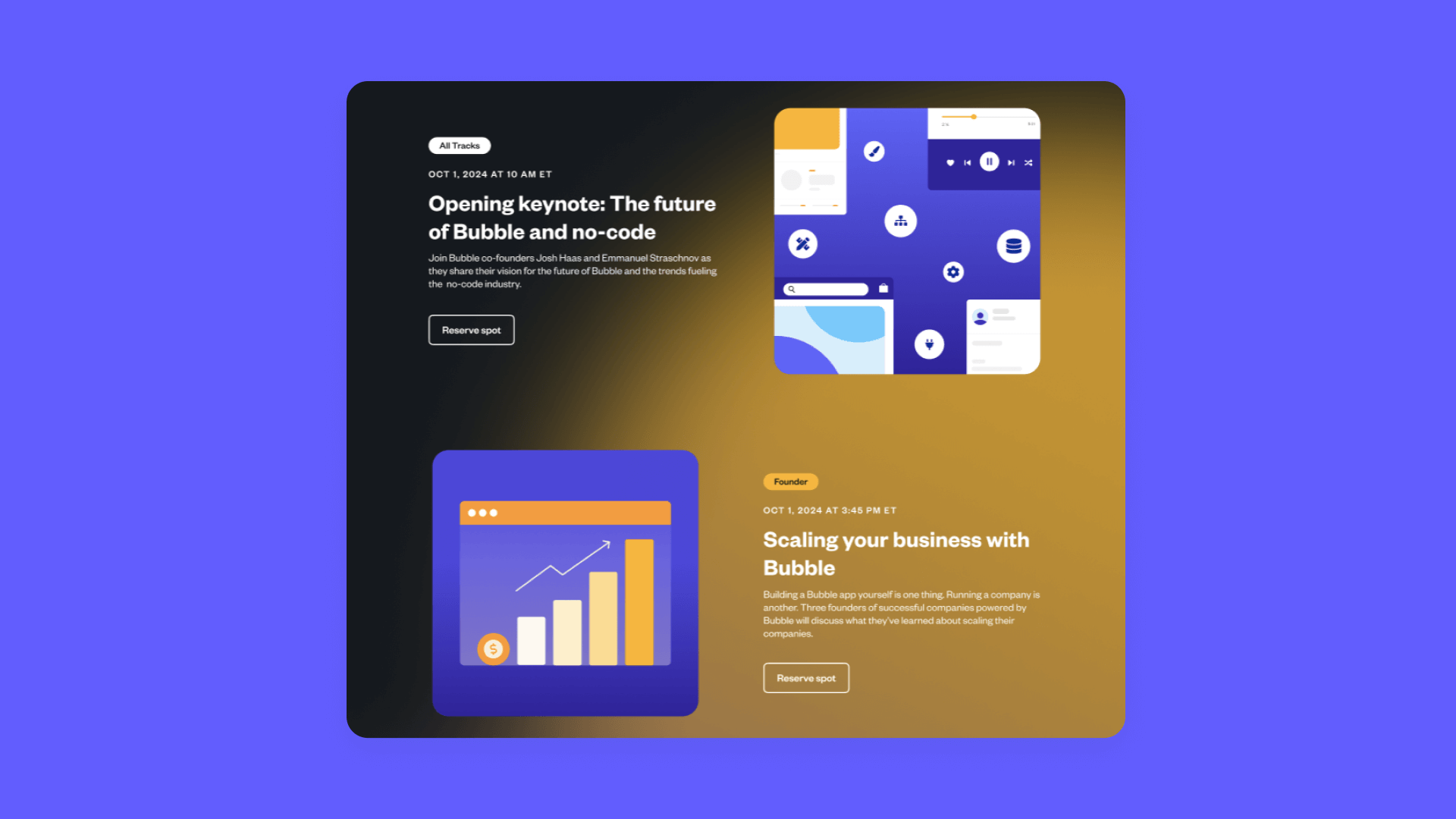
To animate the actual content of the page, they used the Animate-on-Scroll Plugin which allowed them to build scroll-triggered animations. “As you're scrolling down the page, you identify what element you want to target, give it an offset, change the anchor points, and once that element has reached a certain portion of the page, the animation happens. It was the perfect plugin,” John says.
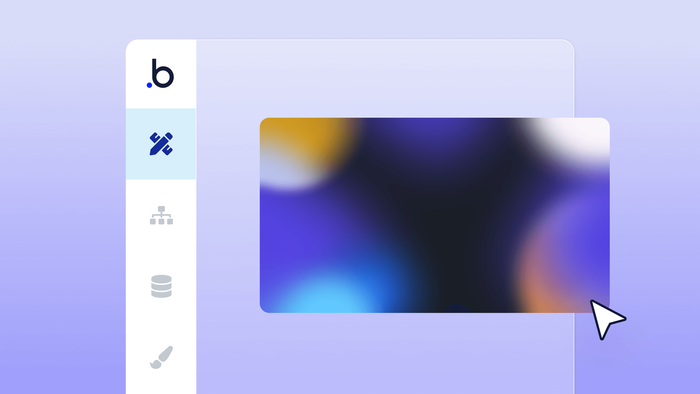
To make the background even more complex and visually stimulating, the team turned to custom CSS. “Each circle has its own CSS to control the length of the animation and movement. The CSS handled blurring the colored circles so that they just really gradate nicely on the page in addition to moving them [via keyframes],” says Andrew.
If you’re interested, here’s the CSS that helped them do it:
#img-1 {
position: relative;
filter: blur(120px) !important;
-webkit-animation: img-1 40s infinite;
animation: img-1 40s infinite;
}
@-webkit-keyframes img-1 {
0% {left: 0%; top: 0%; -webkit-transform: translate3d(0, 0, 0);}
35% {left: 2%; top: 3%; -webkit-transform: translate3d(0, 0, 0);}
70% {left: 0%; top: 0%; -webkit-transform: translate3d(0, 0, 0);}
100% {left: 0%; top: 0%; -webkit-transform: translate3d(0, 0, 0);}
In addition to the background, John and Andrew also wanted to show a rotating carousel of testimonials, which featured tweets from BubbleCon attendees and Bubble Developers. “We wanted a repeating group of eight to ten testimonials that would repeat continuously in a sort of infinite carousel,” John says. To accomplish that, they used the Infinite Scroll Plugin in conjunction with a horizontal repeating group.
In the end, Andrew and John say they’re satisfied with the outcome. “The results [of the custom CSS and plugins] are very high impact, but behind the scenes, they’re very simple,” Andrew says.
Leaning on AI and beyond for no-code learning
One of the biggest challenges in building the BubbleCon 2024 landing page was the unknown — there were a lot of pieces of the animation process that John and Andrew had never encountered before.
“In places where we lacked the proper knowledge to achieve something, we leaned on ChatGPT to fill in those blanks. We would bring working code to ChatGPT and ask it to tweak it,” says John. “ChatGPT is also pretty good at not only making the change but explaining why that change worked.”
Relying on other external resources like AI — including community forums and YouTube — they say, can help any developer take on a new challenge.
“From the outside looking in, you always assume that developers have all the answers, see a design problem, and know exactly how to build it. But the best developers I know are actually just especially good at knowing how and where to look for answers,” says Andrew.
Build for as long as you want on the Free plan. Only upgrade when you're ready to launch.
Join Bubble