When you think of design, it’s easy to jump straight to colors and logos. But the web app design process is a lot more complex.
Visual identity is a big piece of it, for sure. But you’ll also need to consider things like:
- Information architecture
- Data organization
- User experience
- The app’s functionality
- Page structure and layouts
- Standard components
- … and more
In this article, we’ll walk you through the basics of the web app design process, how to do it, and give you some great examples to follow.
What is web application design?
Web application design is the process of designing a functional, interactive web app that your audience can use to accomplish certain tasks.
It’s more similar to app design than to website design, even though web apps are accessed through your browser.
One of our lead product designers, Matthew Traul, distinguishes it this way:
“Website design and web app design are quite different. Designing a website is creating a document that is intended to communicate information to a particular audience. You can code it or build it with no-code tools and deploy to the web.
A web app is much more complicated. Instead of just a web document to communicate information, it has rich read, write, and CRUD (Create, Read, Update, and Delete) capabilities at its most basic level. It allows the user to achieve something, whether that’s ordering food, booking a flight, etc.”
So in short, website design focuses on the look and feel of static pages, while the web app design process focuses on both user experience (UX) and user interface (UI) design for interactive, functional products.
Not quite sure which you need? Check out our guide to web apps vs. websites to help you decide. If you’re moving forward with web applications, we’ll walk you through the design process below. If you’re designing a website, jump to our website design guide.
How to design a web application, step by step
Designing a web app isn’t just choosing a color scheme and designing beautiful page layouts. The web app design process brings together core components of data architecture, style, UX, user interface design, and more to create a cohesive and functional product.
Here’s how to break each layer down to create your web application.
Step 1: Define the problem
Especially for your first iterations of your product, you want to focus on solving a problem, not being flashy.
As Bubble Senior Product Designer Christine Shiba told us,
“I think a lot of designers can get really into the look and feel of the product right from the start, but ultimately, it has to help the user solve their problem. It shouldn’t be a solution looking for a problem, the design has to stem from the problem.”
Start with market research that can give you insight into your user needs and expectations for your product, or products similar to yours. Market research helps you identify the biggest opportunities, validate ideas early on, and reduce risks.
Then turn to competitor research and analysis. By looking at what already exists in your space, you can better identify how you can uniquely serve or differentiate yourself among your audience.
Most importantly: Talk to your users! User research can take many forms, from focus groups to prototype testing to surveys and more. Your goal at this stage with user research is to dig into potential problems and solutions. Then you can identify which problems are most relevant to your audience, and validate the solutions you’re working on for them.
✔️ Do market research to understand user needs and expectations.
✔️ Study your competitors to analyze risk, opportunities, and gaps in the market.
✔️ Talk to your users via user research to dig into problems and ideal solutions.
Step 2: Define the essential elements of your product
Once you’re confident you’ve uncovered a genuine problem and a relevant solution, it’s time to create the “bones” of your product.
This involves thinking through the information architecture of your site. Consider the content, site map, and organization of your site to create a logical structure. Basically, you want to organize information clearly so you can design your site in a way that’s easy to navigate for the user.
You can also start thinking about data architecture — that is, what data does your web app need? How will the data be organized?
“Think about your site architecture from the UX side. How are users navigating through your app? And then the same thing for the data side. You want to keep your data organized.
I know a lot of designers will start with the data first. If you start building and you’re making workflows as you go, your data can get really messy. Either way, this is the foundation of web app design: Starting from the bird’s eye view and getting a cohesive view of how things tie together at the system level before going in and building it out.” — Christine Shiba, Senior Product Designer
By considering what pieces need to be included, you can also start to think about how those pieces fit together. Wireframes are great at this stage. They offer a low-fidelity option to help you visualize how things might come together without designing anything too detailed yet.
✔️ Organize the architecture of the UX and the data for your site.
✔️ Create a clear site map and navigation for your web app.
✔️ Design a wireframe to make sure each screen has an efficient layout.
✔️ Consider doing user testing on a wireframe or prototype to validate your ideas so far.
Step 3: Move on to the design system
A design system is a documented catalog of key elements, styles, and patterns within the design of your web app. It’s more than just a style guide, because it should include the how, why, and use cases of various components.
“Starting with a system or having some sort of system-level idea of your brand and tone helps a lot. So if you’ve set up your style variables, font tokens, buttons styles, all of that on Bubble, that will help you with everything else moving forward.” —Christine Shiba
Design systems include things like:
- Standard components and variations (i.e., what buttons and popups look like normally and when they’re clicked)
- Page structures
- Illustrations and images
- Styles, fonts, and colors
- Design principles
A word of wisdom: Keep your system as simple as possible at first.
Matthew told us:
“You always want to start from the system. Over my career, I’ve gravitated from more complex layouts to more simple layouts. Try to keep your imagery, typography, and color system usage as simple as possible — and with the most intention possible.”
Another pro tip: You don’t have to figure this all out from scratch.
There are plenty of good industry-standard design systems and style systems you can work from and customize as needed. Google’s Material Design and Apple’s Human Interface Guidelines are two great resources to start from.
✔️ Create or work from a simple, user-friendly design system.
✔️ Define the fonts, colors, icons, and other visual elements that'll define your brand or product.
✔️ Lean on your design system to make sure your app stays consistent.
Step 4: Start building — but not from scratch
At this stage, you’re ready to take your design systems and the wireframes you’ve created and start building your web app. The key with this step is not to start from scratch.
As Christine explained:
“Don’t start from zero. That’s one of our design principles here at Bubble. Use component libraries within your no-code tool — Bubble has a component library you can use. Or if you don’t use a component library, find an example of a website that emulates the layout, patterns, or functionality you’re looking for and use that example to customize for your own use case.”
By working from pre-built components and then customizing, you can achieve the look and feel you want without redesigning the wheel, so to speak.
No-code tools are great for this. Bubble and other no-code development platforms offer ready-made component libraries based on standard design principles and best practices. Starting from here means you don’t have to individually code every single button, header, popup, form, and so on — saving loads of time and resources.
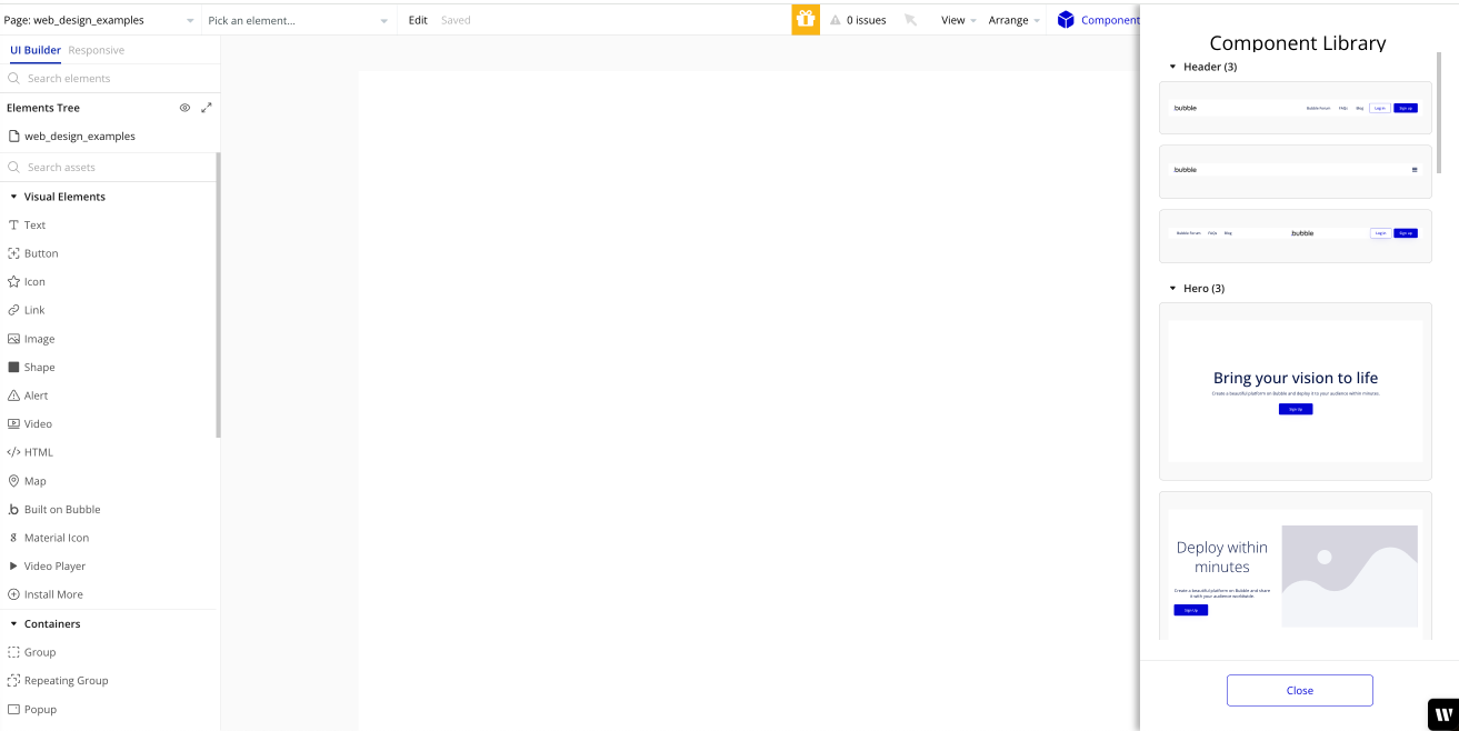
✔️ Find a component library or example web apps you can work from. (See some of our favorite web app examples below!)
✔️ Build out the user interface of your app based on your design system.
✔️ Customize any pre-built components to fit your brand.
Step 5: Follow best design principles as you build
As you build, it’s super important to be sure you’re following best practices for design. This will make sure your user interface is intuitive and help you stay consistent.
Here are some of the key design principles to follow:
Give the user a trail to follow
Always avoid empty states throughout your web app. As Christine says:
“You should never have an empty box. It should always have some kind of notification, like ‘Your search results are empty. Try this instead.’ You want to give them another thing to grab onto or a little signal to follow.”
Always including a guide or trail for the user to follow to the next step provides a seamless user experience, and also helps users recover when they get stuck.
Put tools for similar tasks in proximity.
The goal here is to make it easy for the user to find everything they need for a task, and to progress smoothly from one step to the next.
Or as Matthew says:
“This is especially important if you’re designing a complex, nonlinear tool with an open user flow. When the user can go in a thousand different directions at any time, it’s really important to consider, ‘What tasks is the user trying to do?’ Then consider how you solve those problems and design the UX so the items they need are in close proximity to the others.”
For example, if you’re designing a photo editing tool, you may put the crop and resize buttons near one another, or put the healing tool next to the eraser tool.
Basically: If you expect it to be there, it should be there.
Don’t give your users everything all at once.
This is the principle of progressive disclosure. Avoid confusing users by showing them every possible option all at once. Doing so is unhelpful because it doesn’t show them where to go next.
Instead, take Christine’s advice:
“Don’t show them all of their options. Give them just a few and be smart about it. Show them your best options, or even their immediate, best next step. Then if they want, they can get into the more advanced customizations and go further.”
For example, if you’re building a productivity work management tool, you don’t need to show users every possible board style at once. Instead, a popup when they get started to create their board in a calendar view or a Kanban view can give them a clear place to start.
Preserve user confidence by avoiding dead ends.
In any situation, you want your user to clearly understand what’s working — or what’s not — and where to go next. You never want to have a user take an action and then the program simply doesn’t work, without any detail about why or what to do instead.
Matthew explained it this way:
“It’s really important to think about this because there’s so many different actions you can take within most web apps. There can never be a dead end like, ‘I dragged this element onto my dashboard and it won’t let me drop it there, but it doesn’t tell me why.’ That’s a dead end. Now the user doesn’t know what to do.”
Instead, you want to create popups and notifications at these points that instruct the user what to do instead, or tell them why something isn’t working.
This is also a key way to preserve user confidence. As Matthew points out, “As soon as one small thing doesn’t work as expected, it can really tank user confidence and that might stick with them forever.”
Avoiding dead ends for your users can help preserve their confidence in your product and make it easier for them to use.
✔️ Always give the user a trail to follow.
✔️ Put tools needed for similar tasks in close proximity.
✔️ Don’t give the user everything at once.
✔️ Preserve user confidence by avoiding surprises.
✔️ Avoid dead ends in your UI.
Step 6: Test, launch, and iterate
At this stage, the foundations of your web app design are in place and functional for users. The key now is to get your web app to real users who can benefit from it and provide feedback for you to improve it.
Before you launch, you want to run some usability tests. Usability testing allows you to see how the user interacts with your product. This helps you make sure the design is user-friendly and intuitive, and further validates your design system.
If there are major problems, you’ll be able to make adjustments before launching it.
Once you launch, don’t stop testing and iterating — that’s how your product continues to grow and improve. Implement a regular testing process and add the feedback you get to your product development roadmap or backlog.
✔️ Launching your app to start growing your audience.
✔️ Testing your app with real or potential users via user testing and usability testing.
✔️ Prioritizing user feedback for iteration and improvements to your app.
Five great web application design examples
As Christine said, sometimes it helps to start with examples of web application design and then customize it to fit your own needs, audience, and brand.
Even better, she told us, “A lot of companies have their design systems open to anyone. As a designer, you can go in and see how they’ve written their documentation, how they’ve categorized components, and whatnot.” This inside look into other brands’ design systems can give you a major head start when creating your own.
For a good starting place on where to look for effective web app designs, Christine and Matthew gave us a few of their favorites:
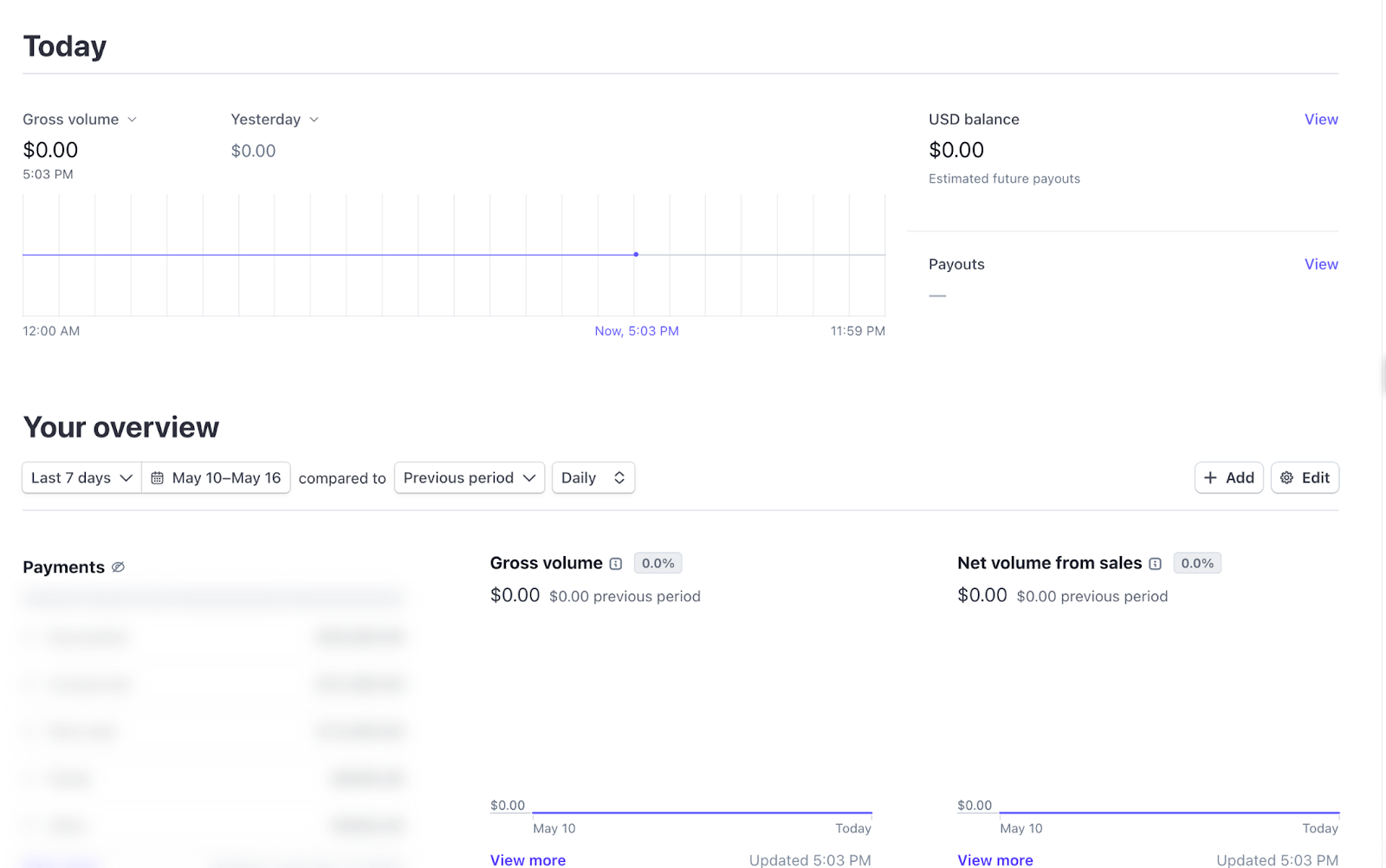
Stripe: Clear user flows
Stripe is a payments app that has lots of complicated user workflows. They’ve designed their web app in a way that makes those workflows obvious and clear to the user, and also organizes the (often messy) payments and financial data in a way that makes sense.
For example, they’ve used the “No empty spaces” rule, especially for new users.
Instead of having a blank payments page for users who haven’t received any payments yet, they highlight common first workflows (design principle: progressive disclosure) to get users engaged right away.
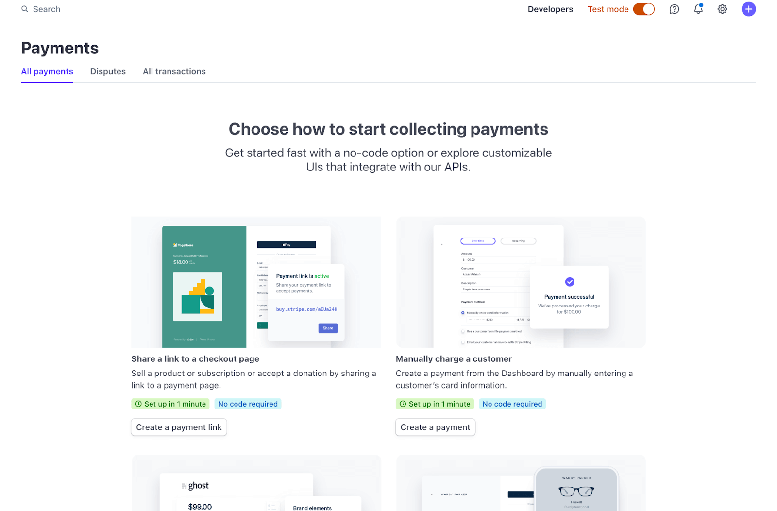
The homepage organizes user data in clear structures, making it easy for users to understand their payments and finances in the app.
You’ll also notice they haven’t chosen a complicated design system. With so much data being stored and manipulated in their web app, a simple, clean interface for users makes it easier to manage and interpret data quickly.
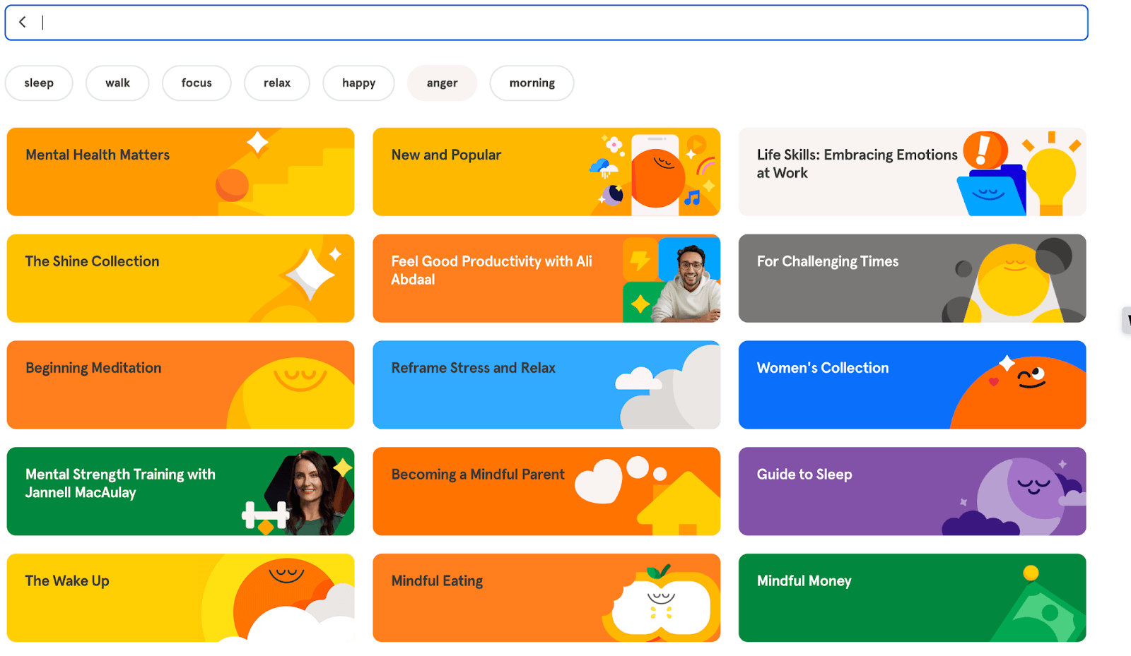
Headspace: Focuses on user needs
Headspace is a great example of design that focuses on the user’s needs at every stage (see Step 1: Define the Problem).
Headspace, a meditation app, knows that their users are overwhelmed and looking for guidance on how to relax and focus. Their web app design mirrors their native mobile apps (design principle: simplicity) and creates a calm, focused user interface design.
For example, when you log in, you’ll immediately land on a meditation page with their best short meditations, which encourages users to get started.
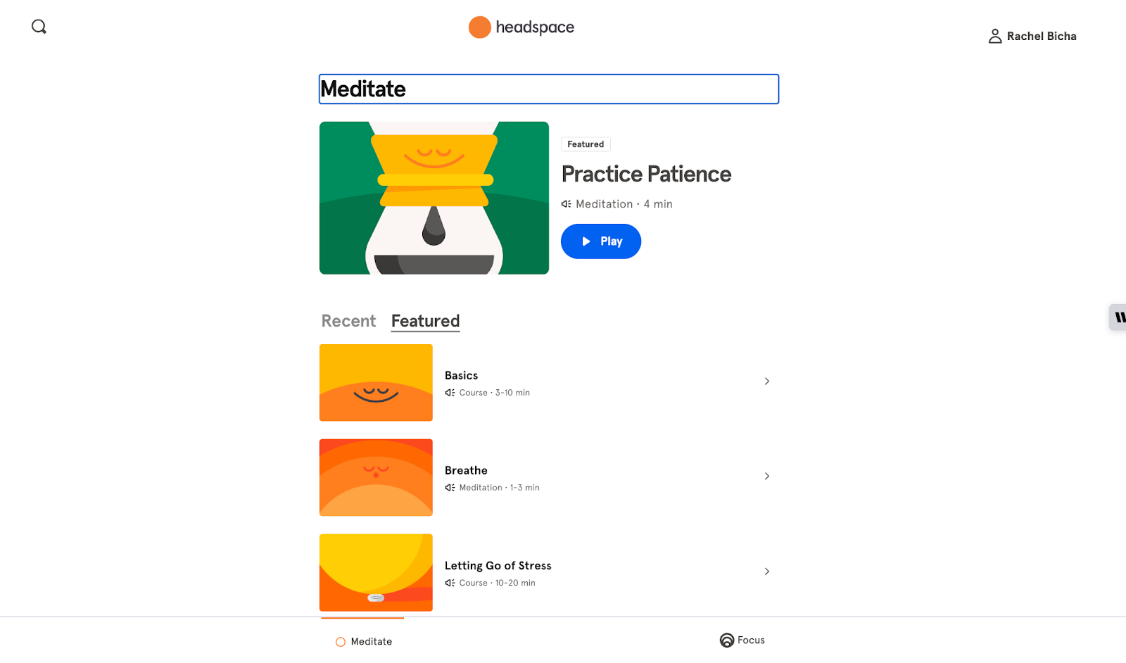
If you want to search for something specific, pre-set searches like “sleep,” “focus,” and “relax” and categories like “Reframe Stress and Relax,” “Guide to Sleep,” and “Becoming a Mindful Parent” help users find what they’re looking for right away.
Even the meditation screens themselves are designed well.
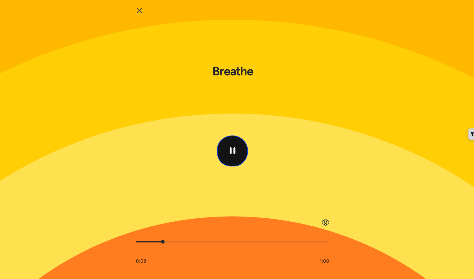
The design supports user goals and needs (to slow down and meditate) with a very simple design that stays visually consistent with their brand.
Uber: Solution-focused simplicity
Uber’s web app is a great example of a clear design that laser-focuses on the solution: finding a ride from Point A to Point B.
From the web app's homepage, there’s no way a user could get lost. All you have is a map, a menu to fill in your pickup and dropoff location, and the pickup time.
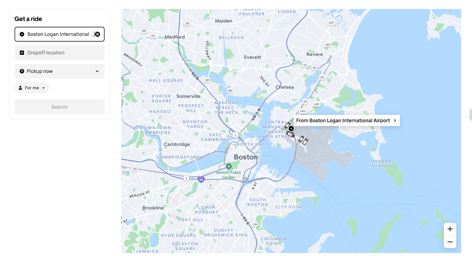
Once you’ve made your search, users can easily see different options and request the one that works for them.
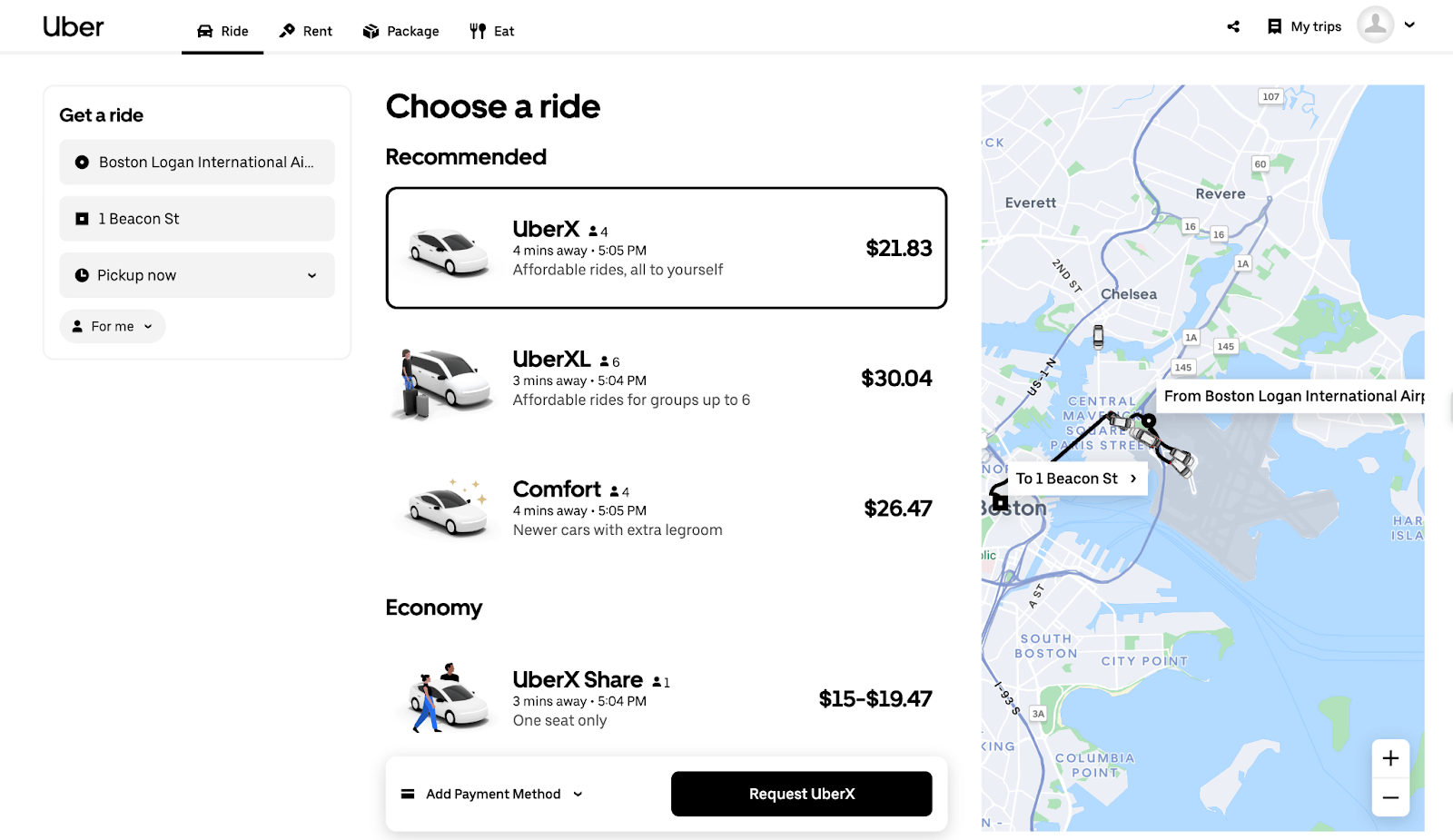
There aren’t any bells and whistles, which results in a clean, straightforward design that anyone could use easily.
Missy Kelley, our head of product design, added that Cash App is another great example of solution-focused simplicity.
“It was the BEST example of an MVP with a crystal clear purpose. The interface is straightforward. They don’t try to do too much. It’s just so simple.”
And as a result: It serves its purpose perfectly.
Loom: Loads of user prompts
Loom is a great example of including user prompts and easy-to-follow trails and guidance in your design to make things easier for your user.
Take a look at the Loom homepage, for example.
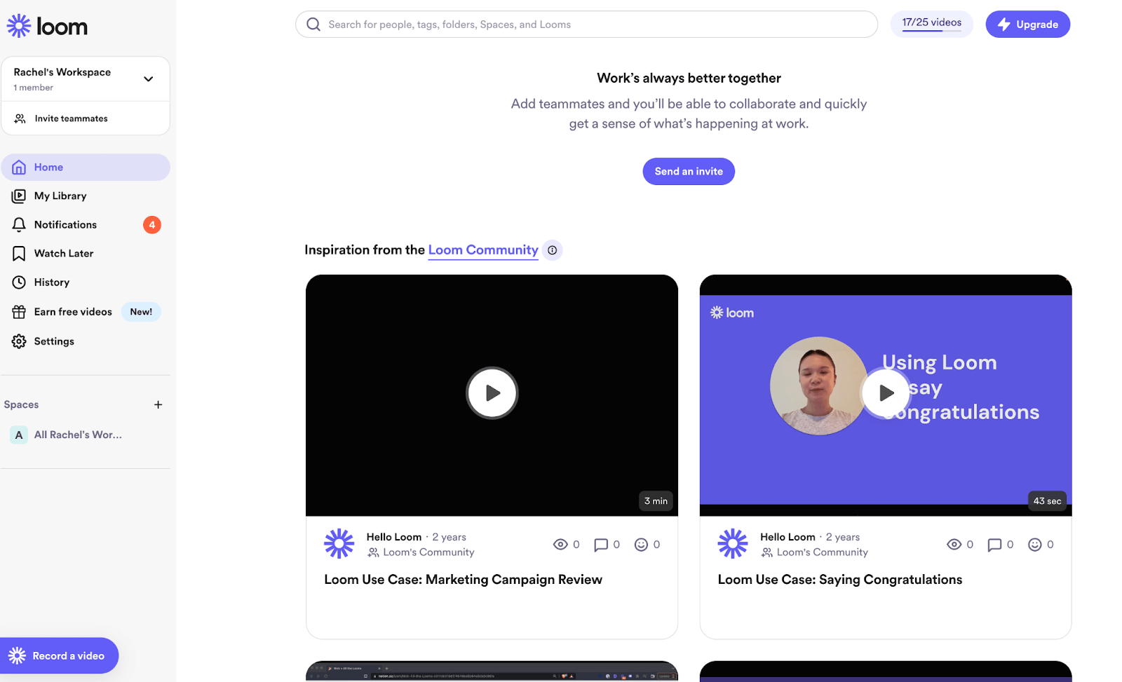
You can see:
- The most important “first steps” for users highlighted with purple buttons (“Upgrade,” “Send an invite,” and “Record a video”).
- Video demos on the homepage show you right away how to get started.
- The “Record” button in the fixed sidebar menu means users can always easily start the main function of the product from any page.
Loom’s design system (see Step 3: Move on to the design system) also gives users a clear, consistent message about what matters most on this page. Like our other examples, they’ve followed the “no empty states” rule by pre-populating the search bar and showing icons even when a video doesn’t have views, reactions, or comments.
Notion is another great example of a product that prioritizes user prompts and clear design systems to guide users through their experience.
“[Notion] has a good balance of features that range from beginner to advanced, and they do a good job of giving users tools as they engage with it and not a moment before! I also love their modular “blocks” concept that spreads throughout. I feel like they prioritize working in systems. Users don’t even have to think about it, but it makes it more efficient with little to no effort.” — Nishita Aswani, Senior Product Designer
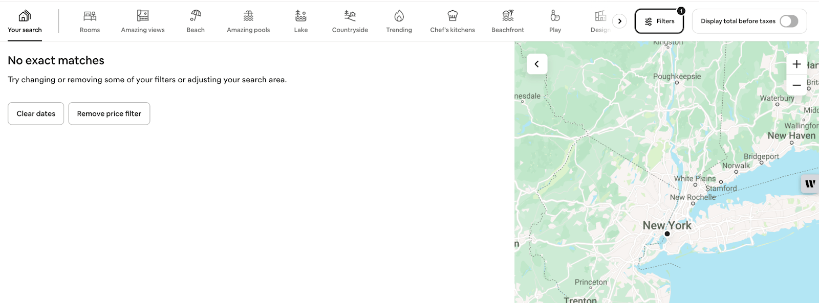
Airbnb: Highlights best design principles
Airbnb is a really commonly cited brand with great design, but it’s only because they really do highlight so many best design principles.
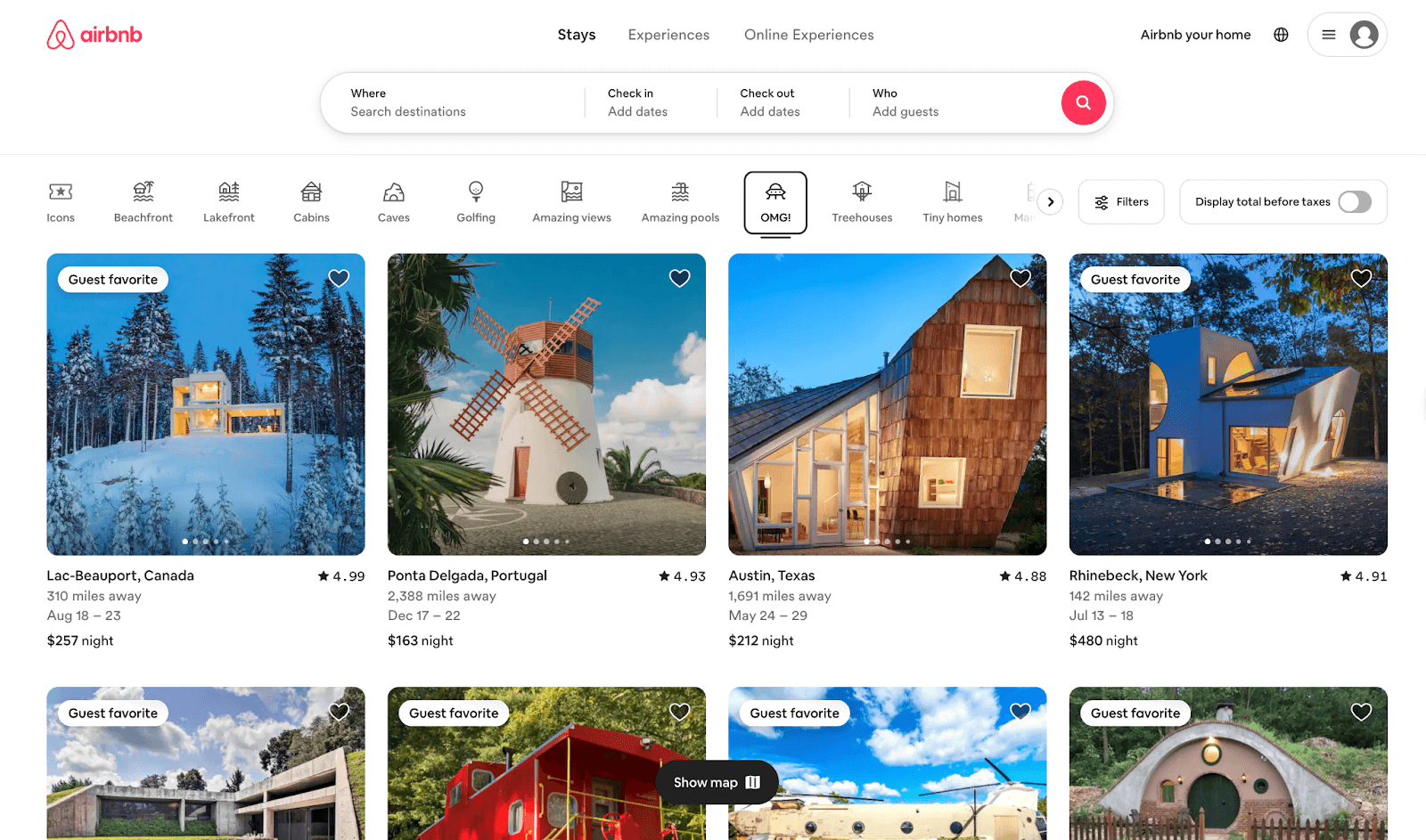
For example, they’re a great example of:
- Cohesive design systems. Their brand design, colors, logos, graphics, fonts, and so on are cohesive across their pages and products. This makes them very recognizable and strengthens the visual identity of their brand.
- Progressive disclosure. Airbnb doesn’t show you a list of all the options at once, or a giant map with pins for all their listings. Instead, they show you a page with some of their best available listings right away to spark your interest.
- Using proximity. The search bar at the top lets you get started easily by setting your location, dates, and group size to find relevant listings. There are prompts at every step to help you navigate through the workflows.
- No empty states. If your search doesn’t turn up any results, the screen prompts you with one-click buttons to make suggested changes and get the results you need.
Designing your web app with Bubble
Your web app design project involves much more than just picking out the right colors and fonts.
With Bubble, every step of the design process is simplified:
- Built-in databases help you organize data quickly — and keep it organized.
- Pre-made components based on best design principles get your design system off to a great start.
- No-code tools let you build with a visual editor, rather than coding everything from scratch.
- Testing integrations and APIs make it easier to test your app and gather feedback.
- Hosting options let you launch your product with Bubble and scale quickly.
Besides all that, Bubble’s visual, no-code web app development platform takes your app from wireframe to MVP to V1 launch and beyond all in one place. This makes iterating on your app even easier, at any stage of the process.
Better yet: Building on Bubble is free until you’re ready to launch.
So what are you waiting for?
Build for as long as you want on the Free plan. Only upgrade when you're ready to launch.
Join Bubble