TL;DR: Good dashboards show a focused set of metrics matched to the right type (operational, analytical, strategic, or tactical) based on who needs them and why. Getting there means cleaning your data, setting access controls, picking chart types that fit your data, and adding filters and drill-downs so users can explore.
If you’ve ever tried to get a clear picture of how your business is performing and ended up staring at a spreadsheet, waiting on a developer, or prompting an AI tool in circles, you already know the problem. The data is there. Getting it into a dashboard you can actually use is the hard part.
This guide walks you through building a dashboard in Bubble: how to pick the right dashboard type, define your metrics, connect your data, customize your visuals, and deploy across web and mobile. It’s faster and more affordable than bringing in a developer, and you won’t need to prompt your way out of every small change.
What are the four types of dashboards?
The four types of dashboards are operational, analytical, strategic, and tactical. Each category is defined by who uses it and what decisions it drives — a real-time operational dashboard for a support team looks nothing like an executive strategic dashboard tracking quarterly KPIs.
Operational dashboards track real-time performance against key metrics. Support teams use these to monitor ticket volume and response times throughout the day. They require live data connections and focus on immediate actions — if the number spikes, someone needs to respond now.
Analytical dashboards help users explore historical data to identify trends and patterns. Marketing teams use these to compare campaign performance over the last quarter. They include extensive filters and drill-down capabilities so users can investigate the “why” behind the numbers rather than just the “what.”
Strategic dashboards give executives a high-level overview of company performance against long-term goals. They track KPIs like monthly recurring revenue or customer churn. These dashboards prioritize clarity and simplicity over deep exploration — the CEO doesn’t need to drill into individual transactions.
Tactical dashboards sit between operational and strategic views, helping mid-level managers track departmental goals. A sales manager might use a tactical dashboard to monitor their team’s weekly quota progress and pipeline health. These dashboards balance the immediacy of operational views with the goal-orientation of strategic ones.
Define your dashboard’s goals and key metrics
A dashboard is a visual display of your most important data, designed to help you make specific decisions faster. Before you touch any tools, you need to define exactly what decisions your dashboard should accelerate. Without this clarity, you’ll end up with a cluttered screen full of metrics that look impressive but don’t actually help anyone.
Start by identifying your primary users and their needs. An executive dashboard tracking company revenue needs different metrics than a manager’s dashboard showing daily team productivity. Each audience makes different decisions and needs different information at different levels of detail.
Focus on actionable metrics that drive specific decisions, not vanity metrics that just look good. Total website visitors is a vanity metric, but conversion rate by traffic source is actionable because you can decide where to invest your marketing budget.
Ask yourself: “If this number changes, what would I do differently?” If you can’t answer that question, the metric probably doesn’t belong on your dashboard.
As a rule of thumb, keep dashboards focused (often around five to nine core metrics) and add secondary views only when users need more detail. Connect each metric to a specific action or decision point, and define what success looks like for your specific use case, whether that’s faster response times, better forecast accuracy, or clearer visibility into team performance.
Connect and prepare your data sources
Before you can display anything useful, your dashboard needs data to work with. That might be your own database, a third-party service, a spreadsheet export, or a live API feed. For most real dashboards, it’s some combination of all of these. Getting the connections right from the start saves a lot of rework later.
Bubble includes a built-in database and integration tools to connect external services, so you don’t need to build custom backend infrastructure. The Bubble AI Agent (beta) can also help you structure your data and generate privacy rules to review as you go.
Set up data connections and relationships
Start by listing all the data sources you need. Most dashboards pull from multiple sources: internal databases, third-party services, spreadsheets, and APIs. Understanding what data lives where helps you plan your connections strategically.
Bubble includes a built-in database for your core data. The API Connector connects to compatible REST APIs, and the SQL Database Connector plugin connects to PostgreSQL, MySQL, and Microsoft SQL.
From there, define relationships between different datasets. Data relationships use common fields to link different tables or datasets together. Think of it like a digital filing system where customer IDs, timestamps, or product codes act as connecting threads between different pieces of information.
Setting these up correctly ensures your dashboard can answer complex questions across your entire data landscape.
Clean and structure data for dashboard use
Clean data means accurate, consistent information without duplicates or missing values. Before any dashboard can deliver insights, the underlying data needs preparation.
Remove duplicate entries, handle empty cells appropriately, and standardize formats across your datasets. Make sure all dates use the same format and all currency values include the same decimal places.
Organize your data in dashboard-friendly formats with clear, descriptive column headers. Avoid technical database naming conventions that make sense to developers but confuse business users — instead of “cust_acq_dt,” use “Customer Acquisition Date.”
This pays off on Bubble when you’re selecting data fields for charts and filters. Both the AI Agent and the visual editor surface these names directly, so clear labels make the whole build faster.
Create realistic sample data to validate your dashboard logic before connecting to live production data. Sample data lets you test whether calculations work correctly, charts display properly, and filters behave as expected. This testing phase catches errors early when they’re easier to fix.
Configure privacy rules and access controls
Customer data privacy needs to be built in from the start. Every dashboard handling user information needs security controls that determine who can access which data.
Row-level security filters data based on user attributes or team membership. A regional manager logging into a sales dashboard would see only their region’s data, while a VP sees all regions. Field-level permissions control access to sensitive columns like salary information, personal contact details, or confidential business metrics.
Bubble’s visual privacy rules let you control who can see which data without code. When the AI Agent creates data types, it can generate accompanying privacy rules to review and customize. You can configure access by role so sales reps see only their own data, managers see their team’s, and executives see everything. Sensitive fields can also be hidden at the column level.
Important: Bubble’s Data Processing Addendum prohibits processing certain sensitive data types including Social Security numbers, biometric information, passwords, financial account credentials, payment card information subject to PCI DSS, and personal data of children under 16. Review the DPA before processing personal data to ensure compliance.
Generate your dashboard foundation with AI
With your data model planned, Bubble AI can generate a dashboard in minutes, including layouts, UI elements, data types, sample data, and supported expressions and workflows, that you can inspect and refine visually. Charting, API-backed datasets, and complex calculations may need manual configuration in the editor. The AI Agent helps you refine your dashboard through natural language prompts, or you can edit directly in visual workflows.
Craft effective prompts for dashboard generation
Structure your prompts to include four key elements: audience, metrics, time periods, and interaction requirements. For example: “Create an executive sales dashboard showing monthly revenue, conversion rates, top five products by revenue, and regional breakdown, with filters for date range and sales region.” This specificity helps Bubble AI make better decisions about chart types and layout.
Start with an initial prompt, then use the AI Agent to refine and iterate, or switch to the visual editor for anything more complex or precise. More complex chart logic, comparisons, or plugin-based chart changes may need manual configuration.
The more context you provide about how the dashboard will be used, the better Bubble AI can optimize the layout and interactions. Tell it whether users will view your dashboard on large screens in conference rooms, individual desktop monitors, or mobile devices. These details influence everything from chart sizing to filter placement.
Review and validate your AI-generated components
After Bubble AI generates your dashboard, everything is visible in the visual editor as pages, data types, and workflows you can inspect directly. Validate the following:
- Chart types match your data: Bar charts work for comparisons, line charts for trends, pie charts for part-to-whole relationships. Ask the AI Agent to explain supported Bubble elements, workflows, expressions, and data structures; plugin-based components and some external integrations may require manual review.
- Data fields connect correctly: Verify that Bubble AI connected the right data fields to charts. If it used “Order Date” when you wanted “Ship Date,” ask the AI Agent to fix it, or change the data source yourself in the visual editor.
- Calculations produce expected results: Test with known data points. If you know last month’s total revenue was $50,000, verify that the dashboard shows that exact number. Run through different filter combinations to ensure that the dashboard updates correctly and maintains accuracy across all scenarios.
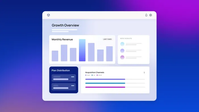
Choose the right visualization types for your data
Picking the right chart type makes your dashboard instantly more useful. Here’s what works best for different scenarios:
- Bar charts work well for comparing values across categories — think revenue by product line or performance by team member. They make relative differences immediately visible.
- Line charts reveal trends and patterns over time, making them ideal for tracking metrics like daily active users or monthly sales growth. Use them when the x-axis represents a continuous time period.
- Tables work best when users need exact values or detailed breakdowns that visualizations would hide. Use them sparingly, as they take more mental effort to interpret than charts.
- Gauge charts effectively display single metrics against targets, like showing quarterly revenue at 87% of goal. They’re useful when the question is “how close are we?” rather than “what’s the trend?”
Once you’ve chosen your chart types, use size, color, and position to guide attention to what matters most. Place critical metrics in the top-left corner where eyes naturally start scanning. Make primary charts larger than secondary ones. Use color strategically to highlight performance: green for on track, yellow for caution, red for concerning.
Customize visuals and add interactivity
A generated dashboard is a starting point, not a finished product. Refining the visuals and adding interactive elements is what turns static charts into something users can actually explore.
The visual editor is where you make it yours. Adjust layouts, swap chart types, restyle elements, and layer in interactive controls so the final result matches exactly what your users need.
Add filters, drill-downs, and interactive elements
Filters let users customize their view without creating multiple dashboard versions. Here are the most useful types:
- Date range filters are nearly universal. Most dashboards benefit from letting users select specific time periods to analyze, whether that’s comparing this quarter to last or drilling into a specific week.
- Dropdown selectors work well for categorical filters like region, product category, or customer segment. They keep the interface clean while offering clear options.
- Multi-select options give users flexibility to compare specific subsets of data. A marketing dashboard might let users select multiple campaign types to compare their performance side by side.
- Search boxes help when you have many filter options (think searching through hundreds of customer names or thousands of product SKUs).
- Drill-down navigation enables users to click from summary views into detailed breakdowns. Clicking on a revenue chart showing all regions might navigate to a detailed view of that specific region’s performance. This progressive disclosure keeps the main dashboard uncluttered while still providing access to deeper analysis when needed.
- Hover tooltips display exact values and additional context without cluttering the visual. They’re especially useful for dense charts where labeling every data point would create noise.
- Dynamic parameter controls let advanced users adjust calculation methods or comparison periods on the fly. Keep these advanced features accessible but not prominent — most users want the default view to just work.
Design for clarity and performance
A gorgeous dashboard that takes forever to load or leaves users scratching their heads is a failed dashboard. Simple design principles can turn a jumble of charts into a story that actually makes sense, and good performance practices keep everything responsive even with large datasets or many concurrent users.
Style variables are your friend here. Define your colors, fonts, and spacing once in your app’s style variables, and they’ll apply consistently across your entire dashboard. The AI Agent picks up these style variables when it generates new elements, so everything looks cohesive and professional without extra work.
When it comes to organizing your metrics, think in logical groups using containers:
- Put all your revenue metrics together in one section so executives reviewing financial health don’t have to scan across the page to compile the picture.
- Give customer metrics their own dedicated space. Acquisition, retention, and satisfaction sit naturally together when a support or success lead is investigating churn signals.
- Keep operational metrics separate from financial data so an ops manager monitoring ticket volume isn’t visually competing with a CFO scanning revenue.
Good grouping helps users find what they need faster and spot connections between related metrics.
Bubble’s infrastructure handles scaling automatically, so you can focus on design choices that keep the experience fast. If you’re working with large datasets, try loading just the current month by default and letting users expand the date range from there.
Test your dashboard on different devices. Bubble AI-generated UI elements are responsive by default, and you can use Bubble’s responsive design tools to fine-tune how charts and tables look on mobile.
Publish and share your dashboard securely
Once your dashboard is ready, Bubble handles the deployment side: hosting, scaling, and security are built in, so you don’t need to configure infrastructure before going live. Web updates go live with one click. For native iOS and Android, Bubble’s mobile publishing flow packages and submits your build, with BubbleGo available for device testing before you submit.
On the security side, Bubble is SOC 2 Type II compliant at the platform level, with data encrypted in transit and at rest. Your app’s own compliance depends on how you configure and operate it — see Bubble’s security page for a full overview of what’s covered.
Configure security and user permissions
Security and permissions determine who can access your dashboard and what they can do with it. Decide whether your dashboard requires authentication, what access different user types need, and how to track data viewing. These decisions shape everything from login requirements to audit trails.
Bubble’s SSO integration (available on the Enterprise plan) lets users access dashboards with existing company credentials. Visual privacy rules control who can access which data, all configured without code. Internal dashboards typically require authentication, while public dashboards can allow anonymous access with appropriate privacy restrictions.
Once users are authenticated, Bubble’s permission system defines what they can do. Set read-only access for viewers, edit permissions for dashboard maintainers, and admin controls for user managers. Bubble’s Security Dashboard scans for issues such as exposed credentials, unsafe API configuration, missing privacy rules, and publicly accessible sensitive fields, with available checks and issue details varying by plan. Two-factor authentication adds extra account security; check Bubble’s current pricing and plan documentation for availability by plan.
Bubble server logs help you monitor and troubleshoot app activity, including processes, workflows, users, timestamps, and parameters. For formal compliance audit requirements, verify that the logging your app needs is configured accordingly.
Bubble provides a GDPR-compliant Data Processing Addendum (DPA) across all plans for apps processing personal data. For international transfers, Bubble’s GDPR documentation states that Bubble applies the EU–U.S. and Swiss–U.S. Data Privacy Framework Principles and continues to use EU Standard Contractual Clauses (SCCs) in its DPAs as extra protection. Bubble’s compliance documentation also identifies U.S. state privacy laws such as CCPA/CPRA, Colorado Privacy Act, Connecticut Data Privacy Act, Utah Consumer Privacy Act, and Virginia Consumer Data Protection Act as frameworks that may apply; review Bubble’s current DPA and consult counsel for your specific obligations.
Choose your sharing method
Different use cases require different sharing approaches. Here are the four main methods for deploying your dashboard:
Internal team access works well for company dashboards and team metrics. This method offers the highest security through SSO and role-based access controls, with full control over all elements and deployment to both web and native mobile apps. It’s particularly useful when your dashboard contains sensitive business data that only authenticated employees should see.
Public sharing with authentication fits client portals and partner dashboards. This approach uses Bubble’s built-in user authentication and privacy rules; token-based access requires an appropriate custom or API-based implementation. Users can view and interact with the dashboard, though customization is limited to viewing preferences. The dashboard works responsively on web browsers across all devices.
Embedded in apps integrates dashboards into custom portals and internal tools. For these scenarios, you can build dashboard experiences directly in Bubble or integrate Bubble data and workflows into another app using Bubble APIs, authentication, and privacy rules. More advanced embedding patterns may require custom implementation, with mobile support inherited from the host application.
Public anonymous access fits marketing metrics and status pages. This low-security option requires no authentication, making it appropriate for publicly shareable data. Users get view-only access with minimal interaction, and the dashboard works responsively across web browsers on all devices.
| Sharing method | Best for | Security level | Customization | Mobile support |
|---|---|---|---|---|
| Internal team access | Company dashboards, team metrics | High (SSO, role-based access) | Full control over all elements | Web and native apps |
| Public sharing with authentication | Client portals, partner dashboards | Medium (password or token-based) | Limited to viewing options | Web responsive |
| Embedded in apps | Custom portals, internal tools | High (API tokens, domain restrictions) | Programmatic control | Inherits from host app |
| Public anonymous access | Marketing metrics, status pages | Low (no authentication) | View-only, minimal interaction | Web responsive |
Deploy across web and mobile platforms
Modern dashboards need to work everywhere your users are: desktop browsers, tablets, and mobile devices. This means responsive design that adapts to different screen sizes and native mobile apps that provide the best mobile experience.
For web, the responsive preview in the editor lets you check how your dashboard looks across screen sizes before going live.
If you need a native mobile experience, you can build iOS and Android apps alongside your web dashboard from the same Bubble editor. They share the same database, workflows, and backend. Bubble’s native mobile apps run on React Native, enabling cross-platform development from a single codebase. Note that native mobile is currently in beta, so test thoroughly before publishing.
You can use Bubble AI to generate mobile app front ends alongside web app generation, then use Bubble’s mobile publishing flow to create builds, test through BubbleGo and TestFlight or Google Play testing tools, and submit to the App Store and Google Play Store. Check Bubble’s current pricing and mobile publishing documentation for plan requirements.
Embed dashboards in existing apps
If you want to show a Bubble-built dashboard inside another app or website, you have a few options. The simplest is iFrame embedding: Copy a snippet into your app’s HTML and the dashboard appears inline. It works well for basic cases, but gives you limited control over styling and authentication.
For tighter integration, Bubble’s Data API and Workflow API let your host app query data and trigger actions directly, so you can control exactly what each user sees based on their permissions. Whichever approach you use, restrict embedding to specific trusted domains and use Bubble’s privacy rules and API authentication to keep data secure.
Ready to start building? Get started for free on Bubble, then upgrade to a paid plan to deploy to the web or native mobile.
Frequently asked questions about building dashboards
What are the four types of dashboards?
The four main types are operational (real-time performance tracking), analytical (historical trend exploration), strategic (executive KPI overviews), and tactical (departmental goal monitoring). Each is defined by who uses it and what decisions it’s built to accelerate.
Can AI generate a dashboard for me?
Yes. Bubble AI generates a working visual foundation from a description of what you want to track, including charts, filters, and data connections. Charting plugins and more complex data configurations may need manual setup in the editor, but everything is visual and editable. From there, you can chat with the AI Agent to refine it or edit directly in the visual editor, with no code to decipher.
What is the best tool to make a dashboard?
The best tool depends on your use case. For standalone business intelligence reports, purpose-built tools like Tableau or Power BI are industry standards — but for dashboards built directly into a web or mobile app, or custom internal tools built without an engineering team, Bubble is the most effective visual development platform for the job.
Can I connect multiple data sources like databases and spreadsheets to one dashboard?
Yes. Bubble includes a built-in database for your core data, and the API Connector lets you connect to compatible JSON-based REST APIs, while the SQL Database Connector plugin lets you connect to PostgreSQL, MySQL, and Microsoft SQL. Spreadsheet data may require an API, plugin, or import workflow depending on the source.
Can different users see different data in the same dashboard based on their permissions?
Yes. Bubble’s visual privacy rules let you configure row-level security (so sales reps see only their territory’s data while executives see everything) and field-level permissions to hide sensitive columns, all without code. When the AI Agent creates data types, Bubble can generate accompanying privacy rules, which you should review and customize to ensure sensitive information is protected correctly.
What should I do if AI creates charts that don’t display my data correctly?
If Bubble AI creates something incorrectly, ask the AI Agent to fix it, or switch to the visual editor and change it yourself. Change chart types, adjust data mappings, modify calculations, and refine layouts with point-and-click editing, no code required.
Build for as long as you want on the Free plan. Only upgrade when you're ready to launch.
Join Bubble