There are so many terms for different kinds of apps: web apps, mobile apps, responsive, progressive —
What do they all mean?!
In this article, we’re here to break down what a responsive web app is and how they stack up to native mobile apps.
Want to jump straight to a specific question? Go ahead:
- What is a responsive web app?
- How did responsive design get so popular?
- What’s the difference between responsive apps vs. mobile apps?
- What are some core elements of responsive web design?
What is a responsive web app?
A responsive web app is an interactive piece of online software that’s designed to “respond” by automatically adjusting to fit the users’ screen size. Whether it’s a desktop, laptop, tablet, or mobile device, the web app will adjust to proportionally fit the space.
When you use responsive design for your web apps, you make sure your design looks great and functions well on any device. Without responsive websites, mobile experiences are a pain. You’ve probably experienced this yourself on “old school” websites:
- Having to scroll horizontally to read a full line of text
- Not being able to close a popup window because the “x” button isn’t displayed on your small mobile screen
- Sections of images or page elements being “cut off” from your screen view
- Text that’s too small to read on mobile or the page looks too “zoomed out”
On the other hand, a well-designed responsive web app will automatically adjust to fit all the content comfortably within your current screen size.
For example, take a look at Bubble’s homepage on desktop compared to on mobile:
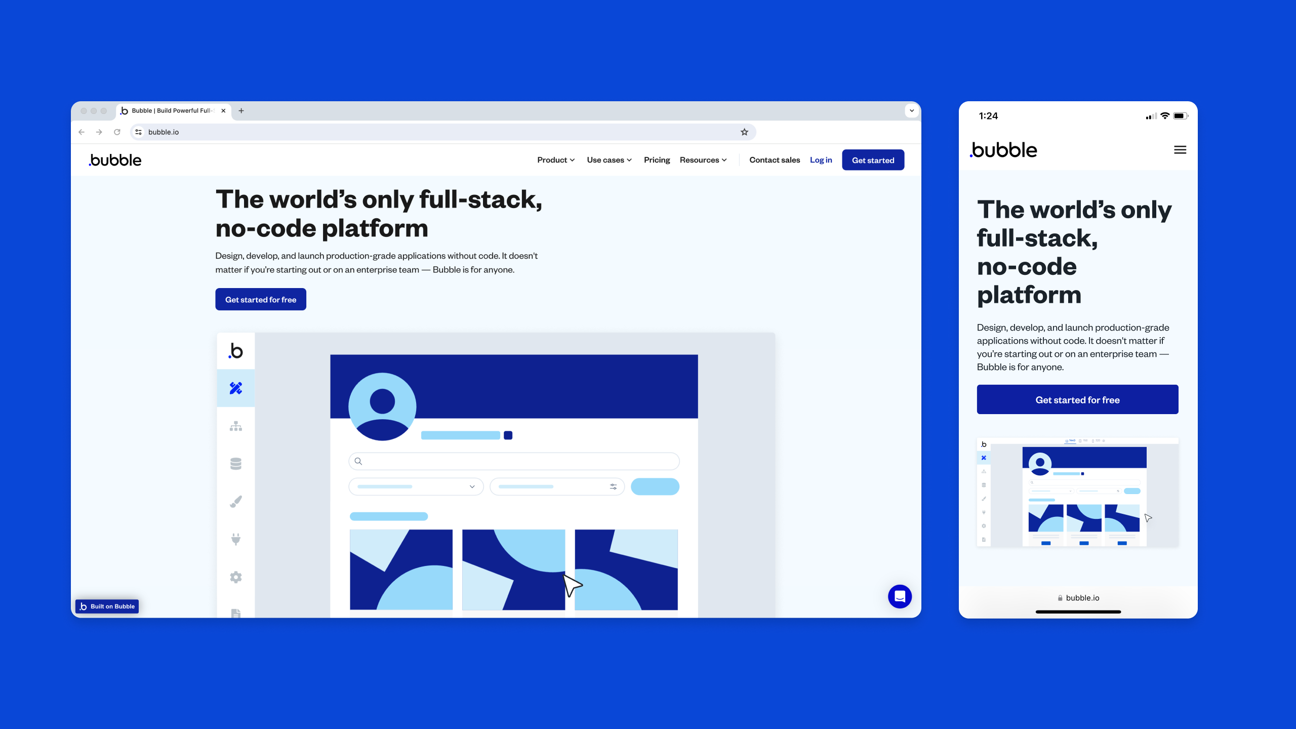
You see the same information, but it automatically resizes to comfortably fit within the width of the screen.
On the flip side, take a look at this non-responsive website on desktop vs. mobile:
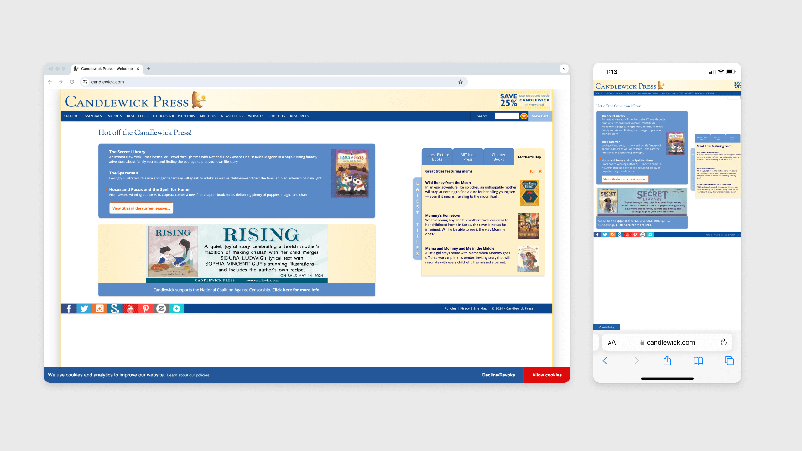
The mobile version simply shrinks the desktop version small enough to fit with the mobile device. It also requires you to scroll side to side to see the whole page.
Why responsive design matters
Before responsive design, designers and developers would create multiple websites or web apps — a standard desktop version and a mobile version. But in the 2010s, as more and more people started using mobile devices, device sizes also got more and more irregular.
There wasn’t just a standard desktop and mobile size. There were smaller mobile phones (like the iPhone SE) alongside those with much larger screens (hello, iPhone 15). There were iPads and tablets and small 13-inch laptops and Apple’s 32-inch retina Pro display.
Today, mobile traffic is more important and widespread than ever. In 2023, a sample of 100 popular websites received 313% more visits on mobile devices than desktops (according to SEMRush’s traffic analytics). Responsiveness and “mobile friendliness” is also an important ranking factor for Google, so a non-responsive website can directly translate to lower web traffic and lost business.
As mobile becomes the default, responsive apps make sure users can visit your site easily on any device. Modern website builders (like Wordpress) or no-code web app builders (like Bubble) are built with responsive design principles in mind, so you can easily create a responsive web app.
Responsive web apps vs. mobile apps
An important distinction: Responsive web apps and mobile apps aren't the same.
Responsive web apps are web apps that use responsive design so they can be used easily on any device.
Mobile apps are designed for a specific mobile operating system (OS), and they’re stored directly on the device.
There are lots of differences between responsive web apps and native mobile apps. Understanding these can make it easier to decide which you should build for your product.
| Responsive web apps | Native mobile apps | |
|---|---|---|
| Costs and resources |
Web apps are typically more cost-effective and require fewer resources, since they’re simpler to design. |
Native apps require more resources (and therefore cost more), since they’re designed for specific platforms. |
| User experience |
Web apps deliver good user experiences, comparable to using the product on desktop. |
Mobile apps deliver better user experiences since they’re designed specifically for that device (and can use device-specific features). |
| Functionality |
Web apps can be just as functional as a desktop version, but can lack some functionality compared to mobile apps. |
Native apps can often be faster and more interactive, delivering increased functionality. |
| Connectivity |
Web apps typically require Wi-FI or internet connectivity to access. |
Many native apps have “offline modes” that don’t require Wi-Fi. |
| Local device access |
Web apps can only access some local device features (i.e., current location). |
Native apps can use local device features like interactions, push notifications, etc. |
| Reach |
Web apps can be used by unlimited audiences and on any device, anywhere. |
Native apps have a much smaller reach since they are designed for a particular device and must be downloaded for use. |
Let’s break down these different categories:
Costs and resources
When it comes to development costs and resources, web apps tend to be easier and less costly to build. Even though customers may prefer a native mobile app, web apps can be a great way to launch your product quickly and start building an audience.
Web apps tend to move faster because:
- Native apps are designed for specific platforms (i.e., iPhone or Android), which requires dev resources with those specific skills (unless you’re building on a no-code tool, like Bubble)
- Web apps can work on any device, making them an easier resource lift
- Web apps can be built quickly with no-code, meaning lower costs compared to traditional development
Native mobile apps are simply more time-consuming and require more specific development expertise, which means more time and investment is needed.
🏆 Winner: Web apps
User experience
A responsive web app should provide just as great of an experience on mobile browsers as it does on desktop computers. However, for many apps, the mobile browser version simply doesn’t deliver as great of an experience as the native mobile version. This is often because:
- Different browsers may display elements differently, causing consistency issues
- Responsive design may impact the look and feel of your web app, creating some brand inconsistency
- Native apps can use the device’s built-in interactions and features for a more seamless experience
However, a responsive web app should still deliver an exceptional user experience. And in some cases, users may prefer to do certain tasks on a desktop or laptop compared to mobile. For example, more than half of travelers still prefer to make bookings on a mobile web app or desktop site compared to a native mobile app.
As a result, you should consider the industry, audience, and function of your product to determine if a mobile app or a web app will provide the best experience.
🏆 Winner: Tie
Functionality
From a strict functionality perspective, responsive web apps and mobile apps should provide a very similar, if not identical, experience.
Native apps and responsive web apps can both:
- Use databases, workflows, and logic to allow users to complete tasks
- Have CRUD (create, read, update, and delete) capabilities that allow users to add and edit data
- Allow users to shop, purchase, and pay for items
- Allows users to login and customize their accounts
However, because mobile apps are designed for a specific platform — and thus, can use native features and interactions — using a mobile app can feel more intuitive. Mobile apps can also make use of some features and functionality (i.e., push notifications) that web apps cannot.
🏆 Winner: Tie
Connectivity
One major difference between web apps and native mobile apps is that you can design a basic version that can be used offline.
Since web apps are accessed via a browser, the user must have Wi-Fi or some internet connection to access them. This can make it difficult for users to access your web app in some environments, for example, when they’re traveling or in a remote area with poor service.
Mobile apps are stored directly on the user’s device, which allows for an “offline mode.” Offline modes can also store new data on the user’s device and later sync it to the cloud when the user regains internet connectivity.
🏆 Winner: Mobile apps
Local device access
Another benefit to a native mobile app is that mobile apps can use device features, functionality, settings, and interactions. For example:
- Accessing and importing the user’s contacts
- Touch gestures and other device-specific interactions
- Device location and GPS
- System storage
- Access to the device’s camera and microphone
With a responsive web app, you can build workarounds for some of these features, but it won’t be as seamless as a mobile app would be.
🏆 Winner: Mobile apps
Reach
When it comes to reach, scalability, and finding more customers, a web app gives you much more power and flexibility.
Since anyone can use a web app on any device, your audience is essentially unlimited. With a native app, you have to design and develop it for a specific platform. Then, your audience is limited to users who have that device.
Plus, getting users to download an app is a multi-step process. They have to hear about your app, go to your website, then go to the app store to download it on their device. With a web app, access is much simpler. This can often help users overcome the initial hurdle of trying out your product for the first time.
🏆 Winner: Web apps
Building responsive web apps easily on Bubble
If you’re considering a responsive web app, a no-code tool like Bubble makes responsive web application development even easier.
If you’re looking to make native mobile apps as well, you can use a wrapper to easily turn your responsive Bubble app into a native mobile app. (And coming soon: native mobile app development, without the wrappers!)
Either way, Bubble’s drag-and-drop visual editor uses a few basic building blocks and pre-set components to allow anyone to easily create responsive apps. You can also work from flexible layouts that automatically adjust for multiple devices.
On Bubble, there’s an infinite number of ways to do this, but there are four core components that make designing responsive web pages simple:
- Responsive columns
- Responsive rows
- Responsive parent-child alignment
- Responsive margins and padding
Prefer to watch an overview of Bubble’s responsive design tools? Here you go:
Responsive columns
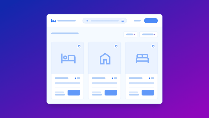
Bubble’s column container lets you align elements vertically. Whether you’re working with text boxes, images, buttons, or something else, columns make sure elements are resized or stretched accordingly based on screen widths.
For example, let’s say you have three long content boxes set for wide screens. On mobile, these will be resized to square boxes that fill the same percentage of the screen’s width, while still being stacked vertically.
Watch how to use them:
Responsive rows
Rows are similar to columns, but with a row, content aligns horizontally. Elements within the row container will be resized and wrapped for smaller mobile layouts to accommodate all the elements.
For example, a series of four images aligned horizontally on desktop might be resized to a 2x2 grid on mobile. Responsive rows are often used to design responsive nav bars, a key element of good mobile design.
See how it works:
Responsive parent-child alignment
Align to parent is a responsive design component that aligns any given component with a larger, “parent” container. Elements attached to a parent container will shift to the nearest grid point to maintain alignment based on screen size.
See it in action:
Responsive margins, padding, and gaps
Responsive margins, padding, and gaps are smaller responsive design tools you can use on any element to maintain the look and feel of your website on different devices.
For example, margins allow you to set consistent spacing around a certain element, while padding lets you set consistent spacing within a certain element. You can also set standard gap spacing to create consistent spaces between certain groups of elements.
As your elements move, wrap, and resize for different screen sizes, you can maintain adequate spacing so that your web app or web page looks familiar on every device.
Watch a detailed how-to on layout and spacing:
Start building mobile-friendly web apps with Bubble for free
On Bubble, building responsive web apps is simple — and free until you launch.
Use Bubble’s responsive design tools — combined with a powerful no-code visual editor — to design a single web app that can be used across any device.
Better yet: Native mobile apps are coming soon to Bubble. With native apps, you’ll be able to build once and ship everywhere — making the development and distribution process even faster.
Build for as long as you want on the Free plan. Only upgrade when you're ready to launch.
Join Bubble