Building a website for your SaaS tool shouldn’t be complicated.
However, with competing expectations from your C-suite, clients, and audience; business goals and needs; product-specific demands and branding decisions; and more, there’s a lot to juggle.
Thankfully, with SaaS websites, there’s a clear blueprint for the expected components that can help you balance all of these competing needs. Here’s what’s absolutely vital for your SaaS website to succeed.
In this article:
- Vital SaaS website elements
- Common SaaS website elements
- Building your SaaS app
- The best SaaS website examples
Vital SaaS website elements
No two SaaS websites are exactly the same, of course, but there are a few core elements that almost every SaaS website needs. Nail these elements, and you’ll be well on your way to having a standout website for your product.
Homepage
It’s pretty easy to understand why a homepage is important: It’s the first place your visitors land when they find your website or product. We all know how much first impressions matter. So make a great first impression with your website homepage by focusing on these three things:
- Make it immediately clear from your homepage (a) what your SaaS product is and does, and (b) what the central value proposition is. Too many SaaS websites speak about their product and its value in vague, jargon-y terms or buzzwords that make it difficult to understand what their product is and how it’s different from anything else on the market. Don’t make this mistake!
- Make sure your homepage matches and highlights your brand. Are you fun, edgy, authoritative, calming, simple, analytics-focused? Your homepage should match your branding and hopefully highlight what’s special about your product through design elements. Prioritize cohesive design between your product and the experience on your site.
- Keep it simple. A clean, well-designed SaaS homepage keeps the focus on the product and its value. Don’t clutter up your homepage with every little detail about your product. Instead, focus on the biggest ideas and leave the details for the other pages on your website.
Take Bubble’s website homepage for example:
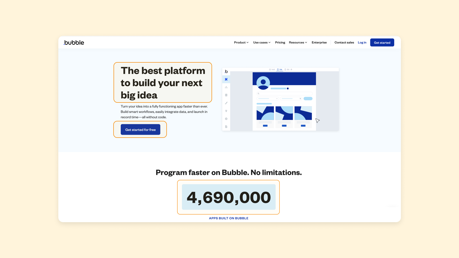
The page is clean and simple, while still highlighting:
- The product and what’s special about it
- Social proof (e.g., tracker of apps built on Bubble)
- Visual appeals, including a gif of how the Bubble editor itself works
- A CTA button giving visitors an obvious next step
The clear design matches Bubble’s branding while also highlighting some of Bubble’s core product differentiators: It’s clean, visual, simple, and easy to use.
Your homepage will likely be the most-viewed page of your website. Take your time with it to make sure you really get it right.
Pricing page
Your pricing page is another crucial element. Visitors want to understand exactly how much your product will cost and what they’ll get in exchange.
So again, don’t be vague here! Clarity is key. Giving visitors the information they want will help them trust you and understand your website better.
The best pricing model pages highlight:
- What each of the plans are and how much they cost
- What the subscription period is (i.e., weekly, monthly, quarterly, annually)
- How the plans compare to one another
- What each plan includes (at least the key elements)
- How to get started
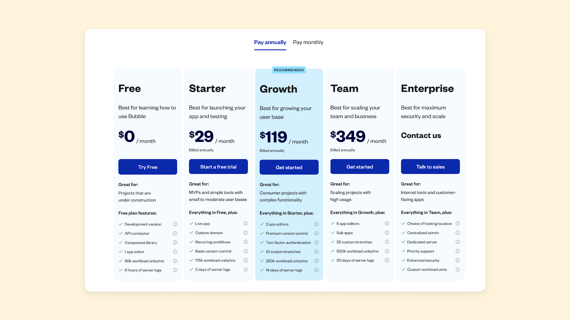
A pricing comparison chart is a common and effective way to lay out this information. It gives visitors a good idea of which plan is right for them, what the costs will be, and how to get started, without overwhelming them with detail.
Calls to action
Clear calls-to-action (CTAs) are a core piece of your SaaS website. They give the visitor a visual cue so they know what to do next, and prompt them to actually do it. CTAs commonly combine short statements with buttons, asking viewers to sign up for a free trial, schedule a demo, start an account, and so on.
However, many SaaS websites also have entire webpages dedicated to core calls to action. For example, on Bubble, you’ll find a page dedicated to contacting our sales team for a demo or more information on our Enterprise offerings:
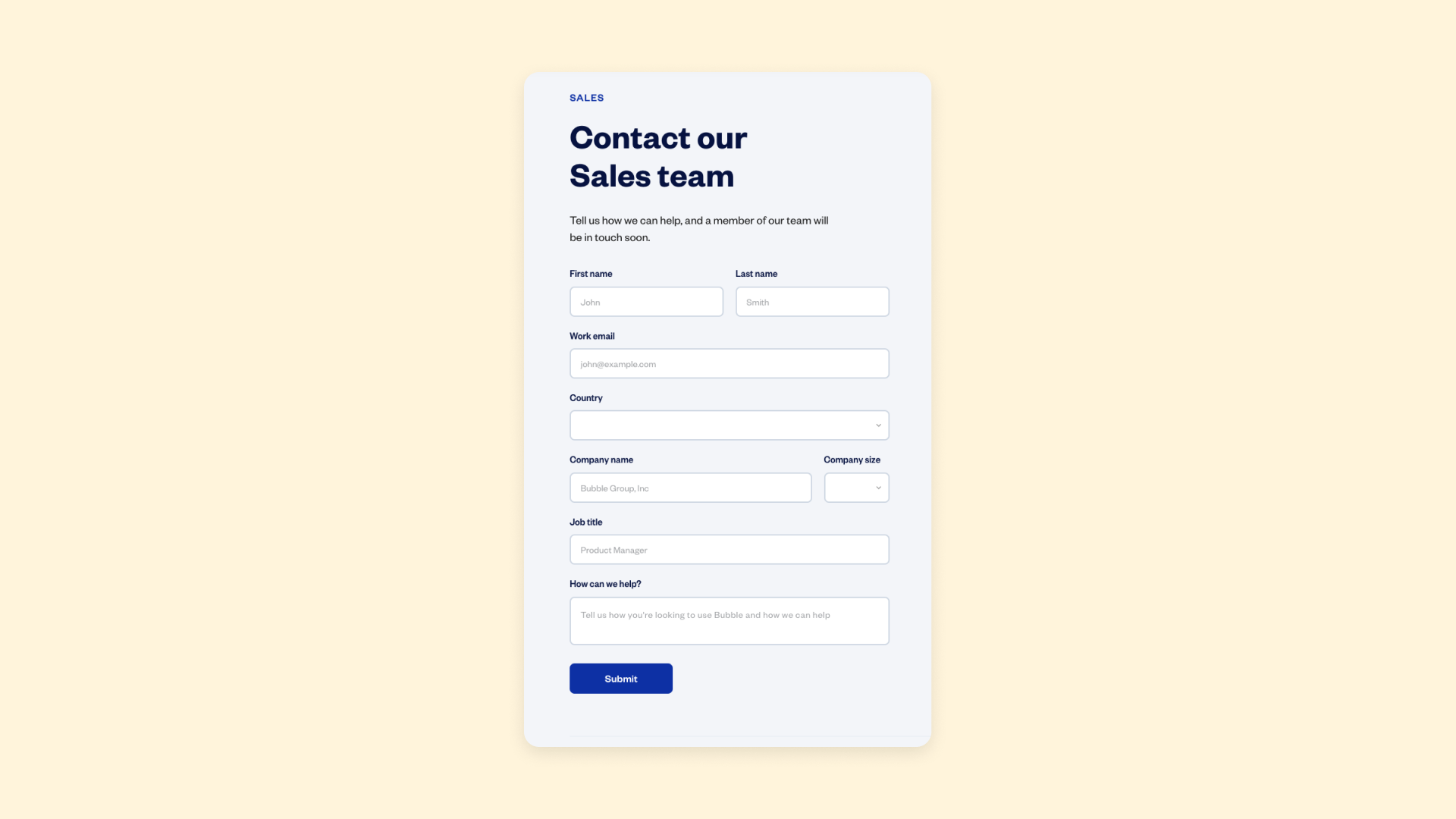
Other SaaS websites might have a demo page or a dedicated page for signing up for a free trial. These pages serve as an extended way to provide information, persuade the potential buyer, or gather more information from the visitor.
What’s the main action you want visitors to take after visiting your website? Consider creating a dedicated landing page for your primary call-to-action and see if you can improve conversion rates.
Common SaaS website elements
Aside from the big three mentioned above, there are plenty of other common elements in SaaS websites. Generally, which of these elements will be most useful for your business depends on:
- Your product and industry
- Your audience demographics
- The goals for your website
Here’s what other pages you may want to consider:
SaaS product pages
Product pages are a core element of most SaaS websites.
Unlike e-commerce product pages, which generally show visitors what the product is, product descriptions, and details so the visitor can add it to their cart and checkout, SaaS product pages are more like a high-level tour or overview of different aspects of the product.
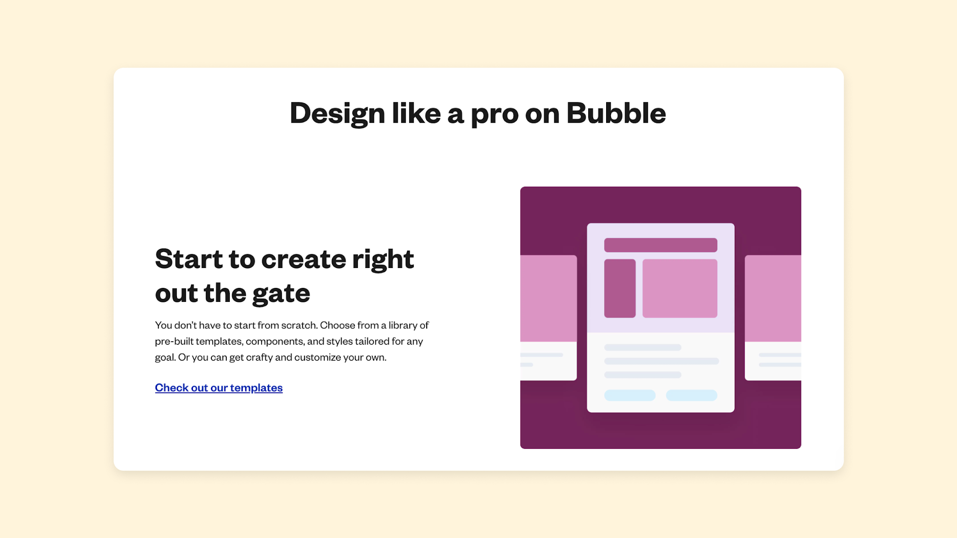
For example, on Bubble’s website, our product pages highlight unique aspects of Bubble, from our drag-and-drop visual editor, to the detailed logic and workflows you can build for your app. These product pages give users a more in-depth tour of how the product looks and works.
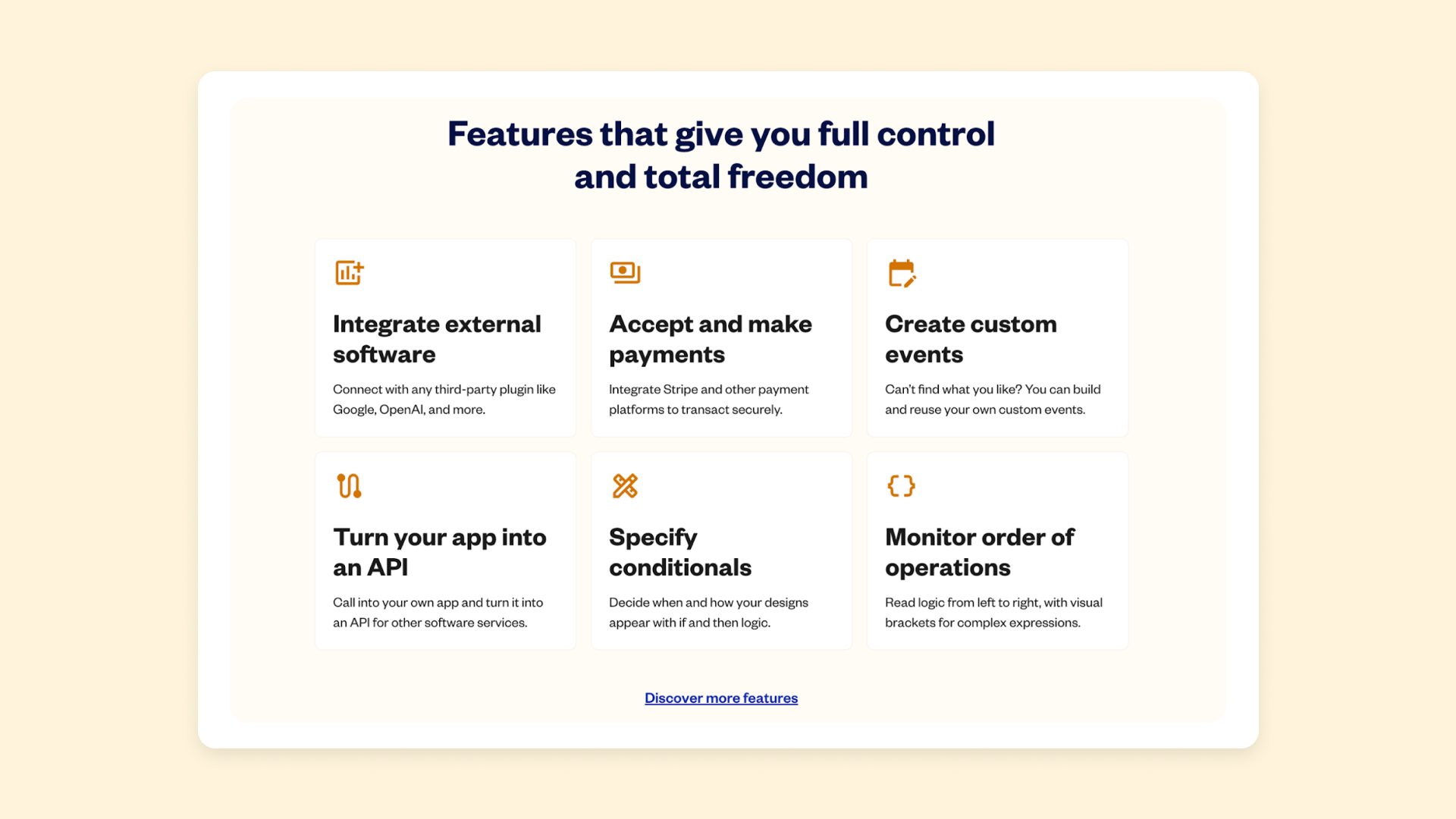
If you’re selling a simple, single product, your homepage may be enough to function as a product page.
However, a dedicated product page is usually a good idea if:
- You’re selling multiple products or package your software into different plans(Add product pages for each).
- You need more space to highlight the elements of a more complex product.
- Your product is unique or will be unfamiliar to your audience (Make sure to have several videos or walkthroughs to help make it obvious how your product works).
- Your audience has to navigate a lengthy buying process prior to purchase.
Feature pages
Feature pages, similar to a product page, describe specific features and elements of the product, and why they’re helpful (i.e., what the value proposition is for the audience). Feature pages are a great idea for most SaaS tools. They give you space to dive deeper into everything your product offers and make the case for why visitors should use your software instead of another option.
You can consider making a single “features” page that highlights the core features of your product. Or, you can create separate pages for each major feature, like Airtable does.
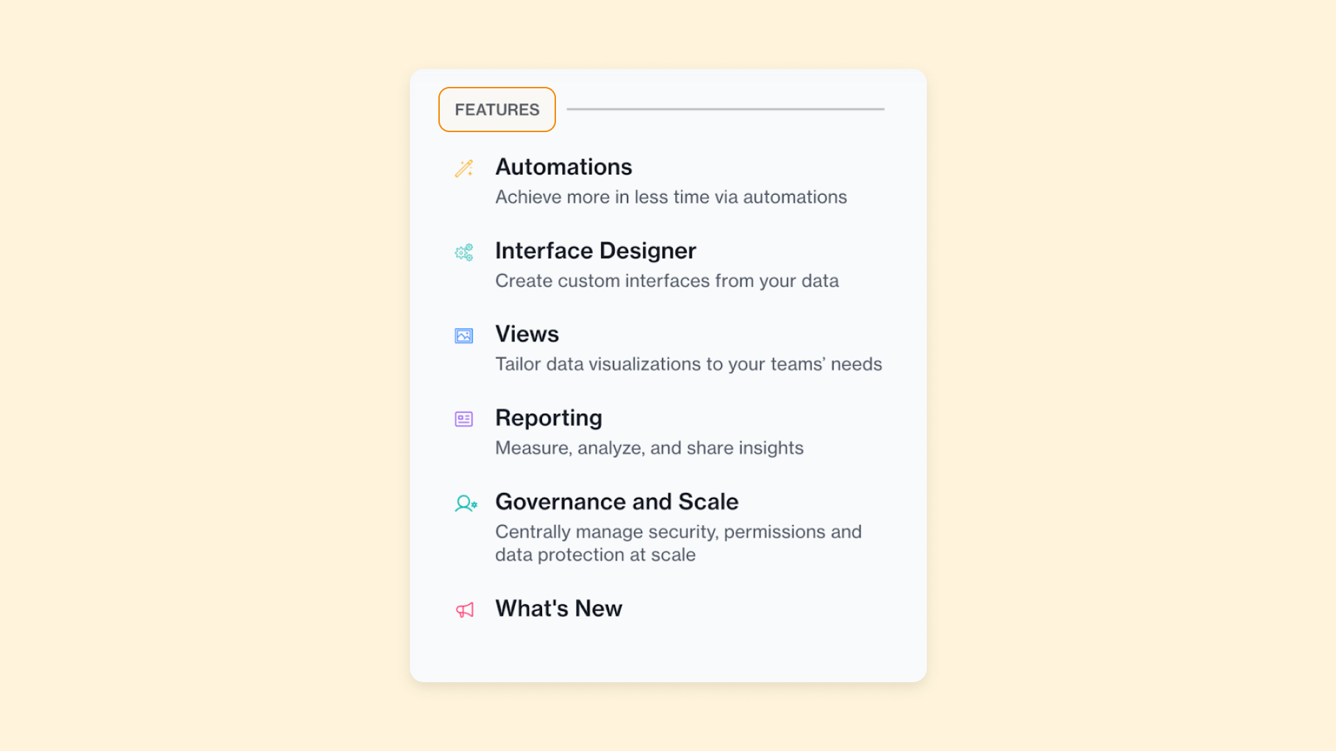
On these pages, make sure to include plenty of screenshots, gifs, videos, and other visual elements that really show the visitor what your product looks like and how it works. These give visitors increased trust and clarity into your product design and functionality.
Use case pages
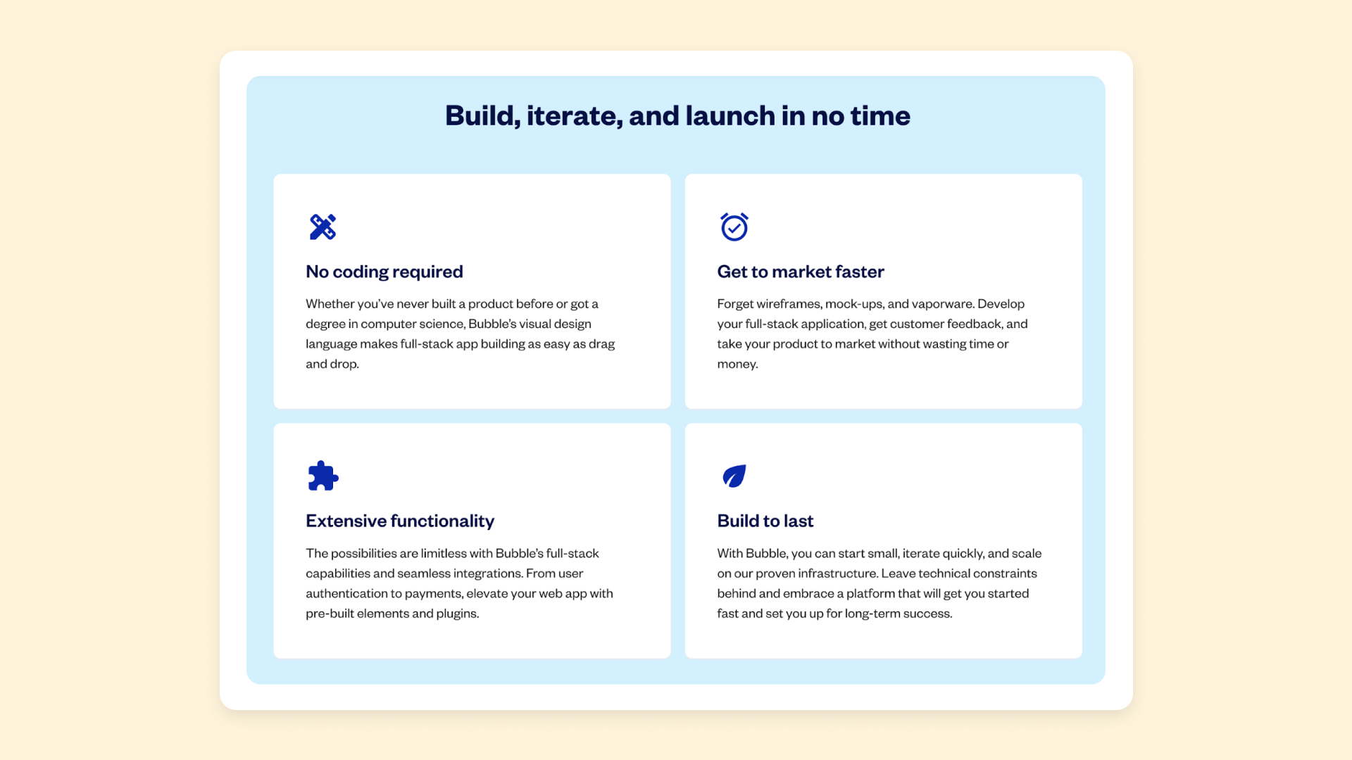
Use case pages are another common page type for SaaS websites. For most SaaS tools, there are a variety of market segments and audiences that might use that tool for different purposes.
For example, founders using Bubble may want to develop their own app or product more quickly without a strong technical background. On the other hand, developers might use Bubble to build products and apps for clients more quickly than with traditional programming techniques.
Or, a SaaS company with a project management tool might be used by different roles within an organization. CEOs use it for analysis, project managers use it for scheduling and management, and designers use it to track work and time. All of these groups are using the same product, but they’ll use it in different ways given their unique goals, experiences, backgrounds, and needs. Use case pages show each of these different segments how the product can be used in real-life for their cases and purposes.
Use case pages can also be a great place to highlight customer success stories. Customer stories build trust in your product, help highlight who can use it and how, and give more concrete examples that can inspire potential buyers.
Company information pages
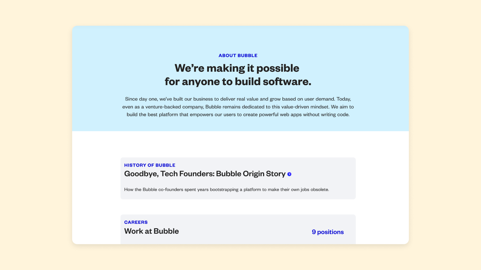
As your company grows, you’ll likely want to include more company information on your website. These can include pages like:
- An “About” page, with company history, philosophies, and so on.
- A “Staff” or “Team” page highlighting your employees, especially notable figures at the company.
- A “Open Roles” page with job listings or details about working at your company.
- A “Contact” page with customer support information or sales team contact info.
In the early days, a single “About” page may have been enough to cover this information and give visitors some details on your company. However, as your company grows, you’ll likely want or need to split these out into separate pages to make this information easier to find.
Documentation
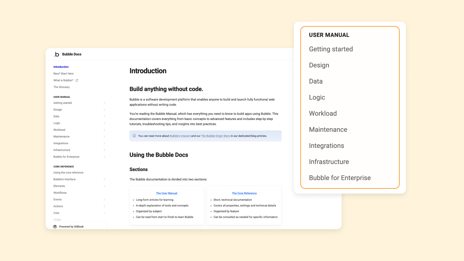
Documentation pages (or, in some cases, a separate website section with a documentation guide, such as a manual or a help center) help your users get the information they need to perform common tasks with your SaaS product. For example, you might have documentation around:
- Setting up a new account on your tool.
- Building dashboards or “homepages” in your tool.
- Doing common tasks, such as scheduling a meeting or building a core element.
- Integrating your tool with other SaaS products.
Depending on your tool and your target audience, you may need more or less documentation. For example, because Bubble is a very open-ended tool with many layers of functionality and an audience with a wide variety of backgrounds, we’ve created extensive documentation. This ensures we’ve outlined all of the things you can build and use on Bubble, and provided guidance for users who may have a lot of background knowledge already, or just a little.
A less complex SaaS tool may require less documentation.
Build your SaaS app with Bubble
Looking to build a SaaS app or an effective SaaS website? Bubble is the best tool — for both! Not only does Bubble provide a simple way to build a marketing website for your SaaS app, but you can build your entire SaaS app on Bubble too.
Bubble’s no-code, drag-and-drop visual editor gives you full customization and control over design, development, workflows, logic, and data. If you can dream it, you can build it on Bubble — without having to code. From simple websites to complex SaaS tools using detailed databases, AI, and more, Bubble can support your SaaS product and make it easier and faster to build.
Even better: You don’t need a technical background to bring your SaaS website or app to life. Bubble’s How to Build guides will walk you through how to make clones of popular SaaS tools like Zendesk, Spotify, and Slack on Bubble so you can learn the basics and then build your own app.
Want to start with your website? Take the inspiration in this article and then follow our step-by-step guide on how to build a website on Bubble and you’ll be up and running in no time.
The best SaaS website examples
Even when you know what to do, sometimes you just need a few examples of what it looks like to make it easier to conceptualize what to do for your own website design. Here are the best SaaS website examples we found that you can look to for inspiration.
Aicado
Bubble Community Award Nominee: Best Use of AI
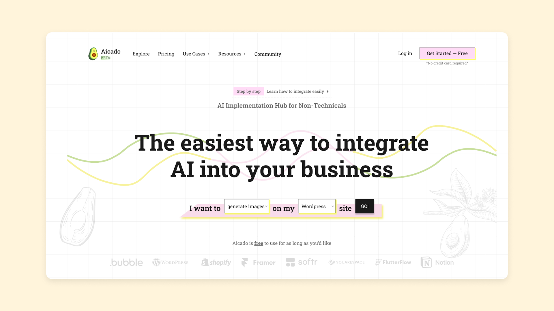
Aicado is still a smaller SaaS platform, but their website checks all the boxes — which just goes to show you don’t have to be a major enterprise tool to have a successful SaaS website. Their homepage is a great example for other SaaS brands:
- It clearly identifies the product and product value right away.
- It provides an immediate way to get started with the product based on your needs.
- It addresses pricing right on the home page (free to get started!) and has a clear navigational link to a more detailed pricing page.
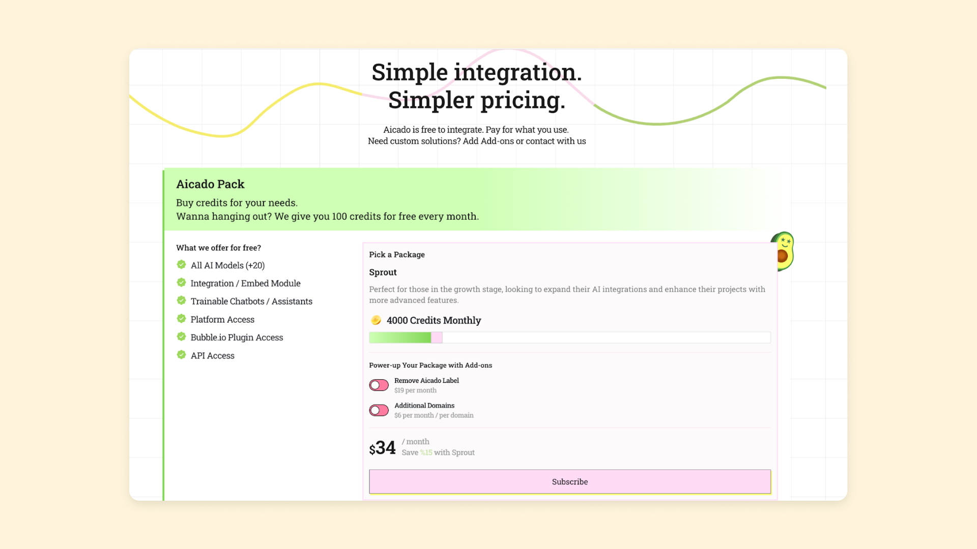
Aicado also uses several other key SaaS website pages. Their pricing page is super simple, with a slider bar that allows you to choose the number of credits you want and see exactly how much it’ll cost. This is a great way to showcase credit-based or usage-based subscription models.
They’ve also built out supporting documentation, even though their product is fairly straightforward. This makes sure that users who aren’t as familiar with this kind of tech can access all of the features. It also helps users know exactly what is available, how to integrate it with their own platforms, and so on.
Aicado is built on Bubble, so building a similar website can be done quickly and without coding. Use containers and groups to set up the basic sections of your page. Then add images, text, and buttons to add in visual and interactive information about your product. If you don’t want to start from scratch, use a template to get started and work from the basic building blocks.
Formula Bot
Bubble Community Award Winner: Best Use of AI
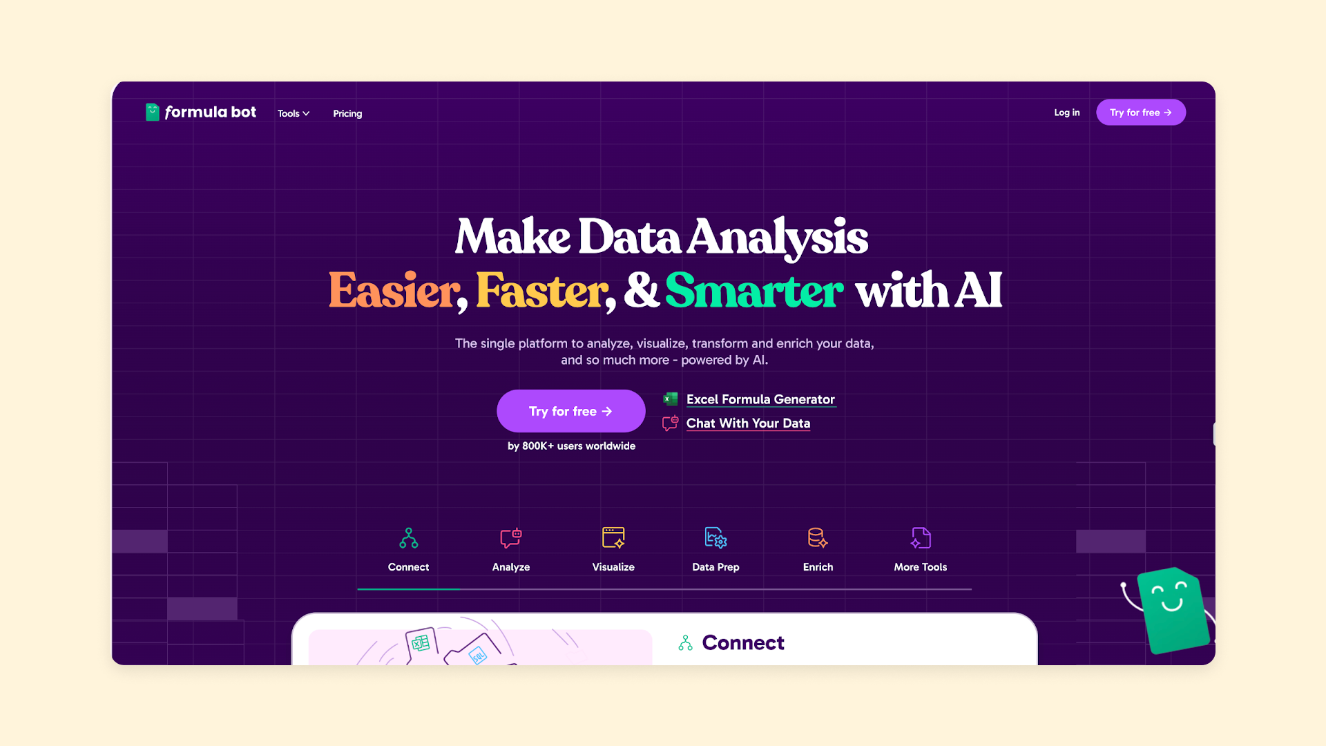
Formula Bot is a SaaS tool that helps users analyze and visualize data with AI. As with Aicado, their homepage is clear, simple, and compelling. It gives users:
- A clear explanation of, and value prop for their product (“make it easier, faster, and smarter”)
- Several CTA buttons encourage visitors to try it out
- A visually appealing and well-designed page that matches their overall brand identity
They’ve also used their homepage as a de facto “Features” page, diving into how it works and some common use cases below the fold. This information is presented very cleanly and simply, so that visitors can get a clear idea of how the product works and would benefit them quickly.
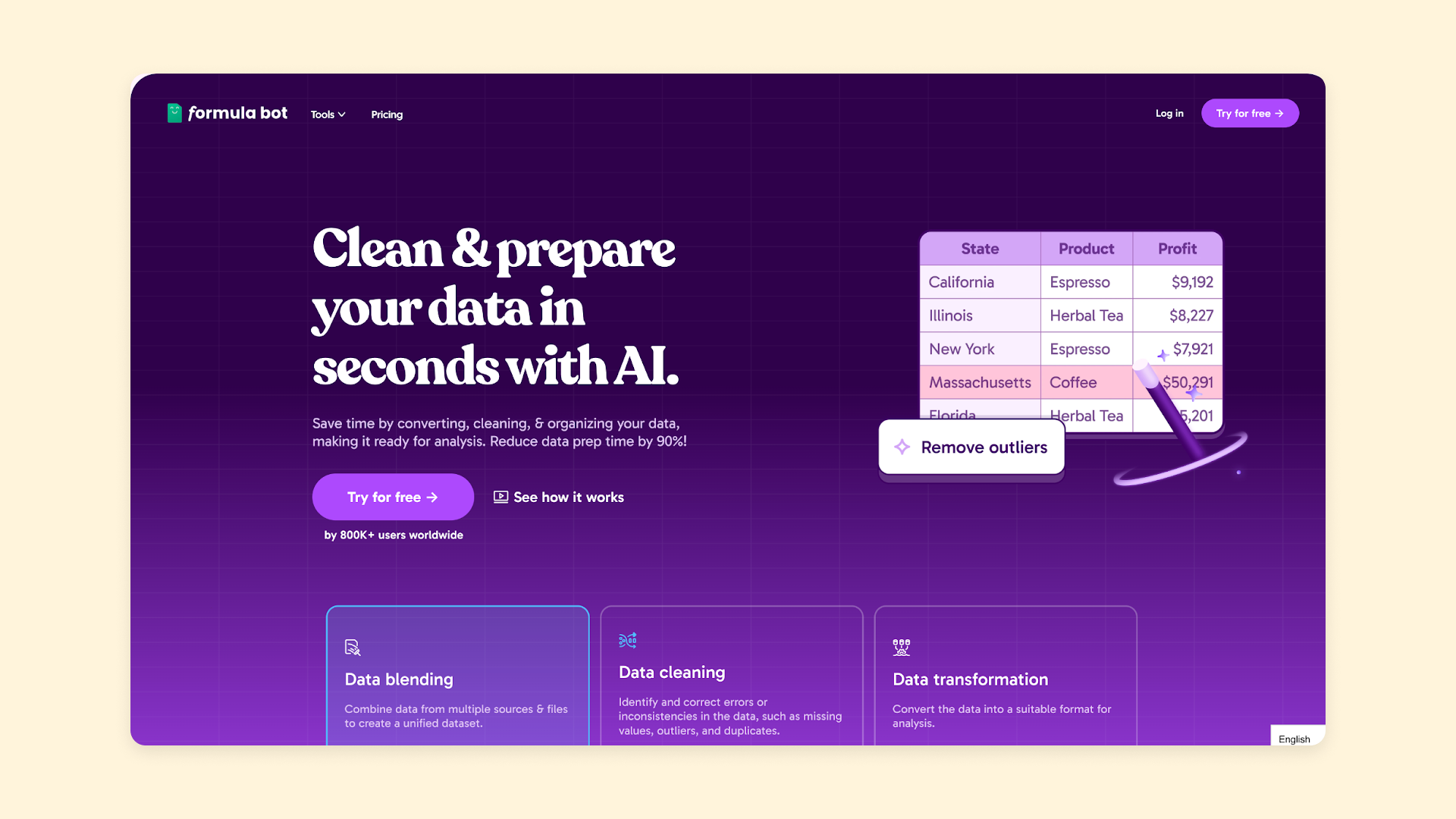
Formula Bot’s “Product” pages are another example of great SaaS website design. They showcase specific elements of the product — data analysis, data prep, and data enrichment. These pages dive into core elements of the product more in-depth, giving the user a visual tour of how it works and what it does.
Did we mention that Formula Bot is built on Bubble? Designing a clear, effective SaaS website like this is easy on Bubble.
Start with the “Design” tab to add containers to your page, then add visual elements to each of the containers to build your basic page layout. From there, use “Styles” to set up the visual identity of your website and create a cohesive look across all your pages. Then, use buttons, menu bars, and more to polish off your design.
My AskAI
Bubble Community Award Winner: Best B2B Tool
The Best B2B App Award goes to the best app created for a B2B audience on Bubble — and My AskAI deserved it for their innovative and extensive use of Bubble’s software and programming language to create a tool that can truly transform customer support.
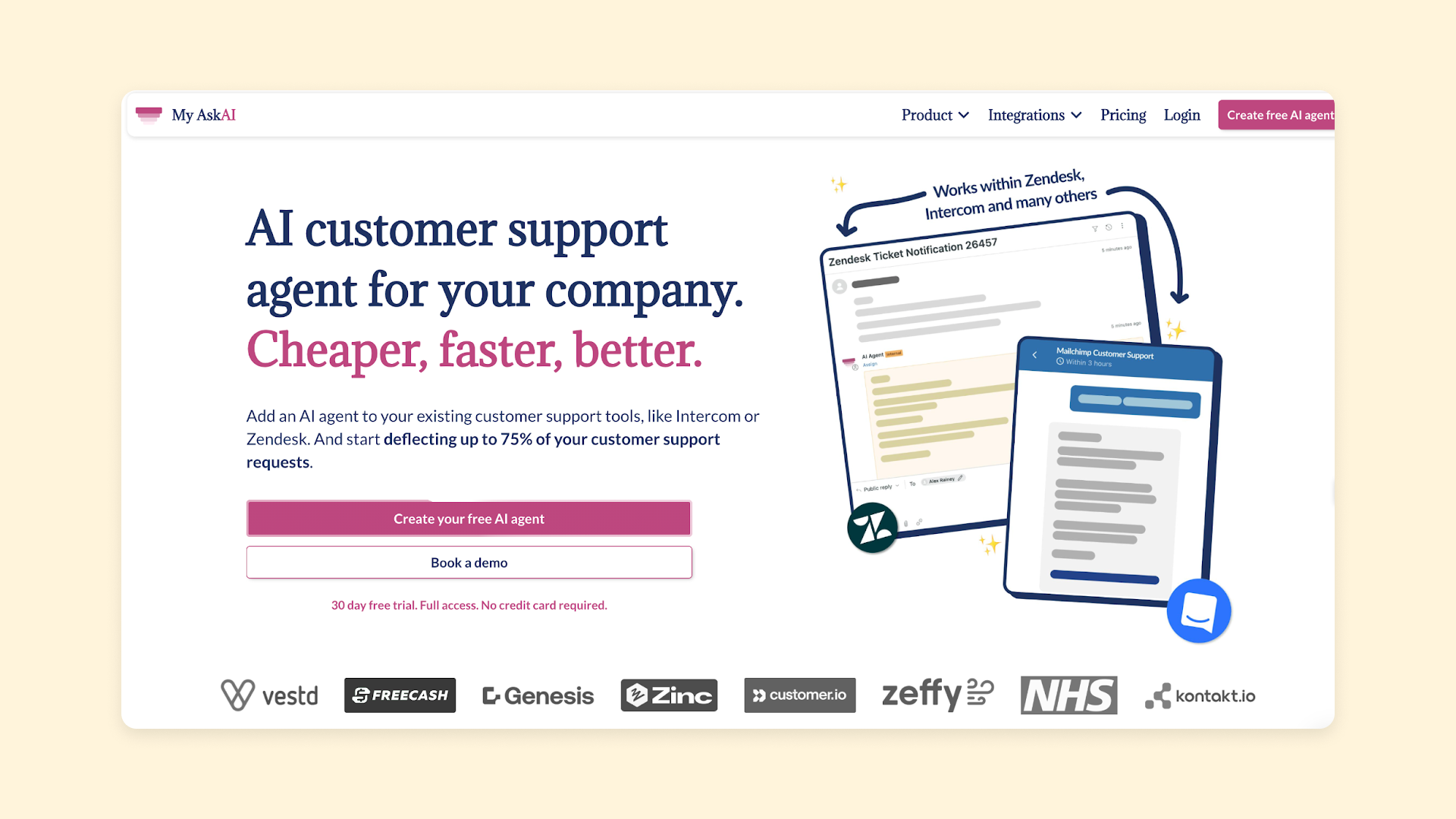
Their website highlights the streamlined, easy, and innovative product they’ve created. As with the others, their homepage gives clear visual and written explanations of what their product is and what the value is.
Their “Features” page stands out as an excellent example for other great SaaS websites. It focuses on a few key features, providing:
- A clear outline of the feature and its value
- A short video showing the feature in action
- A bulleted list of additional feature details and benefits
- A short bit of social proof in the form of testimonials
Further down the page, they’ve added a big list of features and benefits, organized visually to make it easy to scan and process the information.
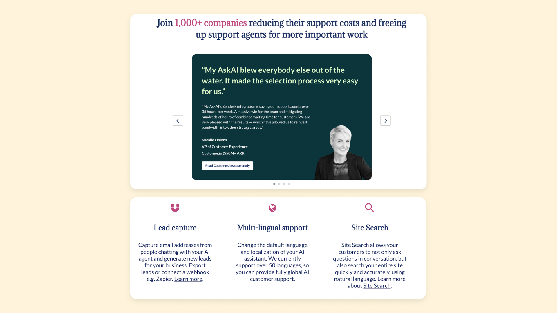
Since integrations are such a huge part of their product, they’ve even added a specific “Integrations” section on their website, with a unique web page for each of the major platforms they integrate with.
These pages function like “Use case” or “Feature” pages, spelling out how the integration works, the features and benefits of each integration, and even providing links to other companies who have used the product in a similar way.
Their strong focus on features and benefits throughout the entire website makes it easy for the visitor to find exactly the information they need for their specific use case, goals, and needs.
Ringly.io
Bubble Community Award Winner: Most Innovative App
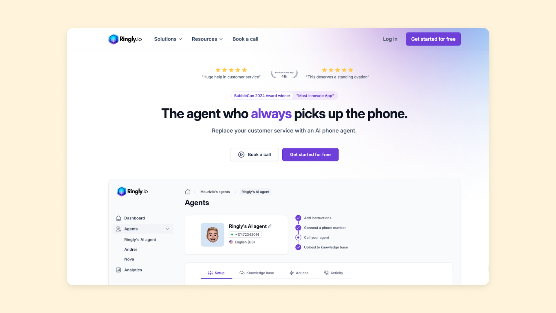
Ringly.io is a great example of how to keep a SaaS website simple without missing any important information or details that users may want. Their homepage nails the basics: features, benefits, product details, and pricing — all in one go. And their “Solutions” pages help dive into feature details based on two main use cases.
But Ringly.io uses another core SaaS website element that many others don’t — the call-to-action page. Rather than just having CTA buttons throughout their site, they have an entire landing page dedicated to their primary goal for their site: getting visitors to book a call.
On their “Book a Call” page, they highlight benefits, awards, their risk-free guarantee, a personal video, and — most importantly — a scheduling calendar on-page where visitors can book a meeting right away. No need for back-and-forth or contact forms, just a simple scheduler where users can take action immediately.
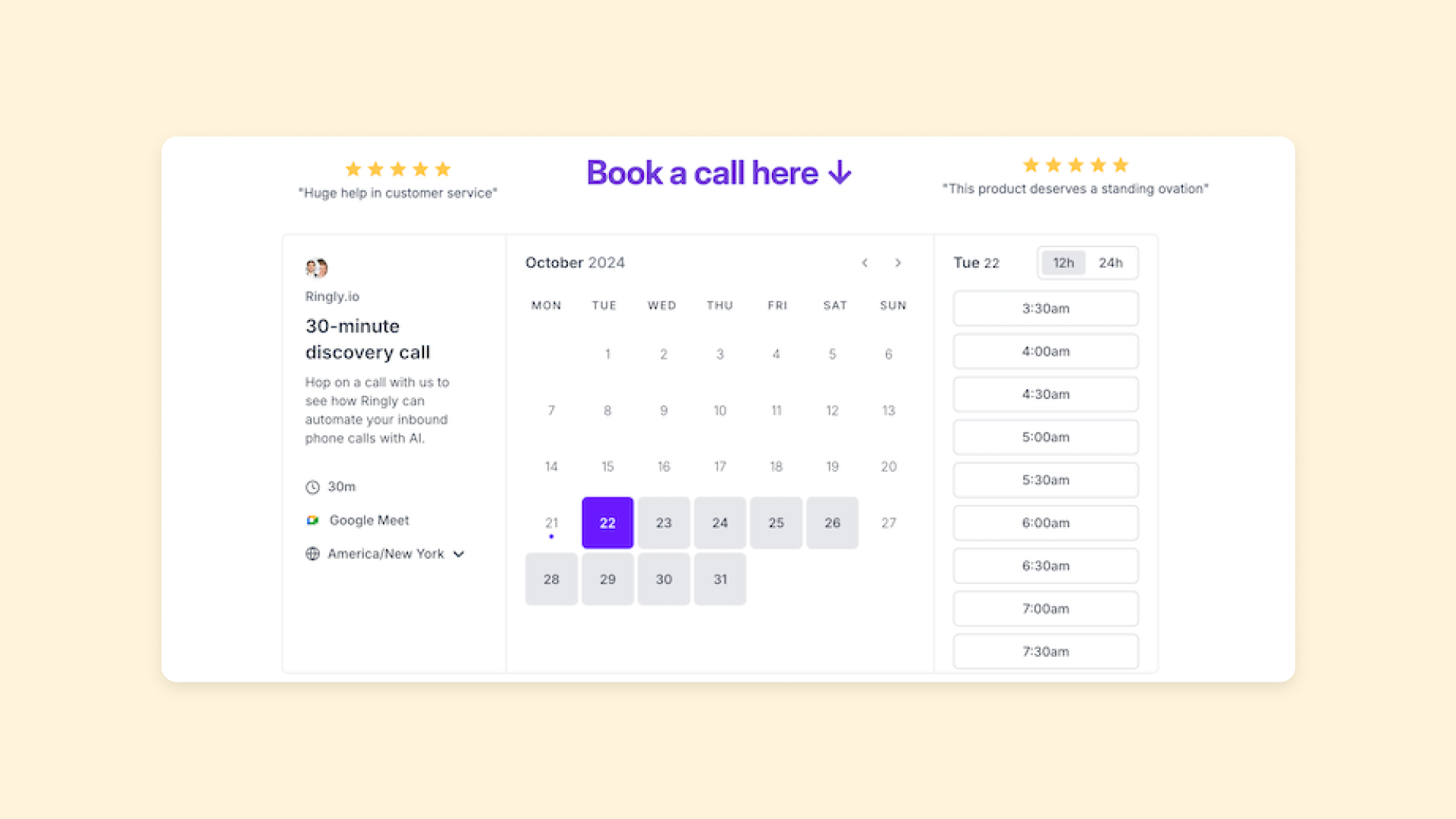
This is a great way to move visitors forward faster: Keep your website simple, streamlined, and focused. Highlight the product and its benefits, and then spend more webpage space and energy on the actual action you want users to take.
Even more great SaaS website examples
Looking for more of the best SaaS websites? Here are more of our favorites built on Bubble you can look to for inspiration:
- WriteHuman: A very clean website that showcases the product’s features by putting the free demo right in the homepage hero banner.
- StoryNest.AI: Clickable interactive demo of the product on the homepage invites users to see how it works before signing up, increasing trust and helping users see the benefits.
- Mapp: Product feature highlights on the homepage link out to dedicated feature and product pages, helping users explore exactly what interests them the most.
- AudioPen: A straightforward website with ample white space highlights two things: the free trial of the product (one-click on the homepage, no login needed) and a huge wall of social proof that both invite visitors to immediately see the benefits of the product for themselves.
- Deepwrk: The simple “How it Works” section on the homepage explains exactly what the product is and does before leading into the free trial CTA button.
- MusicFlow: A single SaaS landing page covers all the basics: features, benefits, product, pricing, and more. Simple explanations that help visitors understand if it’s for them and what to do next.
- Thrift Mango: Effectively uses product screenshots to convey a lot of features and benefits very quickly and concisely.
- Tooni: Extremely simple website offers only the basics: What the platform is and does and a way to get started immediately.
- BDK Native: The gallery highlighted on the homepage shows other customers’ work with the tool, demonstrating features, social proof, and possibilities all in one place.
- Arci: Annotated product screenshots on the homepage serve as a quick and effective intro to the product, brand, and benefits.
- Tend Supervision: Customer testimonials highlight real users and data that gives the visitor a clear picture into the benefits of the app.
- Spontaneous: A clear product page highlights features, benefits, use cases, and more to show visitors how the product can help them.
- 2 Long 2 Watch: A clear example of the product on the homepage lets you try it out for yourself immediately, before leading into additional features and benefits.
Build your SaaS site with Bubble
When it comes to SaaS tools and websites, building on Bubble makes things easier.
Get a head start with our SaaS templates, our How to Build guides, or use Bubble’s AI builder to bring your web pages to life in just seconds. With the power of no-code programming on Bubble, building your SaaS website or app has never been easier.
Not only do you have plenty of Bubble-specific guides, but you can also tap into our dedicated community — including many of the builders who built the apps and websites featured in this article! — to get help, advice, and support troubleshooting.
Build for as long as you want on the Free plan. Only upgrade when you're ready to launch.
Join Bubble