TL;DR: App design has nine steps: define your problem, research users and competitors, map user flows, create wireframes, build a visual system, make prototypes, test with users, improve based on feedback, and move to development. Visual AI platforms like Bubble let you build working apps from your designs without coding, so your prototype becomes your actual product.
You’ve got an app idea that won’t leave you alone. Every tutorial you find either skips crucial steps or assumes you already know what wireframes are. You start designing screens, but then wonder if you’re solving the right problem. You try an AI tool that generates code you can’t read, leaving you unable to tell if it’s actually usable or how to fix what's wrong.
AI visual development lets you create apps faster without writing code, but you still need to validate your idea and make sure people actually want what you’re building. This guide walks you through nine steps that take you from rough concept to production-ready app you can confidently launch.
Define your app’s core problem and success metrics
App design starts with a problem, not a screen. Before you sketch a single interface, you need a problem statement: a clear, one-sentence description of the specific issue your app solves and who experiences it. This statement articulates exactly what’s broken, for whom, and why it matters enough to build a solution.
Write your problem in one sentence using this format: “People struggle to [specific problem] because [reason], which causes [negative outcome].” For example: “Freelancers struggle to track project hours across multiple clients because they use scattered spreadsheets, which causes billing errors and lost income.” This clarity guides every design decision you'll make later.
Separate features from benefits in your thinking. Features describe what your app does: buttons, screens, automated tracking. Benefits describe what users gain: saved time, reduced stress, accurate billing. Your app might feature automated time tracking, but the benefit is peace of mind and getting paid correctly.
Set 3–5 measurable success metrics before you design anything. Common metrics include:
- User retention after one week, to measure how many people come back.
- Time to complete a key task, to measure how fast users can accomplish their main goal.
- Conversion from signup to first use, to measure whether people actually start using what you built.
- Error rate on critical flows, to show where users get stuck or confused.
Later on, when you’re designing and debating whether to add complexity, these metrics help you decide. If a feature doesn’t improve one of your success metrics, you probably don’t need it yet.
Research your users and analyze competitors
User research is the process of learning about the people who’ll use your app by talking to them and watching how they currently solve their problems.
Talk to 5–8 people who experience the problem you’re solving. Ask them about their current solutions, even if those solutions are messy workarounds. What tools do they use today? Where do those tools fail them? What would make their lives easier? Listen for patterns. If three people mention the same frustration, that’s signal worth designing for.
Competitive analysis means studying apps that already exist in your space to learn what works and what doesn’t. Download 3–5 competitor apps and use them for real tasks. You’re not copying; you’re learning where opportunities hide.
Create a simple comparison for each competitor:
- App name and maker identifies who built it and what it’s called.
- Core features describe what users can actually do with it.
- Pricing model indicates whether it’s free, subscription, or one-time purchase.
- User complaints reveal what reviews repeatedly criticize.
- Market gaps identify what users wish existed but doesn’t.
If every competitor has complex onboarding, maybe simple onboarding becomes your advantage. If reviews constantly mention missing features, you’ve found your opening.
Create one or two basic user personas, or simple descriptions of your typical users. Include their role, their main goal, and their biggest frustration with current solutions. One paragraph per persona is enough. These personas guide design decisions when you’re stuck between options.
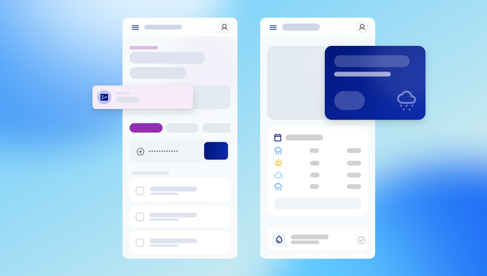
Map user flows and information architecture
User flows are diagrams showing how people move through your app to accomplish goals. This means you need to design what screens exist and how they connect before you design what those screens look like. Information architecture is how you organize and label everything in your app so users can find what they need.
Start with your app’s happy path: the ideal journey from opening the app to completing the main task. For a time-tracking app, this might be: open app → select client → start timer → stop timer → review logged time. Write out each step and decision point as a simple list.
Group related features together and create clear categories. Your users should find what they need without hunting through menus or guessing where functions hide. Think about how a grocery store organizes products — dairy with dairy, produce with produce — and apply that same logic to your app's features.
Navigation patterns differ between mobile and web:
- Mobile apps typically use bottom tab bars for main sections, with screens stacking on top of each other
- Web apps often use top navigation bars or sidebar menus with multiple visible sections
- Both platforms benefit from consistent placement of primary actions and clear visual hierarchy
Map these flows visually if it helps, but even a simple text outline works. The goal is logic, not polish. You’re making sure every screen has a purpose and every user action leads somewhere useful. Bubble’s visual workflow editor lets you turn these user flows into actual app logic as you design, and the AI Agent can help you build them.
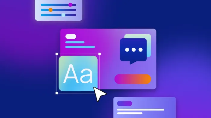
Create low-fidelity wireframes
Wireframes are rough sketches showing where elements go on each screen. You don’t need colors or fancy fonts, just boxes and labels. You’re designing structure and layout before you worry about visual polish. Wireframes are fast to create and easy to change, which makes them perfect for testing ideas. With visual AI building like Bubble, you can generate polished UI immediately or start with wireframes, whichever fits your process.
Start on paper or with a simple digital tool. Draw rectangles for screens and smaller boxes for elements like buttons, images, and text fields. Label everything clearly: “Product photo goes here,” “Buy button,” “User profile section.” Speed matters more than beauty at this stage.
Focus on 3–5 key screens first:
- Entry screen (what users see when they open your app)
- Main dashboard (the hub where users spend most time)
- Primary action screen (where users complete their main goal)
- Error or empty state (what happens when something goes wrong)
Common elements you’ll wireframe include headers, navigation menus, content areas, input fields, and buttons. Arrange them based on importance. The most critical elements get prominent placement and larger sizes. If the “Buy” button is your app’s main action, it should be obvious and easy to reach.
Stop wireframing once you’ve sketched your key user flows and confirmed the basic structure makes sense. You’re ready to move on when you can walk through your wireframes and complete important tasks without getting confused or stuck.
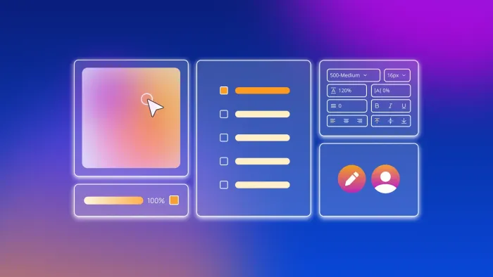
Establish your visual design system
A design system is a collection of reusable visual elements and rules that keep your app looking consistent. This means you’re defining colors, fonts, and component styles once, then applying them everywhere. Consistency makes your app feel professional and helps users learn how it works.
Choose your color palette carefully. You’ll need a primary color for main actions, a secondary color for supporting elements, and neutral colors for backgrounds and text. Limit yourself to five or six colors total. High contrast between text and backgrounds ensures everyone can read your content, including people using assistive devices.
Typography means choosing fonts and sizes that work together. Select one font for headlines and either the same font or a complementary one for body text. Define sizes for different text types: large for page titles, medium for section headers, small for body text. Consistency helps users scan and understand content faster.
Create reusable components: buttons, input fields, cards, and navigation elements that look and behave the same everywhere.
- Buttons: If all primary buttons are blue rectangles with white text, users learn once and know what to expect
- Input fields: Consistent styling for text entry makes forms feel familiar
- Cards: Repeating containers for content like products or posts
- Navigation: Menus and tabs that work the same way throughout your app
Design for the smallest screen first, then scale up. This forces you to prioritize essential elements and prevents cramming too much into limited space. Bubble’s design system allows you to define reusable elements, components, and styles that you can apply throughout your app for consistency.
| Purpose | Best Practice | |
|---|---|---|
| Primary color 🎨 | Main actions, important buttons | Choose one that stands out but isn't jarring |
| Typography ✍️ | Headers, body text, labels | Limit to 2 fonts max, define 3–4 sizes |
| Spacing 📏 | Padding, margins, layout | Use consistent increments (4px, 8px, 16px) |
| Components 🧩 | Buttons, cards, inputs | Design once, reuse everywhere |
| Touch targets 👆 | Clickable areas on mobile | Minimum 44×44 pixels for easy tapping |
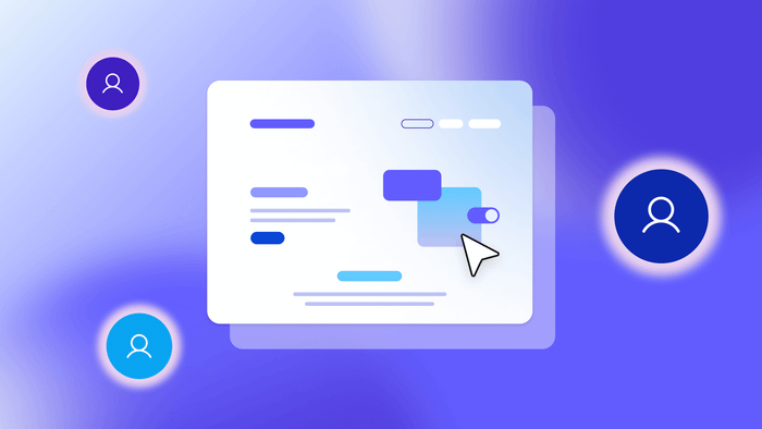
Build interactive prototypes and test with users
Prototypes are clickable versions of your designs that simulate how your app will work. This means users can tap buttons, navigate between screens, and complete tasks as if they're using a real app. Testing with prototypes catches problems when they’re still cheap to fix.
Prototyping tools like Figma let you create realistic interactions for testing. Bubble goes even further: You can build production-ready apps right away, not just prototypes, so what you design becomes your actual app.
Focus on making critical paths fully functional. Users should be able to complete your app's main task from start to finish. With Bubble’s visual tools and AI Agent, you can build real functionality for secondary features too, rather than leaving them as static screens.
Finding test users doesn’t require a huge budget. Post in online communities related to your app’s purpose, reach out to your network, or use platforms like UserTesting. 5–8 users per round reveals most usability issues.
During testing, watch what users do more than what they say:
- Where they hesitate signals confusion and design problems.
- Wrong turns they take indicate unclear navigation or labeling.
- Tasks they can’t complete show fundamental usability issues.
- Features they ignore suggest poor visual hierarchy or unclear purpose.
Ask them to complete tasks while thinking aloud, and note where they hesitate or take wrong turns. If they claim navigation is intuitive but spend 30 seconds hunting for a feature, that’s your real data.
Iterate based on user feedback
Iteration is the process of making targeted improvements based on what you learned from testing. Instead of endlessly revising, you’re fixing specific problems that prevent users from succeeding.
Categorize feedback by frequency and severity. If seven out of eight users struggle with the same screen, that’s high frequency and high severity: Fix it immediately. If one user mentions a minor visual preference, that’s low frequency and low severity: Note it, but don’t prioritize it yet.
Common usability issues first-time designers miss:
- Hidden navigation buries important features in menus users never open.
- Unclear button purposes use labels like “Submit” instead of “Create Account.”
- Missing feedback provides no confirmation that actions worked successfully.
- Inconsistent patterns make the back button work differently on different screens.
- Overwhelming choices present too many options at once.
Make changes and test again. 2–3 rounds of iteration typically catches major issues. You'll know you're ready to move forward when users complete key tasks without confusion and feedback becomes minor refinements rather than fundamental problems.
Transition from design to development
The transition from design to development is where many app projects stumble. You’ve validated your concept, tested your designs, and confirmed users can complete key tasks. Now, you need to transform those designs into working software. This phase requires clear documentation, scope decisions, and maintaining focus on your core problem.
Document your design decisions thoroughly before development begins. This includes interaction details (what happens when users click, how screens transition), error states (what users see when something goes wrong), and mobile-specific behaviors (how the layout adapts to different screen sizes). Clear documentation prevents miscommunication and ensures your vision translates accurately into the final product.
Traditional development requires detailed handoff materials. You'll need to provide annotated designs showing exact spacing, colors (use hex codes), and component behaviors to hired developers. Export assets in the right formats and sizes for both web and mobile if you’re building for multiple platforms. The more specific your documentation, the fewer “that's not what I meant” surprises you'll encounter later.
Visual development platforms like Bubble streamline this transition significantly. Instead of documenting for handoff, you implement design details directly in the visual editor. There’s less translation friction because you’re building functional software as you design, turning your tested prototype into your actual app without any development delays.
Determine your minimum viable product scope before development begins. Which features are essential for launch versus nice to have later? Your MVP should solve the core problem completely, even if it lacks advanced features. It’s better to ship a simple app that works than delay for months adding features users might not want.
Avoid scope creep during development by referring back to your original problem statement and success metrics:
- Does this help users solve the core problem better? If yes, consider it.
- Does this improve one of your success metrics? If yes, it might be worth adding.
- Is this essential for launch? If no, save it for version two.
Ship your designed app faster with visual development
You’ve completed the nine steps from problem definition to production-ready app. Traditional development timelines stretch months from here. Hiring developers, translating designs into code, debugging, and rebuilding takes time and money. But visual development offers up to 90% faster development cycles without sacrificing quality.
Visual AI building platforms like Bubble eliminate the timeline between design and working app by combining both in one tool. What used to require translating designs into code, debugging, and rebuilding now happens through visual programming anyone can learn. You’re not choosing between speed and control anymore.
Your next steps depend on your approach. If you’re using visual development like Bubble, your tested app is already functional. Just add finishing touches and deploy. If you’re hiring developers for traditional code-based development, hand off your documented designs and maintain close communication during build.
Common mistakes to avoid when moving from design to launch:
- Redesigning after testing should be avoided unless you stick to your tested design or run new tests before making major changes.
- Ignoring performance creates beautiful designs that load slowly and frustrate users.
- Skipping edge cases means you fail to design and test error states, loading states, and empty states.
- Forgetting mobile testing means you fail to test on actual devices, not just desktop browsers.
Frequently asked questions
How long does it take to design an app from scratch?
The complete design process typically takes 2–4 weeks for a simple app, depending on how complex your user research is and how many testing iterations you need. Breaking it into the nine steps keeps progress moving without overwhelming you.
Can I design a professional app without expensive design software?
You can start with free tools like Figma’s free tier or even pen and paper for wireframes, then upgrade to paid tools only when your project requires advanced features. Bubble lets you design and build functional prototypes without separate design software, combining wireframing and development in one platform.
How many people should test my prototype before I start building?
Testing with 5 users identifies 85% of usability issues, and 5–8 users per round typically reveals most major problems. You can repeat this process after making significant changes to validate improvements. More users give diminishing returns, as you’ll see the same problems repeatedly.
What’s the difference between wireframes and prototypes?
Wireframes are static sketches showing layout and structure without visual polish, while prototypes are interactive versions that simulate user flows and let you test the actual experience. Think of wireframes as blueprints and prototypes as working models.
Can I skip straight to building if I’m using AI code generation to create my app?
AI can generate screens quickly, but it can’t validate whether you’re solving the right problem or if users will actually want what you’re building — 42% of startups fail from no market need. Following the design process makes sure you build something people need, not just something that looks impressive.
Build for as long as you want on the Free plan. Only upgrade when you're ready to launch.
Join Bubble